Category Archives: Features

Turn Your Pentests Into Insights: The New Business Intelligence Dashboard

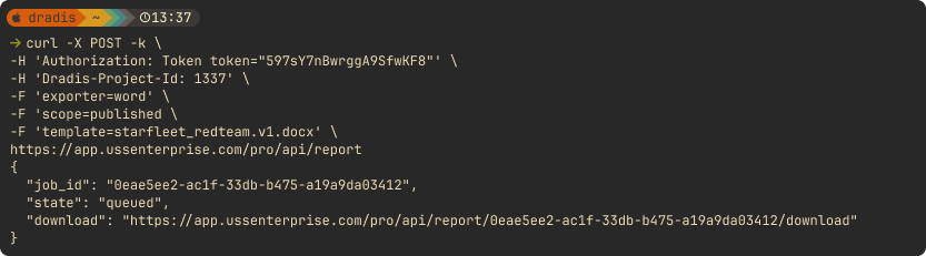
Remember when we shared a “Year in Review” script that could pull basic stats from your Dradis instance? Well, we heard your feedback loud and clear. You wanted more than a command-line script. You wanted insights that were easy to access, customizable to your needs, and powerful enough to help you make real business decisions.

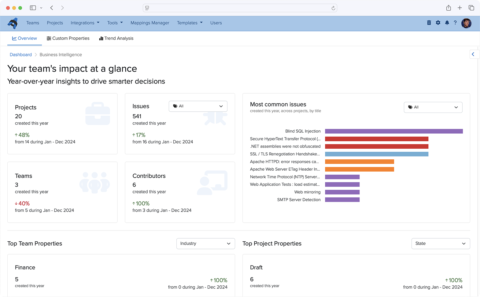
Today, I’m excited to walk you through what we’ve built: a full-fledged Business Intelligence Dashboard that turns your Dradis data into actionable intelligence.

The Journey from Script to Dashboard

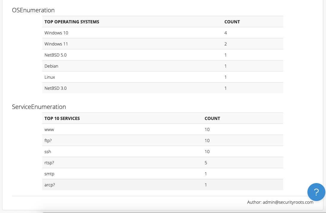
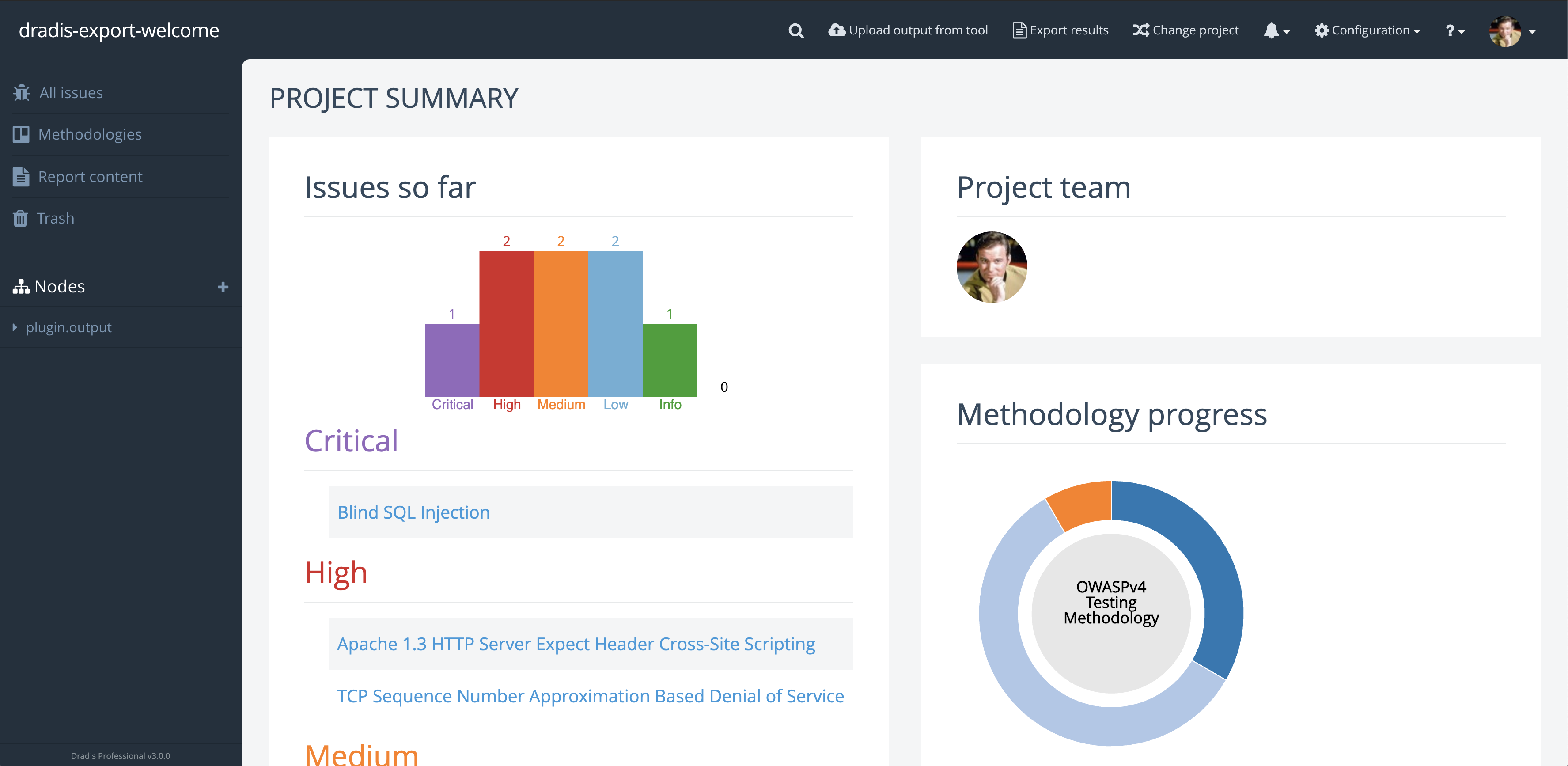
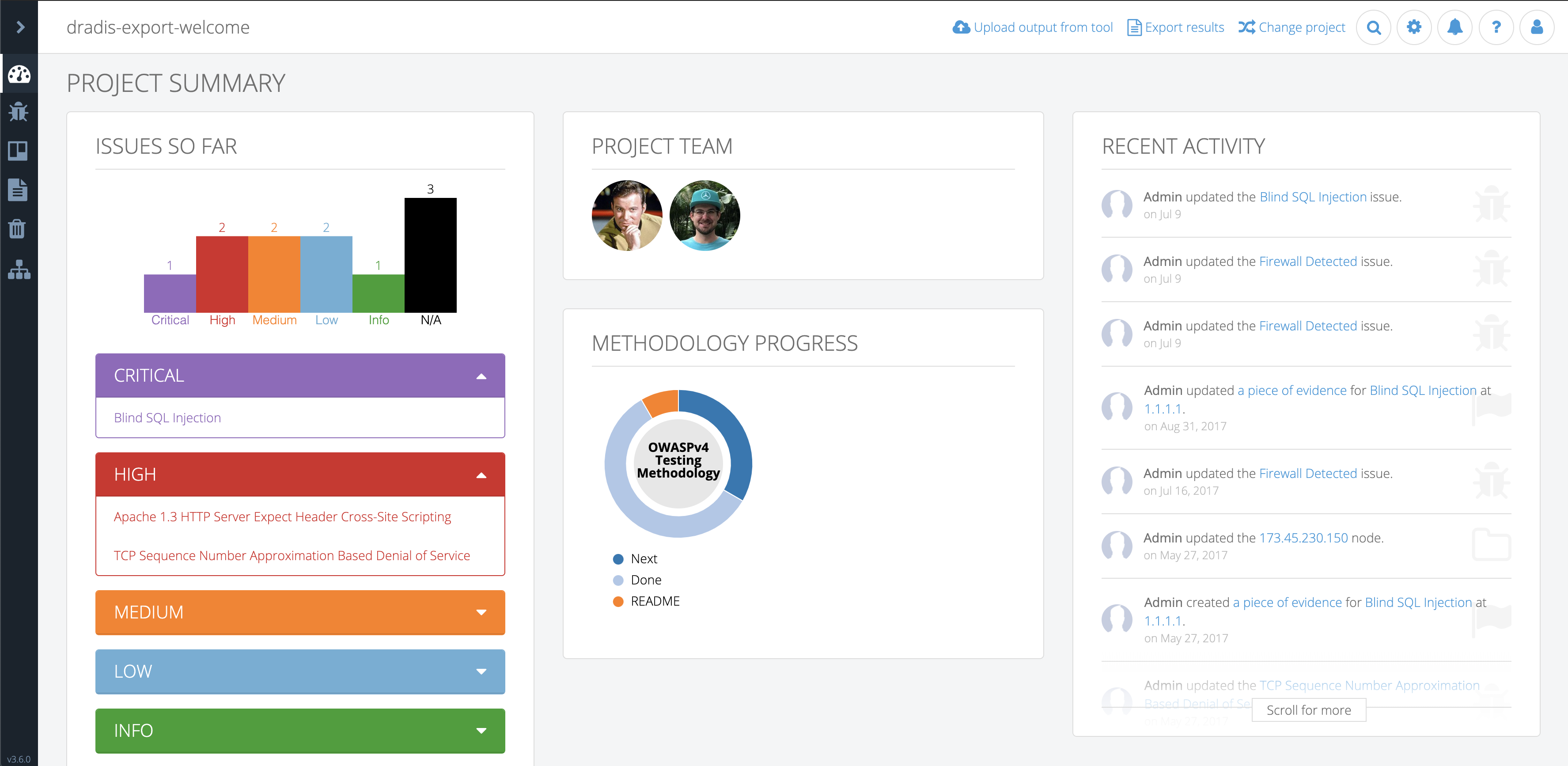
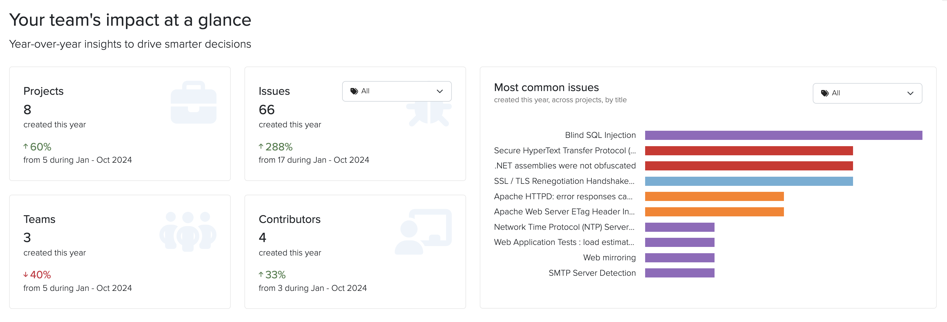
That original Year in Review script was simple but effective. It could tell you how many projects you created, count your Issues by severity, and show you the most commonly found vulnerabilities. But it had limitations. You had to SSH into your instance, run commands, and parse text output. And while it gave you a snapshot of your year, it couldn’t help you understand the why behind the numbers.

The Business Intelligence Dashboard takes that concept and expands it into something much more powerful. Instead of running scripts, you can now log into Dradis and immediately see:

  • Activity summaries comparing this year to last year for Projects, Issues, Teams, and Contributors
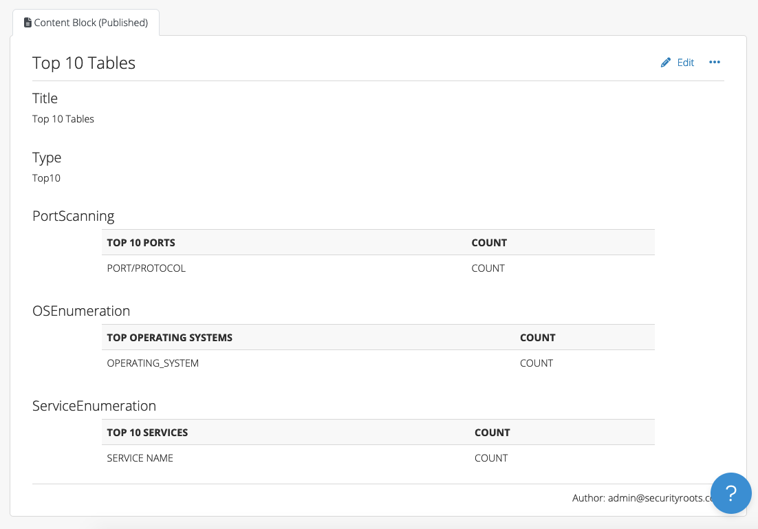
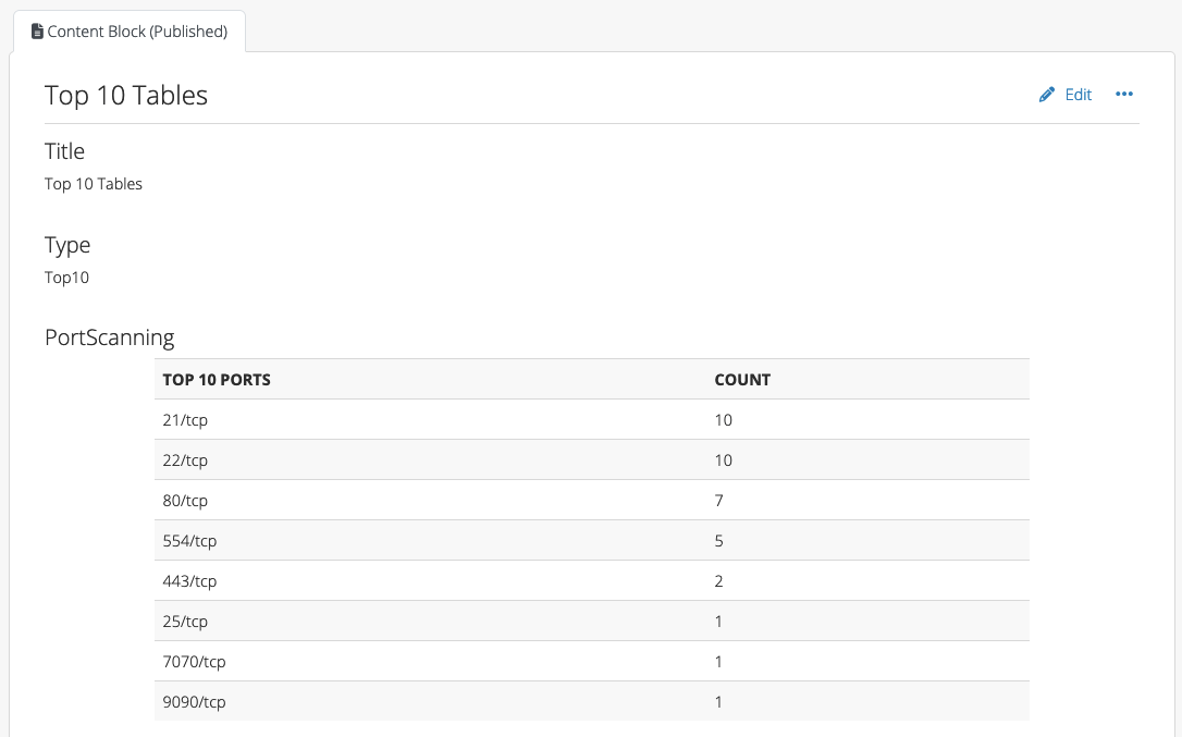
  • The most common Issues found across all your projects by Title, filtered by Tag
  • Custom metrics and trends based on your team and project properties

Custom Properties: The Foundation for Better Insights

The real power of the Business Intelligence Dashboard comes from custom properties. These let you tag and categorize your work in ways that matter to your business.
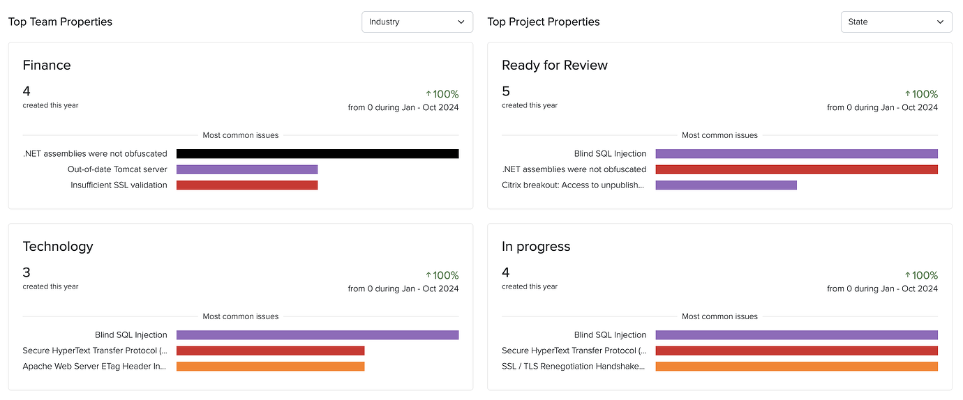
Team Properties

Want to know which industries you serve most? Or which types of clients are most profitable? Team properties let you define custom fields for your clients. You can create:

  • Integer fields for numerical data (revenue, number of employees, etc.)
  • String fields for text data (client contact information, notes)
  • List fields for categorical data (industry, region, client tier)

For example, you might create an “Industry” property with options like Healthcare, Finance, Retail, and Technology. Once defined, every time you create a new team, you’ll be able to select from these options.

Project Properties

Project properties work the same way, but let you categorize individual engagements. This is where you can track things like:

  • Project type (webapp, infrastructure, mobile, cloud)
  • Whether a project was under-scoped or over-scoped
  • Complexity level
  • Testing methodology used

These properties become the basis for answering critical business questions.

Existing Business Intelligence Features

Dradis has other Business Intelligence features beyond those we highlighted above. Once you’ve been collecting data through custom properties, the Dashboard transforms that information into visual insights and searchable metrics.

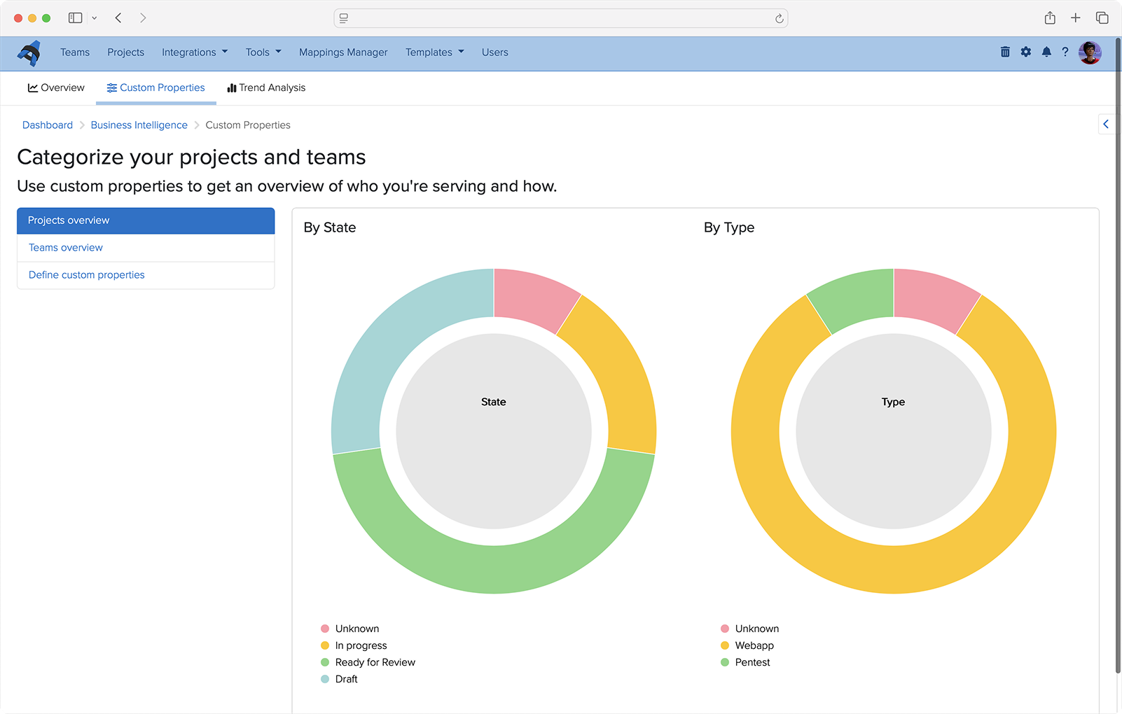
Automated Overview Charts

Every List property you define automatically generates a visual overview chart. These charts give you an at-a-glance understanding of your business composition. See instantly what percentage of your projects are webapp versus infrastructure, or which industries make up the majority of your client base.

Data Analysis Queries

The Data Analysis sidebar lets you drill down into specific questions. Want to see all teams in the Healthcare industry? Or find every webapp project from the last quarter? Just select the property you want to search, enter your criteria, and get instant results.

The results come back in a customizable table where you can toggle columns on and off to focus on exactly what matters. Each result shows not just the projects or teams that match your criteria, but also their associated Issues and other relevant data.

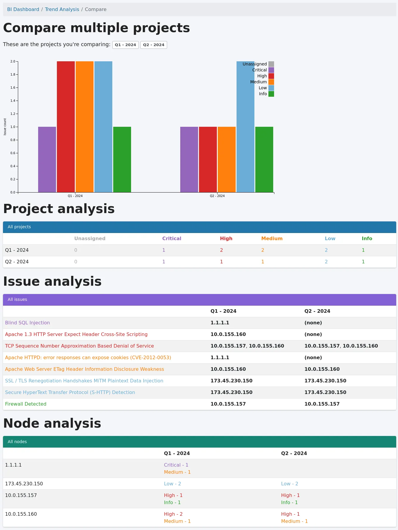
Trend Analysis: Compare and Learn

The Business Intelligence’s Trend Analysis feature lets you select multiple projects and compare them side-by-side to identify patterns and differences.

To use it:

  1. Click “+ Trend analysis” in the sidebar
  2. Select the projects you want to compare (use the filter to narrow your options)
  3. Click “Compare!”

The comparison shows you:

  • A graph of Issues based on tags across all selected projects
  • A project analysis table with Issue counts by tag
  • Issue analysis showing which Issues affect which Nodes in each project
  • Node analysis displaying Issue counts by tag for each Node

This is invaluable for understanding how similar projects differ, identifying trends over time, or comparing repeat/retest projects.

Answering the Questions That Matter

With the Business Intelligence Dashboard, you can now answer:

What types of projects are you running? Define a “Project Type” property and instantly see the breakdown in your overview charts.

What types of team industries are you serving? Create an “Industry” team property and use Data Analysis to explore the distribution.

Which types of teams are most profitable? Combine revenue properties with industry properties to identify patterns.

What percentage of your projects are under-scoped or over-scoped? Add a “Scope Accuracy” project property and let the Dashboard show you the numbers.

But it doesn’t stop there. The flexibility of custom properties means you can answer questions specific to your business that we never could have anticipated. That’s the beauty of this approach—you’re not limited to our assumptions about what matters. You define what success looks like, and the Dashboard helps you measure it.

What This Means for Your Team

The Business Intelligence Dashboard isn’t just about pretty charts. It’s about making better decisions:

  • Resource allocation: Understand which project types require more time and adjust your scoping accordingly.
  • Client focus: Identify which industries or client types align best with your expertise and business goals.
  • Quality improvement: Track Issue trends across projects to understand where your team excels and where there’s room for improvement.
  • Business growth: Use data to make informed decisions about which services to expand, which clients to pursue, and how to position your team in the market.

Getting Started

The new and improved Business Intelligence Dashboard is available now in Dradis Pro v4.19.0 and later. If you’re already using Dradis, navigate Tools > Business Intelligence to start defining your custom properties. If you’re new to Dradis, check out our complete documentation to learn more.

We’ve come a long way from that simple Year in Review script. But the journey isn’t over. We’re continuing to enhance the Business Intelligence Dashboard based on your feedback. What insights matter most to your team? What questions are you trying to answer? We’d love to hear from you.


Want to learn more about the Business Intelligence Dashboard? Check out our support guide for step-by-step instructions.

ICYMI: What we shipped in 2025 🚀

2025 has been a busy and productive year for the entire Dradis team. While we shipped a lot of cool stuff, there are some features that really stand out as we look back over the year. We hope you’ve been making as much use of these as we have.

Our top features and improvements in 2025 include:

  • Business Intelligence Analytics
  • Echo: Context-aware Automation for Dradis
  • Gateway Services and Questionnaires
  • Whitelabling
  • Docker Deployments
  • Hera: Our New Layout
  • Webhooks
  • Issue Library CSV imports
  • Dradis OTP
  • Project QA
  • Audit Logging
  • API Improvements

Read on for a roundup of our favorite features that you may have missed.

Business Intelligence Analytics

We had a lot of requests around a Business Intelligence Dashboard, and now the first version is ready! You can see year-over-year trends of projects, issues, teams, contributors, and custom properties, along with lists of your most common issues across projects.

Get a clearer look at progress over time.

Echo: Context-aware Automation for Dradis

Improve Issue write-ups, summarize raw scanner output, rewrite tester notes into executive language, enhance remediation advice, and more! With Dradis Echo, you can deploy your preferred LLM locally, with no external connections at all. Your data always stays local to uphold data sovereignty.

This is still in a Beta Release, but if you’d like to test this out or be an early adopter, you can read more about Echo and how to install it.

Gateway Services and Questionnaires

As we continue to improve the features and possibilities of Dradis Gateway, we have built a Services section of the portal where you can create questionnaires to send to Gateway Contributors.

For example, you could use a questionnaire to establish the scope and goals of a penetration test before starting a Dradis project. Based on the responses, you can create a new project for the team right from the questionnaire results.

Teams are also creating post-engagement questionnaires, re-test request questionnaires, and much more!

Whitelabling

Admins can now add a custom logo and brand color to Dradis. Contributors will see this logo and color when logging in and throughout the Dradis UI, providing a white-labeled experience that reflects your team’s brand identity.

Docker Deployments

We are now offering new deployment options for Dradis CE (Pro coming soon!). Releases are now available on Docker Hub and we have a new command-line interface that streamlines deployment on a remote server. See https://dradis.new/ for more!

Hera: Our New Layout

Dradis has been a trusted tool in the pentesting world for over 15 years. Many changes, features, and components have been added during that period, and as the platform evolved, the growing number of links and navigation layers made the layout feel more complex than we’d like. That’s why we’ve decided it’s time for a refresh.

Our main goal was to make Dradis easier to navigate, give it a fresh look, and create a unified layout that feels consistent and intuitive.

The most significant change is the new navigation architecture, introducing a main navigation bar, a secondary navigation bar, as well as a left and right sidebar.

  • The main nav gives you everything you need to stay on top of your tasks. Projects, tools, settings, and more can be found in the main navigation bar.
  • The secondary nav has everything you need that is section-related. Whether you’re working on a project or using a tool, you can find all the related links here. Available as needed.
  • The left sidebar is available in projects and is dedicated to Nodes, allowing you to easily navigate through them, while the right sidebar contains secondary content that you may need to get the job done.

If you’re wondering about the name, Hera Agathon is a character in the Battlestar Galactica universe. She was the first human-Cylon hybrid to exist, also known as “the shape of things to come” before her birth. Hera symbolizes a new era, the future, a way of moving forward, making it the perfect name for Dradis’ new updated layout!

Webhooks

You can now use Webhooks to carry out actions based on events in Gateway. Contributor requests, remediation progress, and project completions can trigger automated actions across your security stack. For example, kick off an onboarding flow when a client submits a project request through Gateway, post Slack updates on new events in Gateway projects, or sync your ticket status across Jira, Azure DevOps, or ServiceNow.

While only Gateway webhooks are supported today, we plan to support other types of events in the very near future!

Issue Library CSV imports

Have an existing library of Issues that you’d like to use in Dradis? You can now upload CSV files to the Issue Library to bulk-import your own set of custom issues. No more tedious copy/pasting or re-formatting. Our support team is still available to help with more complex imports with our concierge service.

Dradis OTP

We have created our own multi-factor authentication integration, Dradis OTP. You are no longer limited to using DuoWeb for MFA. With Dradis OTP, you can create and scan a QR code to use for MFA in whichever authenticator app you use.

Project QA

Many teams love our in-project QA flow for Issues and Content Block, and it’s sparked a good amount of feedback to bring something like this to the project level. Teams want to know which projects are ready for review without opening each project and going to the QA views.

Projects now have overall States that can be customized in BI to fit your team’s unique workflow requirements. The Project State is actually a custom project propery in BI which enables getting project insights by state.

Audit Logging

By popular request, we have added audit logging to Dradis, which tracks activity on a deeper level than the Recent Activity tabs and gathers it in one place. Your logs for the whole Dradis instance are now easily accessible for your security, compliance, and accountability needs. You can even export them to CSV files!

API Improvements

We added a number of API improvements throughout the year, such as adding an endpoint for exporting and downloading reports, as well as adding Node Properties to the Node endpoint. Save time and boost efficiency with the Dradis API, designed to automate repetitive tasks and fit perfectly into your unique workflow.

Looking Ahead

2025 has been a transformative year for Dradis. From the powerful insights unlocked by our Business Intelligence analytics to the intelligence-driven capabilities of Echo, we’ve focused on building features that don’t just add functionality but fundamentally improve how security teams work. Gateway has opened entirely new collaboration possibilities, bringing your clients directly into the platform and streamlining communication in ways that weren’t possible before.

And we’re not slowing down! Our 2026 drawing board is already packed with innovations that will push Dradis even further. We’re excited about what’s coming, and we can’t wait to share it with you as these features take shape.

Thank you for being part of the Dradis community. Your feedback, feature requests, and real-world use cases continue to drive our development priorities. Here’s to an even more productive 2026. 🚀

Top 10 tables – a custom Dradis script

Imagine, you scan a few hundred hosts to create a summary report. You want to show data on ports and operating systems without giving the end user hundreds of pages of data. Enter the “Top 10” script!

Credit for this script idea goes to Chris from I.S. Partners. He reached out via the support inbox to see if we could create a “Top 10” script that would do the following:

  1. Create an array of all of the operating systems, ports/protocols, and services in the project
  2. Deduplicate the arrays and count the number of instances
  3. Narrow down the array to the top 10 based on the number of instances
  4. Update a Content Block in the project with a textile table based on each array

The script assumes that you have a Content Block with the Type field set to “Top10” with the following fields:

  • PortScanning
  • OSEnumeration
  • ServiceEnumeration

Head to our scripting repo and check out the “Top 10” script. To use it:

1. SCP the top10.rb file to your instance (e.g. to the /tmp folder)

2. In the browser, find the project ID of the project that you need to update. For example, if your project lives at /pro/projects/123 in the browser, the ID is 123.

3. Run the following in the command line as “dradispro”:
$ cd /opt/dradispro/dradispro/current/
$ RAILS_ENV=production bin/rails runner /tmp/top10.rb <project_id>

You’ll need to sub in your project ID (Step #2 above) for “<project_id>” above! Example:

$ RAILS_ENV=production bin/rails runner /tmp/top10.rb 123

When the script completes, you’ll see this output in the console:

Port Scanning table updated!
Service Enumeration table updated!
OS Enumeration table updated!

After running the script, you can refresh the Top 10 content block to see the updated tables:

Chris reported that with their largest Nessus file (125MB), the script was able to perform the calculations successfully in less than 30 seconds. We’re optimistic about a similar script’s performance with your projects.

This script will need to be adjusted to meet your individual team’s specific requirements and preferences. But, we think it’s a promising option for teams who prefer not to use VBA or want to create similar tables in their Word reports.

If you need any help customizing this script to meet your specific use case, please reach out to our support team. Or, if you have ideas for improvements, please fork the repo and post in our users forum.

The Plugin Manager is not so scary anymore!

So you’ve been using Dradis for a while (or maybe you’re a new user — welcome to the community 👋), and you’ve been avoiding the Plugin Manager because it’s been a little intimidating. Its purpose may not have been clear, and the relationship between the Plugin Manager, uploading files, the Rules Engine, and what ends up in a project may have been fuzzy. You uploaded some scanner results, dove into your project, and realized things didn’t appear as expected. Now you’re clicking around trying to figure out what went wrong. Sounds familiar? We’ll admit the Plugin Manager caused some confusion, but you’re in for a treat with Dradis Pro v4.4.0!

We took action to smooth out the friction

Since most of the mystery and confusion seems to be around how changes in the Plugin Manager affect projects and reports, we decided to add a way for users to validate their Plugin Manager configurations. This validation happens on a per-tool basis against any report template uploaded to Dradis. Let’s dive into some of the changes we made and the thought process behind some of those changes.

Improvements to the user interface

Before building out this new feature, we had to figure out where it would live. While deciding on that, we also determined it would be a great time to tidy up the Plugin Manager layout.

When users first landed on the Plugin Manager view, we presented them with some explainer text and an example of how tool output translates to a Dradis note. This wasn’t terrible, but it wasn’t exactly super helpful or welcoming.

Some of the issues we identified and set out to improve here were:

  1. Parts of the copy were confusing
  2. The example section wasn’t clear to first-time users
  3. Users didn’t have a sense of direction (what do they need to do next?)
  4. The plugins menu was not labelled or explained (users had to explore by clicking)
  5. The layout wasn’t very consistent with other views in the app

We decided to shuffle the layout around a little to tackle these points and make it more consistent with other views. Most of our views have a page title, the main content area and a sidebar, so we wanted to implement that here as well. Here is an early mock-up with some changes added with a fat marker (Title, subheading, section headers, and a sidebar with some tips).

Overall, the plan was to:

  1. update the copy and move it to a tips panel in the sidebar
  2. change the example section to a vertical layout with some arrows added to show the flow of stages in the process
  3. update the headings of the three stages in the example section to make them clear
  4. add a header to the plugins menu 
  5. add some copy (not pictured above) to direct the user to select a plugin from the menu on the left

These changes would bring consistency to the view, enable the user to quickly understand the relation of the three stages in the example, and give the user some direction as to what to do next. This design addresses all five issues we wanted to improve, so we started implementing these changes, and this is the new view as a result:

Addition of Plugin Manager Validation 

So far, the above changes are fine and dandy, but they still don’t help users bridge the gap between what they expect in their projects and what they get. This is where the shiny new validation feature comes in.

The idea was to allow users to edit their plugin manager configurations and show them how it will jive with their report template of choice. The validation feature would work by having users select a plugin and a report template. It would show which fields are mapped correctly and which fields are missing. We had internal discussions about the best approach and where we could incorporate validation into the Plugin Manager. Initially, we thought about adding the validation section to the main Plugin Manager view, but we quickly decided against that and thought about a new view dedicated to this new validation feature:

This is the first look at the validation feature design and components. We’ll get into the details a little farther down, but the overall idea is that users select a plugin, select a report template, and they see what’s mapped correctly and what’s not.

This view would show all things related to the validation of the selected plugin, and at first, it seemed like it would work in terms of layout. The view would be consistent with other related views, it would give users all the validation functionality, and it would allow users to edit the plugin’s configuration. However, after further design work and discussing with the team, we realized this implementation would be pretty annoying for users. It would require users to make an edit, come to this validation view, check their validation, realize they need to make further edits, go back to editing, then come back here to re-check their validation… you get the idea, way too much clicking around to get one thing done so back to the drawing board.

Rather than making users navigate away from the validation view to make the edits to the configuration, we figured why not bring the validation feature to the edit view? Another upside of having validation added to the edit view is that we would eliminate the need for users to select which plugin they want to validate. Here is a screenshot of the current edit view for reference:

It’d be pretty crowded if we just dropped that validation section into this view, so we knew we had to make further refinements to the design. 

We also had to consider cases where there could be multiple exporters for the selected plugin (i.e. Qualys has Asset, Vuln, and WAS), and each of those exporters could have templates that map to Issues, Evidence, or Notes in Dradis Projects. It can be a bit of a guessing game to know which template maps to issues, notes, or evidence. Here is an example:

The image above shows that Nessus has Report host, Report item, and Evidence templates. Users can guess that Nessus Evidence maps to Evidence in Dradis projects, but what about Report Item or Report Host? We decided to get rid of the guesswork for users. Let’s jump into an early mock-up with some fat markered changes:

This design iteration would:

  • Remove those long prefixes in the plugins menu to give us some more real estate to work with 
  • Add a selector for Issue, Evidence, and Note (where applicable). This selector makes it easier for users to determine where things will end up in Dradis Projects; no more guessing! 
  • Add the validation feature to the sidebar. This is a more condensed version of what we designed initially, but all of the same info is there, just arranged in a way that would be more effective in a sidebar format.

It’s a good general direction, but dissecting this further, we didn’t like that the preview is now stacked under the editor. This is awkward and inconsistent with every other view where we show previews. This also makes for awkward placement of the save button. 

Enter the final design iteration:

We really wanted the editor to be side by side with the preview, but we needed some more space to make the editor and preview usable. Ultimately, we decided to trade the plugin menu on the left for that extra space. Removing the plugin menu enabled us to have the side-by-side layout we wanted. The keen observer may have noticed that this design moves the exporter select menu out of the validation section and into the main content area. We made this change here because users not concerned with validation would still need to select the exporter if they wanted to make edits in the editor. The validation feature is only really concerned about which report template users wish to validate against. 

After a few more minor tweaks, we implemented this design and got this final result:

Users are now able to:

  • Differentiate between Issue, Evidence, and Note templates
  • Differentiate between multiple exporters 
  • Validate that all fields are mapped accordingly

How to validate your configuration

Now that we have this awesome new feature, let’s take it for a spin. Let’s say you have a report template with some issue/evidence fields defined and your plugin of choice is Burp. 

Head over to the Plugin Manager and select Burp from the plugin menu:

Select the template you want to validate:

Then select the exporter (if there are options):

At this point, you will see the selected plugin’s template content and a preview of how it would appear based on some sample Burp output.

Now you can select a report template in the Report Template Validation panel:

A validation check will now be executed, and you will see if any fields are not mapped as expected by the report template you selected. From here, you can make edits in the editor to add those missing fields. As you type, you will see the validation panel update in real-time to show you if the configuration passes validation.

Once you see a green validation checkmark, your configuration is valid. You can start importing tool output into Dradis and exporting reports knowing that fields will appear as expected.

Pretty cool, right?

But wait, there’s more!

Earlier in this blog post, I mentioned that the Rules Engine is involved in all of this, but we haven’t touched on it yet. If you’re not familiar with the Rules Engine, it can be used to manipulate the plugin output before it imports everything into a project. For example, based on user-defined conditions, the Rules Engine can do things like:

  • Replace the description that comes from the plugin output with a custom description
  • Change the risk rating
  • Delete a finding
  • and much more.

Here is an example of a Rule being created in the Rules Engine:

We have the condition that has to be met on the left and the actions that will be executed on the right.

Up to now, when building conditions, users would have to manually enter the field that the condition would check, but this required knowledge of the plugin manager configuration. This was also prone to user errors as the field name had to exactly match a field in the plugin manager for the selected plugin. Considering that we already have these fields in Plugin Manager, there is no reason to put this burden on the user. 

With the changes to Plugin Manager, this seemed like a great time to update the Rules Engine and do something about that pesky field input. 

Another issue we tackled was the scalability of this view. With the 2-column setup (conditions on the left and the actions on the right), we found that the arrow in the center would often get misaligned. This arrow guides the user’s flow from one side to the next, but when it gets misaligned, it becomes hard to understand and sometimes, it may even add confusion. 

Keeping the above in mind, we set out to design some changes. We wanted to ensure the view could scale well, accommodating both small and large numbers of conditions and actions for each rule. After some experimenting, we decided to flip the layout into a top-down orientation to give it more of a timeline or story-like feel that paints the complete picture for users.

The view would list all conditions at the top, and as users transition their attention down the page, they would flow into the actions. We added some copy to guide the users between the conditions and actions. This layout scales well because regardless of how many conditions and actions there are, nothing gets misaligned and everything stays grouped together. Users start with their attention at the top, then transition towards the bottom with everything they need in between. We gave this design the green light, and after some further tweaks to the design, this is the implementation:

During this updated layout implementation, we also updated the condition boxes. They now have an uploader select to differentiate between the different uploaders a plugin may have (similar to the exporters in Plugin Manager). In addition, the field input has been replaced by a field selector. This Field selector lists all the possible fields based on the corresponding plugin manager configuration. Now users can simply select available fields without knowing what they are ahead of time or ensuring they don’t mistype anything. The action boxes largely remained the same with just a minor tweak to the headers where we now number the actions to convey the order of the actions executing. 

Give it a whirl

All of these changes combined make for an easier UI to follow and a less complex UX to upload scanner output, map the fields to Dradis in the Plugin Manager, process the data through the Rules Engine, and get the desired results in projects.

Give v4.4.0 a go and test out these new features yourself. Feel free to experiment with them and share your feedback with us. We’d love to know how you like this new validation feature in the Plugin Manager and the updates to the Rules Engine.

Happy Hacking ✌️
Matt

Designing & Developing Tylium

On March 2nd, 2020, we released Tylium, a new layout for Dradis projects replacing the long-lived Snowcrash layout. Let’s go into some of the details of the work that went into designing Tylium.

Dashboard view of the new Tylium layout

I’m Matt Budz, the product designer for Dradis, I help create new Dradis features and re-design some of the older ones that need some TLC.

First, let’s start with some background. Snowcrash has been the layout for Dradis projects since 2013. Some users may remember way back when it was released as part of v1.9. It was a shiny new UI built using the now-ancient Bootstrap 2 with a handful of 3rd-party plugin stylesheets sprinkled on top. Many new features were added over the years, but the look and feel of the app became dated.

Dashboard view of the old Snowcrash layout

My goal was to make the app look more modern and to update it to Bootstrap 4. But what does more modern entail?

I wanted to retain the long-used brand colors for both Dradis CE and Pro editions and adjust the remaining color palette to improve color contrast while ensuring the changes wouldn’t be too jarring for existing users.
Increasing on-screen real-estate was a priority during the redesign. Adjusting spacing and incorporating a collapsable sidebar that could move out of the way provided more space. Snowcrash had some inconsistent visual hierarchy, especially around header & paragraph text sizes.

Some elements lacked visual cues to inform users that more information could be seen by scrolling. Additionally, Snowcrash had various cluttered views with a lot of information and action links that could be tucked away and accessed only when needed. I wanted to create an action menu (we call it the dots-menu) that could be used for any resource in virtually any view. I wanted this to have a specific look so that users would be able to recognize that there is something more they can do when they see this menu – like adding, editing, moving, and so on.

I embarked on this re-design journey knowing that I wanted to change the overall layout of the app but not completely re-design the individual partials that are rendered within the layout’s different views. I decided it would be best to work on those as the respective features got updated or other features got added.

Using my design tool of choice, Adobe Xd, I started on the main sidebar and the collapse/expand functionality. I designed this so that the user would expand the sidebar and once they navigated by clicking the links in the sidebar or clicked off the sidebar, it would collapse out of the way. With the sidebar opened, the rest of the view became faded out to bring attention to the floating sidebar. This came with subtle animations for the sidebar width transition, navigation link position, as well as opacity transitions for the node tree and sidebar header. At this point, I also added the new-to-Tylium Dashboard link, so users could easily navigate back to the initial view they are greeted with when they opened the project.

New sidebar style

Next, I moved on to the top navbar. In Snowcrash it was becoming a bit full and offered very limited space for long project names as well as new nav items. It was also visually connected to the sidebar giving the illusion of a smaller workspace for everything else in the project. I wanted to completely separate the navbar from the sidebar so I moved away from using the edition color as the navbar’s background color. In order to save some space, I changed the less-used nav links to round buttons with icons to reduce the total width they took up. I also re-designed the way the search button expanded and behaved to match the new round nav buttons.

Comparison of the old navbar (top) vs the new navbar (bottom)

I worked on the sidebar and navbar while looking at the project dashboard, so naturally, I moved on to the main dashboard area next. I wanted to keep the panels the dashboard had in Snowcrash but with an updated look. Again, I didn’t want to completely re-design any of the partials but I did update things along the way so they would be more cohesive with the new layout. The page heading and the panel headings had to become more distinguishable for one another so I increased the size of the page headers to ensure they wouldn’t be lost with panel headers. I also noticed there was inconsistency with borders and dividers, both in terms of colors and usage. I ensured all borders and dividing lines got the same color and that they were used consistently regardless of the view for a better visual presentation. The panels got a subtle border with rounded corners along with matching underlines for the panel headers. Some other components that got a refresh were the list of issues and the list of recent activities. 

For better user experience, I wanted the sidebar and navbar to always be visible regardless of the height and width of the view. This meant that only the view content would be scrollable. In order to keep a visual consistency throughout the layout, I used the changes I made to the dashboard to set the tone for all the other views.

Sidebar and navbar with locked position

At this point, I had a decent base for all views in the app but one major component that still needed work. Many of the views utilize a secondary sidebar that lists view-specific collections of items like, attachment uploads and import options. In design, we want the secondary sidebar to flow nicely with the main sidebar. I achieved this flow by making the secondary sidebar background color the same as the main sidebar active item background color. This would give the active sidebar item and the secondary sidebar a visual connection. The views that use a secondary-sidebar needed to match the rest of the app by having the view content sections neatly presented in panels. This meant that sections like Comments, Subscriptions, and so on got their own panel.

After all the design was completed it was time to dive into the code and translate the mockups to an actual working layout. Before I could do any of the fun stuff I had to first do the Bootstrap 2 to Bootstrap 4 migration. This proved to be quite tedious and required every single view file to be touched and restructured the Bootstrap 4 way. All the rows, columns, modals, panels/cards, and more, all had to be revised. Additionally, any JavaScript files using Bootstrap 2 classes had to be updated with Bootstrap 4 classes to maintain functionality. Finally, moving on to CSS files, I realized that over time as new features were added to Snowcrash, more CSS was added but as features were revised or updated, the no-longer-needed CSS was not removed. This resulted in a good amount of unused CSS lingering in the codebase. Furthermore, the custom CSS on top of 3rd party stylesheets resulted in some messy CSS that could have been significantly reduced to achieve the same result. I found many instances of over-specified properties on child elements and re-defined properties that were already defined elsewhere for the same elements. I put off cleaning up the CSS until I had the new Tylium layout in place. I figured some of the CSS could be re-used since the design of the partials rendered in the layout would not significantly change.

With the Bootstrap migration completed and out of the way, I was able to start coding the layout changes I’d designed in Adobe Xd. I implemented the design in roughly the same order as I designed it. I started with the sidebar and navbar, then moved to the main content areas of all views without a secondary-sidebar. I added the panel changes to each section of the views and adjusted things like header styles and font-sizes while utilized SASS variables for easy switching of colors between CE and Pro editions. 

Example of Tylium view without a secondary sidebar

Last but not least, I worked on the secondary sidebar and adjusted all the view files that utilized this sidebar and updated panel styles, panel headers, page headers, etc . While coding the secondary-sidebar I quickly realized that it could be taller than the view content itself depending on the collection of items rendered within it. This would cause the view content to be unnecessarily scrollable. To solve this, I locked the secondary sidebar height to match the height of the browser window and made it scroll independently of the main view content. This would also be a more natural behavior in situations where both the secondary sidebar and view content have enough height that they both need to scroll vertically. 

Another challenge I ran into was caused by a bug where the Bootstrap 4 modals appeared under the modal backdrop rendering all modals useless. After many hours of digging through the code, scratching my head, and growing new strands of grey hair, I turned to StackOverflow. It turns out this is a known Bootstrap 4 issue and the best way to solve it is to render all modals as direct children of the <body> tag. This required a refactor of the way we rendered modals in views.

At this point, the layout had come together nicely and everything was working as expected. Any bugs and quirks that came up along the way were resolved. Just as I was feeling good about it, all kinds of specs in the test suite were failing. I dove into the specs and updated what I knew needed updating based on the layout changes and Bootstrap migration but I noticed I wasn’t getting consistent failures. Some specs would fail sometimes and those same specs would pass other times. I had our developers, Aaron and Brian, step in to take a look. After many hours of debugging and researching, they finally realized the problem had to do with the sidebar toggle animation. The test suite was expecting the sidebar to be opened instantly so it could continue to go through the testing steps but the milliseconds of animation caused the test suite to intermittently break causing failures at different points. Ultimately, the solution was to disable animations for the test suite and all was well.

The last piece of the puzzle was to clean up all that old CSS. I ended up restructuring the CSS using a modified version of the SMACSS methodology. While tediously combing through each stylesheet, I removed unused, redundant, and unnecessary CSS. I was able to further reduce the amount of CSS by improving specificity.

Fun fact: Implementing Tylium modified 290 files and reduced the app’s code by 1871 lines.

GitHub stats

Tylium was finally ready for release. Pleasantly, the new look was generally well-received and as more and more users started to use the updated version of Dradis, we started to get more constructive feedback. Both our internal team and our users realized that the auto-collapsing toolbar created a workflow issue in cases where users needed to frequently switch nodes or manually add many new nodes. I set out to fix this hindrance by eliminating the need to click the sidebar in order to create/navigate nodes. After discussing a few options with the team, the decision was made to have users toggle the sidebar manually. To enable users to keep working regardless of the state of the sidebar, I removed the overlay that faded out the rest of the view. This allowed users to chose if they would like to have the sidebar open or closed and we implemented some logic to remember the sidebar state so users wouldn’t have to toggle it each time they returned to a project. This also helped with seamless navigation between views.

Overall, the new layout improved the app by:

  • Increasing screen real-estate by 18-20%
  • Updating Bootstrap’s version from the historic 2.3.2 to a more current 4.3.1
  • Improving accessibility by updating the text colors to meet at least Level AA of WCAG 2.0 standards.
  • Providing users with an app that has a modern look and feel while also increasing their productivity

This entire endeavor started in Oct 2019 with very early rough sketches and spanned about 6 months until it was finally publicly released in March 2020. Huge thanks to the entire team for their help and input throughout the entire process. ✌️

Matt,
Designer.

New in Dradis Pro v3.6

We’re heading to Singapore for Black Hat Asia 2025, and we’ll be showing off the latest in streamlined reporting and collaboration at our Dradis Arsenal demo. We’re excited to be part of the Black Hat Arsenal, demoing how Dradis helps security teams collaborate and report more effectively.

Catch us here:

🧪 Dradis @ Black Hat Arsenal  
Business Hall – Arsenal Station 3
📅 April 3, 10:05am-11:20am

Learn how our most recent updates—which include in-app quality assurance workflows, easier deployment with Docker, and AI-driven enhancements—allow for the creation of reports faster and with greater quality.

📍 See our Arsenal session

When we’re not presenting, we’ll be diving into the briefings, trainings, and executive summits across AI, exploit development, cloud, and physical infrastructure. Here’s what we’re most excited about.

Hello, good looking.

screen showing the project summary in Dradis Tylium theme
Tylium is included with Dradis Pro v3.6 and CE 3.16

We’ve introduced a new project theme for Dradis. Tylium* is more than sprucing up the design with sleek lines and modern styles. It incorporates thoughtful details to improve your workflow and provides us greater flexibility to address your UI feedback moving forward.

This is a big visual change, but you won’t have to hunt for the Dradis items you rely on since they haven’t gone too far from the previous theme, Snowcrash. We’ve minimized the impact on your day-to-day use of Dradis by keeping the feel and flow of the app familiar. 

A comparison of two different project summary themes
Snowcrash vs Tylium

Tylium optimizes your workspace, keeping the purpose of each view in mind. It adds space where you need more real estate for updating findings and resizes or rearranges elements when you need to see the big picture. An example of this can be seen with the collapsible sidebar that adds roughly 20% more space and keeps all sections of the app quickly accessible, even adding a dashboard link to the project summary.

animation showing a navigation bar collapsing.
Now you see it, now you don’t!

As always, we’re eager to hear what you think. If you have feedback on Tylium drop a comment here, send it via email, or share it in Slack.

*It is SOP at Security Roots that we honor our nerdoms where we can. Snowcrash, the previous theme, is a nod to Neal Stephenson’s cyberpunk novel of the same name. Our love of Battlestar Galactica continues on with the new theme, paying homage to the powerful fuel source used in the series – Tylium.

Report Generation Errors

Everyone knows that validating your report before generating it will save you a headache tracking down problems with the report later. Now, the validator is more helpful by providing additional context to help locate the problematic evidence. While we are preventing headaches if your report has errors that are detected during generation the option to download it won’t be displayed.

Oooh, there’s the problem!

Release Notes

  • Update app to new Tylium layout
  • Add the ability for kits to update an instance’s Plugin Manager templates
  • Add revision history for cards
  • Bugs fixed:
    • Updated support beacon. Legacy support was dropped for older versions
    • Fix errors on content overwrite flash messages
    • Fail and redirect to login instead of raising an error when attempting to log in as a user that has been removed
    • When a report export is invalid and errors we disable the download button to prevent further errors
    • Fix the mail initializer not finding existing configuration settings from the db
    • Fix Cancel link path for the Note Edit page
    • Fix services_extras not being excluded from Excel exports
    • Fix Rule checking for non-existent fields
  • Integration enhancements:
    • CVSSv3 calculator provides access to all Temporal/Environmental fields
  • Reporting enhancements:
    • Add support for ellipsis
    • Better Evidence references on failed validations
  • REST/JSON API enhancements:
    • Add team (team id, team name, team_since) in the teams API endpoint
  • Security Fixes:
    • High: Authenticated author can no longer continue to make project changes and will be logged out after being disabled by an admin
    • Medium: Prevent admins from updating other user’s comments

New Dradis Integration: WPScan

WPScan logo

When the WPScan team approached us in late 2019 offering to create an integration for Dradis, we were excited to work together. What goes together better than a WordPress security scanning tool and an easy way to turn those findings into a customized report? Maybe chocolate and peanut butter, but the Dradis WPScan integration is much more likely to result in a more secure website.

A screenshot of Dradis showing Issues created by the WPScan integration
Time to update WordPress 😬

WordPress powers 35% of the Internet’s websites from hobby blogs to Fortune 50 companies. WordPress’ ease of use, well-established community, and extensive plugins offerings (55,457 as of this post) make it an attractive option for creating a presence online. Unfortunately, these same charms also make WordPress an easy and frequent target for attack. 

In 2011, while investigating his own blog’s security, Ryan Dewhurst created a script that combined testing for WordPress’ vulnerabilities into a single tool. This script, now WPScan, enumerates usernames, plugins, and themes, performs brute force password attacks, and identifies the version of WordPress on a target. 

WPScan contributors went on to create WPVulnDB to manage the ever-growing list of known WordPress vulnerabilities in an online database. When used together, WPScan and WPVulnDB API provide realtime detailed vulnerabilities and recommendations in your scan results.

This new Dradis WPScan integration makes it a snap for you to import the results of your WPScan directly to a Dradis Project. Each target maps to a node within your Dradis project, any vulnerabilities found in a plugin, theme, or setup become Dradis issues, and when evidence is available – like a list of enumerated usernames – it is pulled into Dradis as evidence.

Ready to get started with Dradis and WPScan?

The steps to add the Dradis WPScan integration to Dradis CE or Dradis Pro are similar for both editions.

  • Add or edit the Gemfile.plugins file. The file locations for each edition is listed below
    • Dradis CE: top-level Dradis CE directory
    • Dradis Pro: /opt/dradispro/dradispro/shared/addons/
      • This file should be symlinked to /opt/dradispro/dradispro/current/
  • Append gem 'dradis-wpscan', github: 'dradis/dradis-wpscan' to the file
  • Save Gemfile.plugins
  • $ bundle install
  • Restart Dradis
  • 🎉 All done!

If you run into any snags with the process, reach out on the community forums, the CE or Pro Slack workspaces, or directly to support.

TL/dr: Import WPScan findings into Dradis with the new Dradis WPScan integration

Year in Review – a future Dradis feature

This feature was implemented in Dradis v4.19.0.
Check out the full details in our forum post.

How many Dradis projects did you create this year? How many Issues did you find? What were the most commonly found Issues? What was the most common severity of the Issues that you found?

Credit for this script idea goes to Marc Ligthart. His teammate reached out via the support inbox to see if we could create a quick “Year in Review” script that would list out the following:

1. Count of Projects created this year
2. Total Critical/High/Medium/Low Issues (by Tag)
3. Top 10 most found Issues (by title)
4. Top 10 most found Critical/High/Medium Issues (by title)

Dradis year in review script output example
Example output from the year-in-review script

You can already head over to our scripting repo and check out the Year in Review script. To use it:

1. SCP the file to your instance (e.g., to the /tmp folder)

2. Run the following in the command line as “dradispro”:
$ cd /opt/dradispro/dradispro/current/
$ RAILS_ENV=production bundle exec rails runner /tmp/year_in_review.rb

The output will list out the yearly review for all of the projects present on your Dradis instance.

Now, for the fun part? We want your feedback. If you like this idea, you’ll like version 2.0 even better. We want to include this functionality as part of the existing Business Intelligence Dashboard within Dradis. But first, we want to hear from you. What else would you like to see in a summary view like this in the BI Dashboard? What other metrics would be helpful for your team, or what isn’t particularly useful about the current output? Please email our support team directly with feedback! We’re excited to continue working with you in 2020 and get you some more valuable insights into your Dradis usage along the way.

New in Dradis Pro v3.4

This post references an older release of Dradis Pro. You can find the most current version here:


We’re heading to Singapore for Black Hat Asia 2025, and we’ll be showing off the latest in streamlined reporting and collaboration at our Dradis Arsenal demo. We’re excited to be part of the Black Hat Arsenal, demoing how Dradis helps security teams collaborate and report more effectively.

Catch us here:

🧪 Dradis @ Black Hat Arsenal  
Business Hall – Arsenal Station 3
📅 April 3, 10:05am-11:20am

Learn how our most recent updates—which include in-app quality assurance workflows, easier deployment with Docker, and AI-driven enhancements—allow for the creation of reports faster and with greater quality.

📍 See our Arsenal session

When we’re not presenting, we’ll be diving into the briefings, trainings, and executive summits across AI, exploit development, cloud, and physical infrastructure. Here’s what we’re most excited about.

Node Methodology

Add a methodology to a node containing the details appropriate for that node type. Create and apply methodology templates to ensure everyone on the team knows the next steps for that node. Project methodologies are still available; these new methodologies bring the same consistency to nodes.

Merging Nodes

If you have ended up duplicate nodes in your project, you can now merge them and preserve any findings related to that node. The new node merge action moves all associated Notes, Evidence, Attachment, and Activities from the source node into the target node.

Highlight Inside Code Blocks

Call attention to the most important details within a code block. Wrap the section with $${{ }}$$ to highlight it in yellow. The highlights transfer to your final report using styling updated in your report template.

Collapsable Sidebars

If your project has a long list of issues or attachments, it can be unwieldy to quickly access the import fields at the bottom to add more. The sidebars are now collapsable using the chevron at the top of the list and are expanded by default. Issues, Report content, and Nodes received this UI update to help you move through a cleaner interface.

Release Notes

  • Allow nodes to have an associated methodology
  • Highlight code snippets.
  • Better new board form empty name handling
  • Fix migration paths during database setup
  • Collapsable sidebar in issues
  • Collapsable sidebar in report content
  • Better placeholder syntax in Issuelib
  • Contributor dashboard redesign
  • Fix screenshot validator when Textile screenshot links have captions
  • Add Node merging feature
  • REST/JSON API:
    • New coverage: Tester users
  • Word reports:
    • Add CodeHighlight style support
  • Add-on enhancements:
    • Nexpose: Add risk-score attribute to nodes
    • Nmap: Add port.service.tunnel field to the port template
    • Remediation tracker: tickets can be assigned to testers and contributors, and contributors can see their tickets too.

New in Dradis Pro v3.3

Dradis Professional Edition is a collaboration and reporting tool for information security teams that will help you deliver the results of security assessments, in a fraction of the time without the time-wasting frustration of creating manual reports.

What’s new in Dradis Pro v3.3

Auto-Save

There are few things more frustrating than losing work in progress when your connection drops, browser crashes, or you close the wrong tab. Dradis now automatically saves your changes every few seconds to help avoid this problem. When you return to work, and auto-saved data is available, restore your work from the browser’s cached version.

Configuration Kits

Get started with Dradis Pro with a click of a button using kits. Use a Dradis kit to set up an instance tailored to your needs just by uploading a single file. A single kit zip file can quickly import and configure a project, report, issue, and evidence templates and properties, Rules Engine rules, methodologies, and sample projects. Admins can still tweak and configure Dradis manually; kits offer a simple way to jumpstart setup.

Azure DevOps / VSTS

Send any issue from a Dradis project to Azure DevOps (formerly Visual Studio Team Services / Team Foundation Server) to create a Work Item. Once sent, the Issue in Dradis displays the state of Work Item so you can keep track of remediation activities without leaving Dradis.

Ready to upgrade to v3.3?

Release Notes

  • Fix column overflow on Issues / IssueLib entries table
  • Allow report content management even without an RTP
  • Fix content blocks sorting in the sidebar
  • REST/JSON API:
    • Add-ons can inject Project attributes
    • BI custom fields included in Projects API endpoint
    • BI custom fields included in Teams API endpoint
    • Project Scheduler add-on includes :start and :end date in Projects endpoint
  • Fix sorting for issues under nodes on export
  • Add ability to upload configuration kits via web
  • Add screenshot validator
  • Projects are created with a background job
  • Two-step Contributor login

Not using Dradis Pro on your team?

These are some of the benefits you are missing out on:

Read more about Dradis Pro’s time-saving features or what our users are saying.