Author Archives: Matt Budz

About Matt Budz

Product Designer, Technology Enthusiast, Web Junkie and Formula 1 Fanatic.

The Plugin Manager is not so scary anymore!

So you’ve been using Dradis for a while (or maybe you’re a new user — welcome to the community 👋), and you’ve been avoiding the Plugin Manager because it’s been a little intimidating. Its purpose may not have been clear, and the relationship between the Plugin Manager, uploading files, the Rules Engine, and what ends up in a project may have been fuzzy. You uploaded some scanner results, dove into your project, and realized things didn’t appear as expected. Now you’re clicking around trying to figure out what went wrong. Sounds familiar? We’ll admit the Plugin Manager caused some confusion, but you’re in for a treat with Dradis Pro v4.4.0!

We took action to smooth out the friction

Since most of the mystery and confusion seems to be around how changes in the Plugin Manager affect projects and reports, we decided to add a way for users to validate their Plugin Manager configurations. This validation happens on a per-tool basis against any report template uploaded to Dradis. Let’s dive into some of the changes we made and the thought process behind some of those changes.

Improvements to the user interface

Before building out this new feature, we had to figure out where it would live. While deciding on that, we also determined it would be a great time to tidy up the Plugin Manager layout.

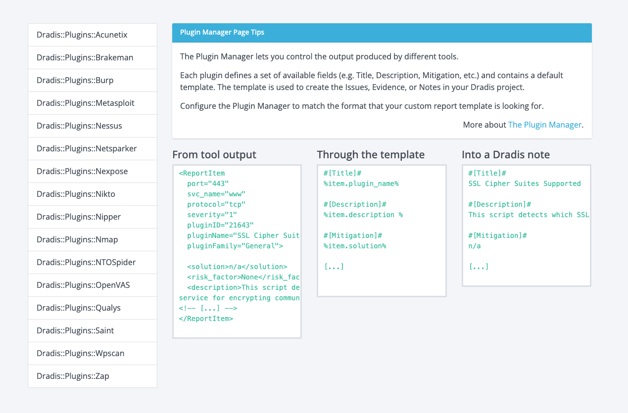
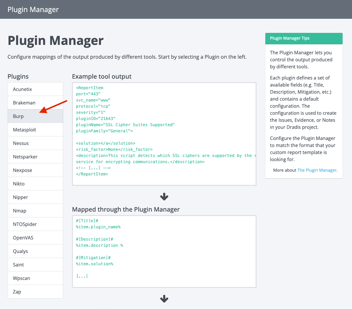
When users first landed on the Plugin Manager view, we presented them with some explainer text and an example of how tool output translates to a Dradis note. This wasn’t terrible, but it wasn’t exactly super helpful or welcoming.

Some of the issues we identified and set out to improve here were:

  1. Parts of the copy were confusing
  2. The example section wasn’t clear to first-time users
  3. Users didn’t have a sense of direction (what do they need to do next?)
  4. The plugins menu was not labelled or explained (users had to explore by clicking)
  5. The layout wasn’t very consistent with other views in the app

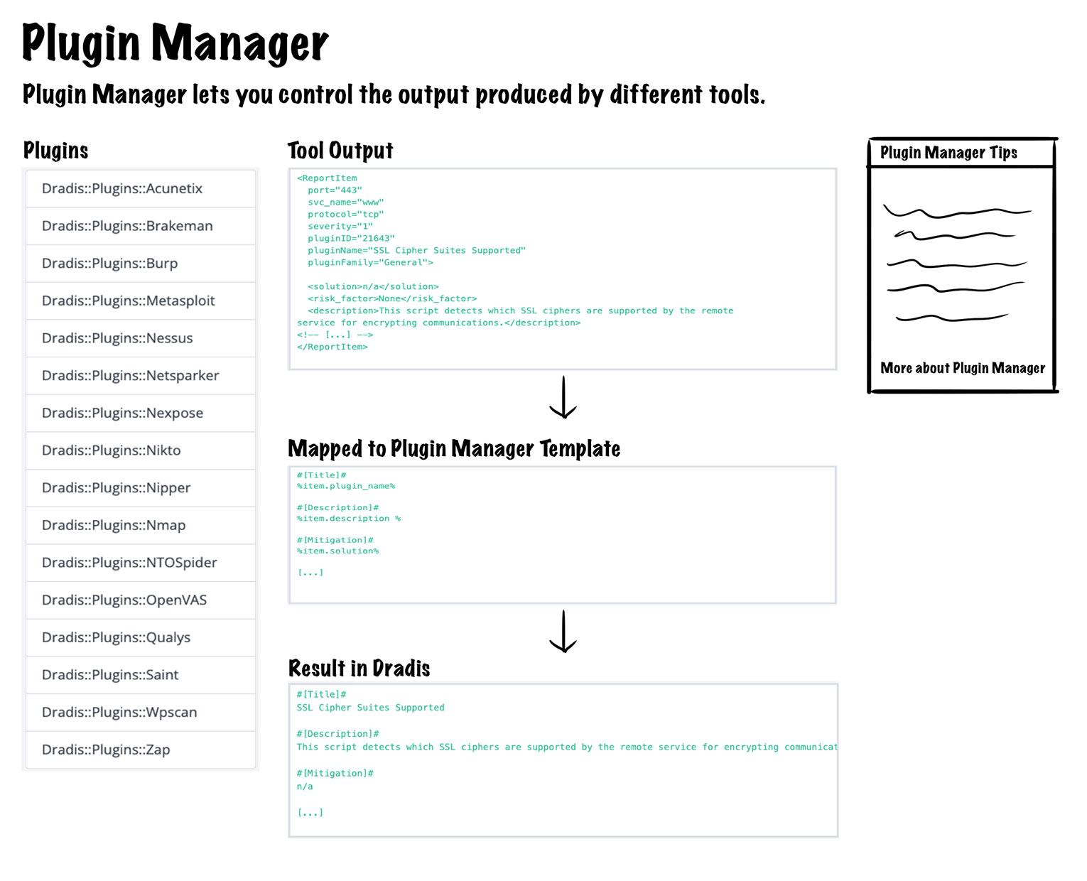
We decided to shuffle the layout around a little to tackle these points and make it more consistent with other views. Most of our views have a page title, the main content area and a sidebar, so we wanted to implement that here as well. Here is an early mock-up with some changes added with a fat marker (Title, subheading, section headers, and a sidebar with some tips).

Overall, the plan was to:

  1. update the copy and move it to a tips panel in the sidebar
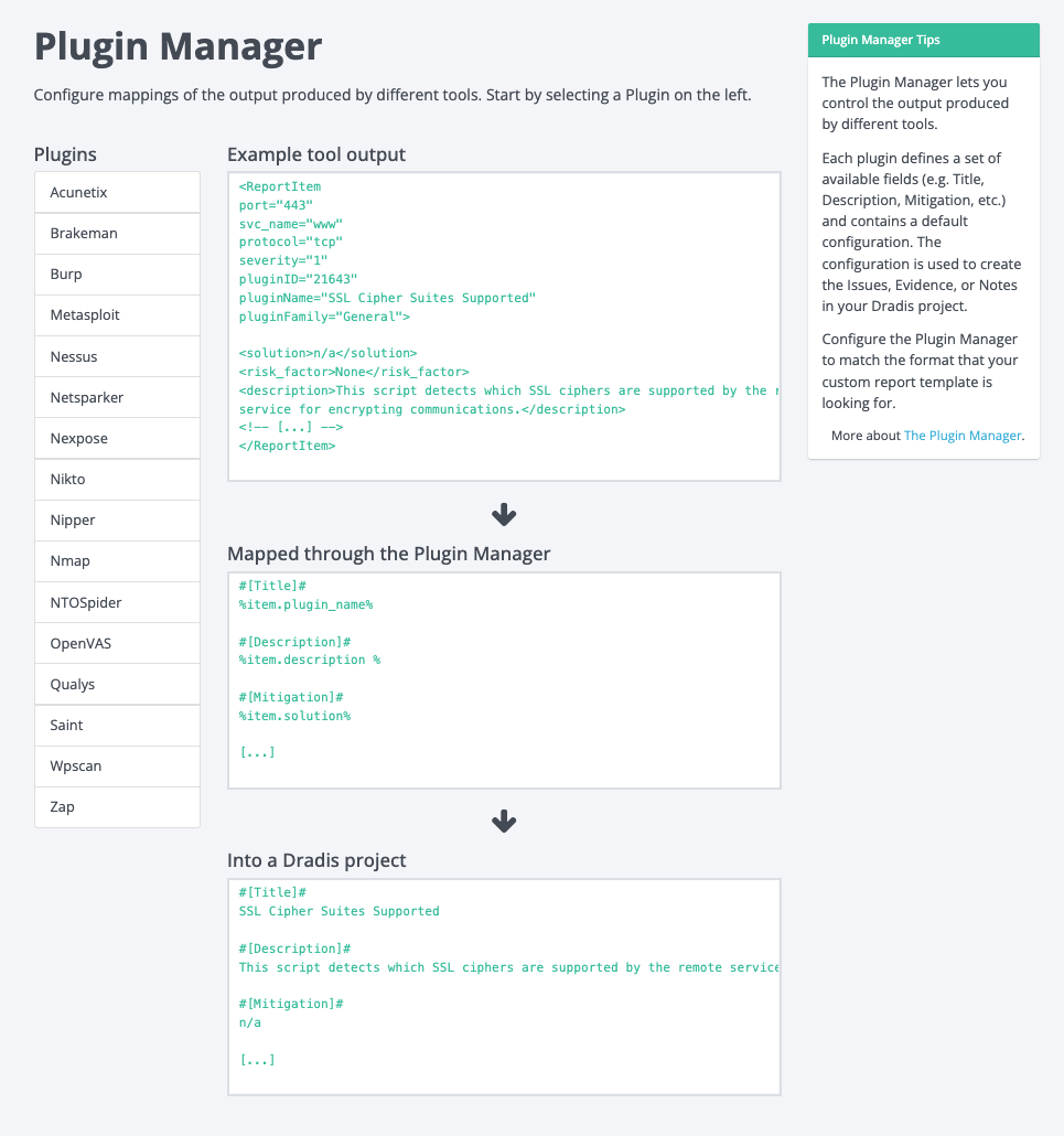
  2. change the example section to a vertical layout with some arrows added to show the flow of stages in the process
  3. update the headings of the three stages in the example section to make them clear
  4. add a header to the plugins menu 
  5. add some copy (not pictured above) to direct the user to select a plugin from the menu on the left

These changes would bring consistency to the view, enable the user to quickly understand the relation of the three stages in the example, and give the user some direction as to what to do next. This design addresses all five issues we wanted to improve, so we started implementing these changes, and this is the new view as a result:

Addition of Plugin Manager Validation 

So far, the above changes are fine and dandy, but they still don’t help users bridge the gap between what they expect in their projects and what they get. This is where the shiny new validation feature comes in.

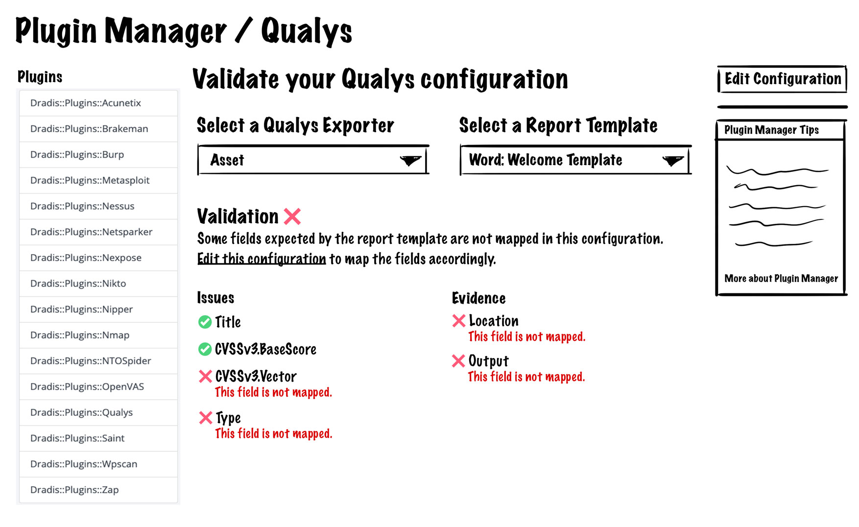
The idea was to allow users to edit their plugin manager configurations and show them how it will jive with their report template of choice. The validation feature would work by having users select a plugin and a report template. It would show which fields are mapped correctly and which fields are missing. We had internal discussions about the best approach and where we could incorporate validation into the Plugin Manager. Initially, we thought about adding the validation section to the main Plugin Manager view, but we quickly decided against that and thought about a new view dedicated to this new validation feature:

This is the first look at the validation feature design and components. We’ll get into the details a little farther down, but the overall idea is that users select a plugin, select a report template, and they see what’s mapped correctly and what’s not.

This view would show all things related to the validation of the selected plugin, and at first, it seemed like it would work in terms of layout. The view would be consistent with other related views, it would give users all the validation functionality, and it would allow users to edit the plugin’s configuration. However, after further design work and discussing with the team, we realized this implementation would be pretty annoying for users. It would require users to make an edit, come to this validation view, check their validation, realize they need to make further edits, go back to editing, then come back here to re-check their validation… you get the idea, way too much clicking around to get one thing done so back to the drawing board.

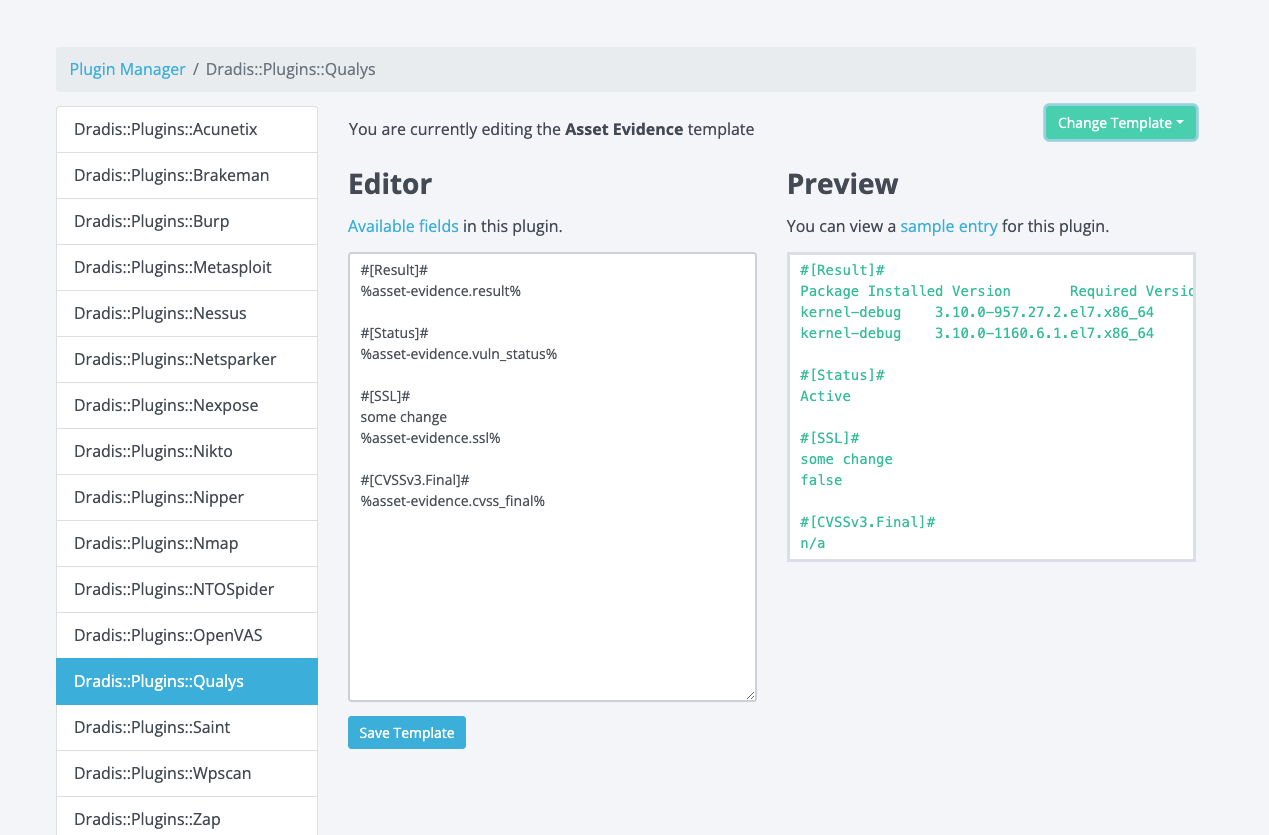
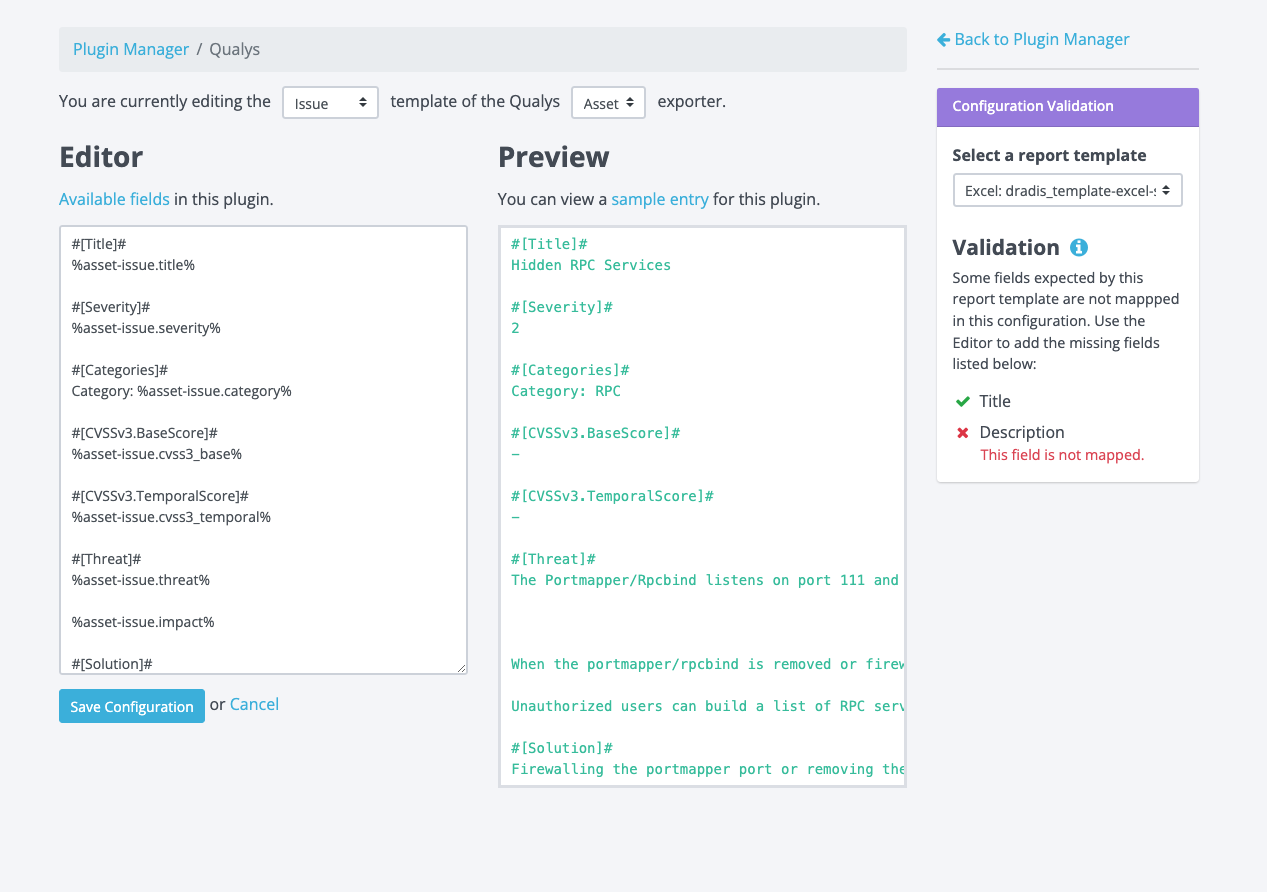
Rather than making users navigate away from the validation view to make the edits to the configuration, we figured why not bring the validation feature to the edit view? Another upside of having validation added to the edit view is that we would eliminate the need for users to select which plugin they want to validate. Here is a screenshot of the current edit view for reference:

It’d be pretty crowded if we just dropped that validation section into this view, so we knew we had to make further refinements to the design. 

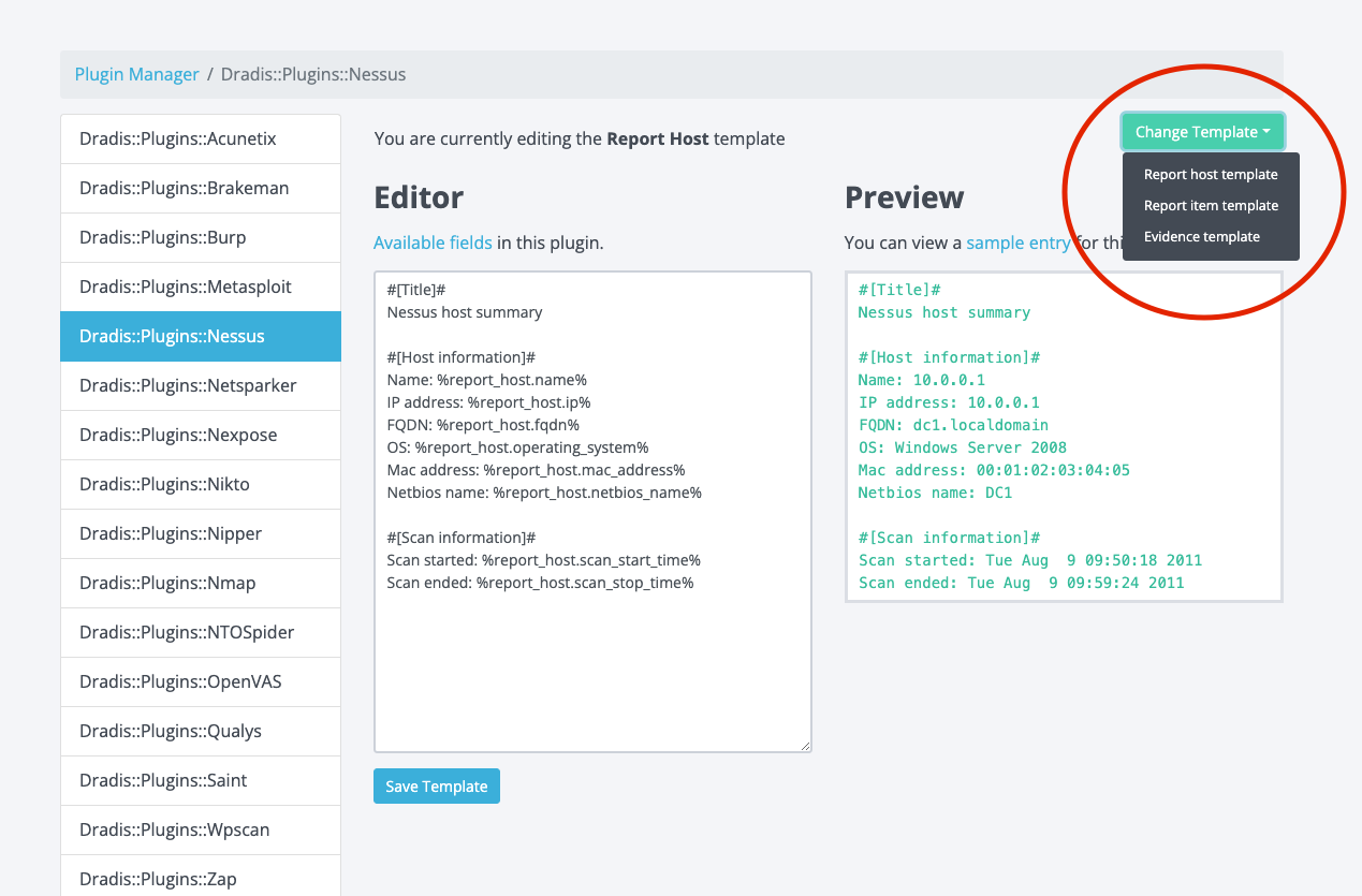
We also had to consider cases where there could be multiple exporters for the selected plugin (i.e. Qualys has Asset, Vuln, and WAS), and each of those exporters could have templates that map to Issues, Evidence, or Notes in Dradis Projects. It can be a bit of a guessing game to know which template maps to issues, notes, or evidence. Here is an example:

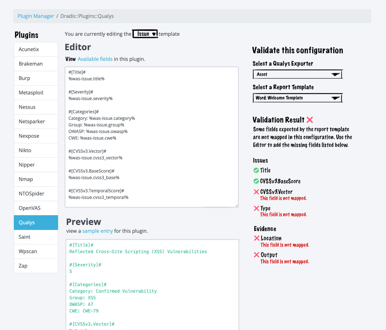
The image above shows that Nessus has Report host, Report item, and Evidence templates. Users can guess that Nessus Evidence maps to Evidence in Dradis projects, but what about Report Item or Report Host? We decided to get rid of the guesswork for users. Let’s jump into an early mock-up with some fat markered changes:

This design iteration would:

  • Remove those long prefixes in the plugins menu to give us some more real estate to work with 
  • Add a selector for Issue, Evidence, and Note (where applicable). This selector makes it easier for users to determine where things will end up in Dradis Projects; no more guessing! 
  • Add the validation feature to the sidebar. This is a more condensed version of what we designed initially, but all of the same info is there, just arranged in a way that would be more effective in a sidebar format.

It’s a good general direction, but dissecting this further, we didn’t like that the preview is now stacked under the editor. This is awkward and inconsistent with every other view where we show previews. This also makes for awkward placement of the save button. 

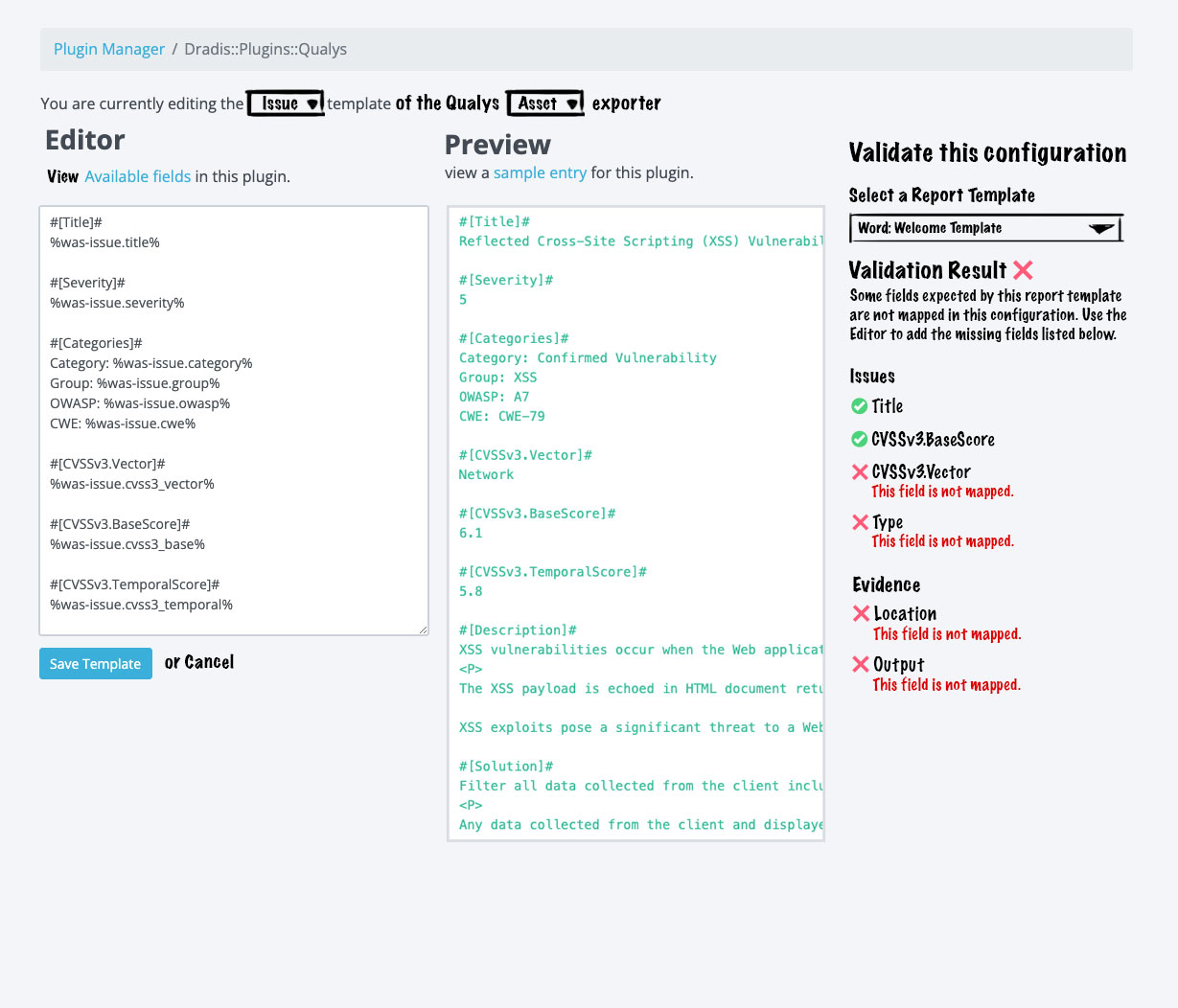
Enter the final design iteration:

We really wanted the editor to be side by side with the preview, but we needed some more space to make the editor and preview usable. Ultimately, we decided to trade the plugin menu on the left for that extra space. Removing the plugin menu enabled us to have the side-by-side layout we wanted. The keen observer may have noticed that this design moves the exporter select menu out of the validation section and into the main content area. We made this change here because users not concerned with validation would still need to select the exporter if they wanted to make edits in the editor. The validation feature is only really concerned about which report template users wish to validate against. 

After a few more minor tweaks, we implemented this design and got this final result:

Users are now able to:

  • Differentiate between Issue, Evidence, and Note templates
  • Differentiate between multiple exporters 
  • Validate that all fields are mapped accordingly

How to validate your configuration

Now that we have this awesome new feature, let’s take it for a spin. Let’s say you have a report template with some issue/evidence fields defined and your plugin of choice is Burp. 

Head over to the Plugin Manager and select Burp from the plugin menu:

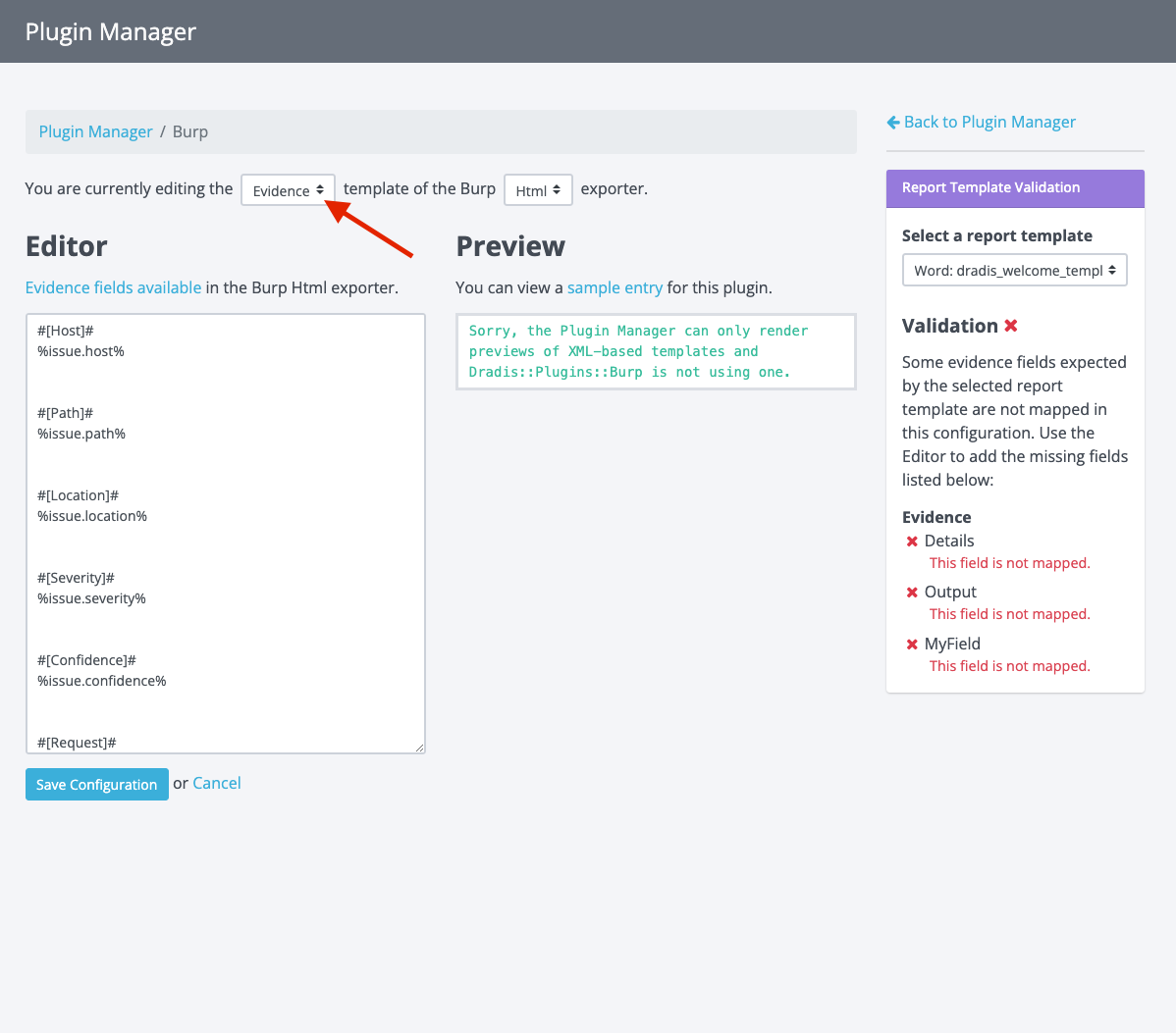
Select the template you want to validate:

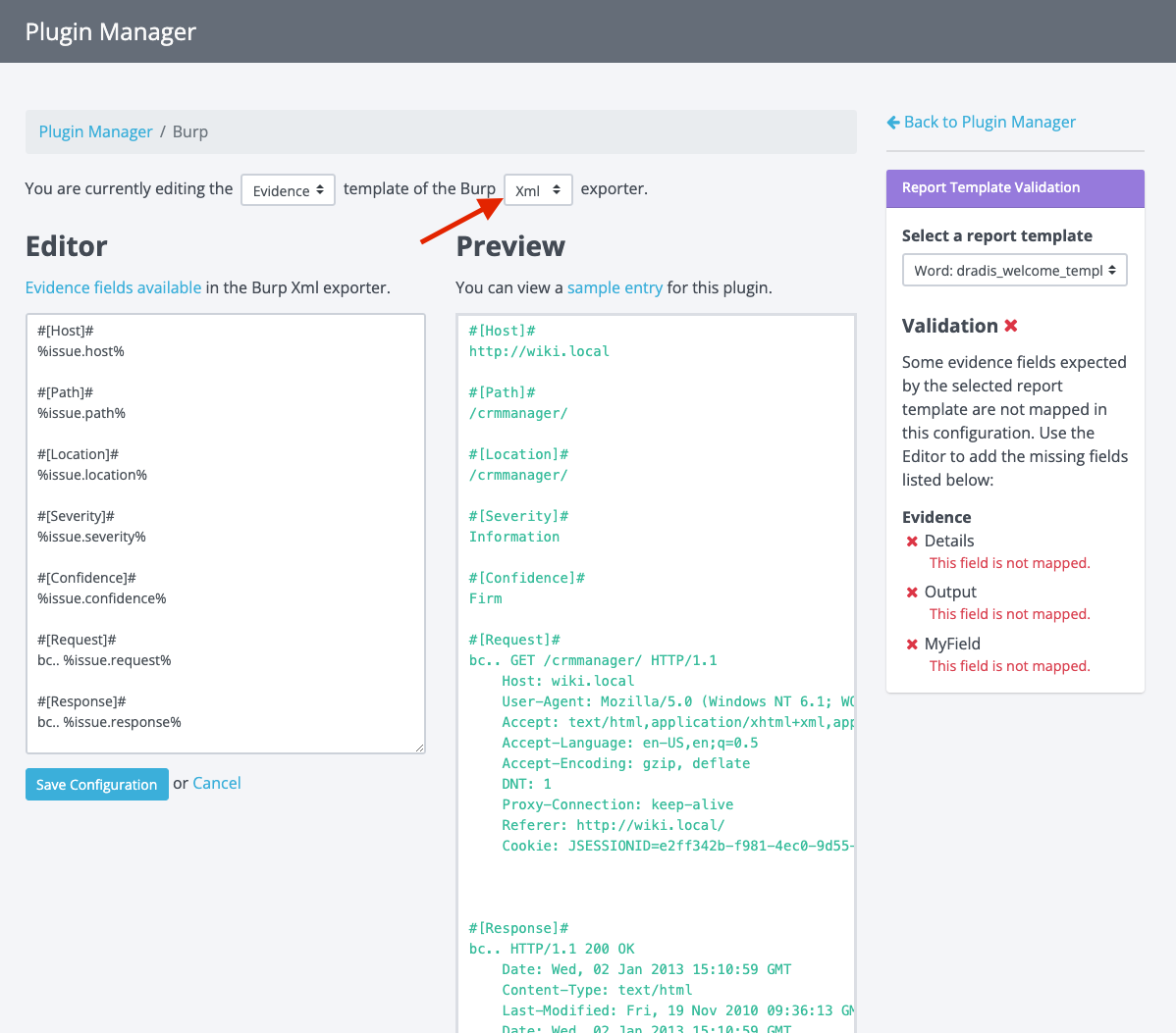
Then select the exporter (if there are options):

At this point, you will see the selected plugin’s template content and a preview of how it would appear based on some sample Burp output.

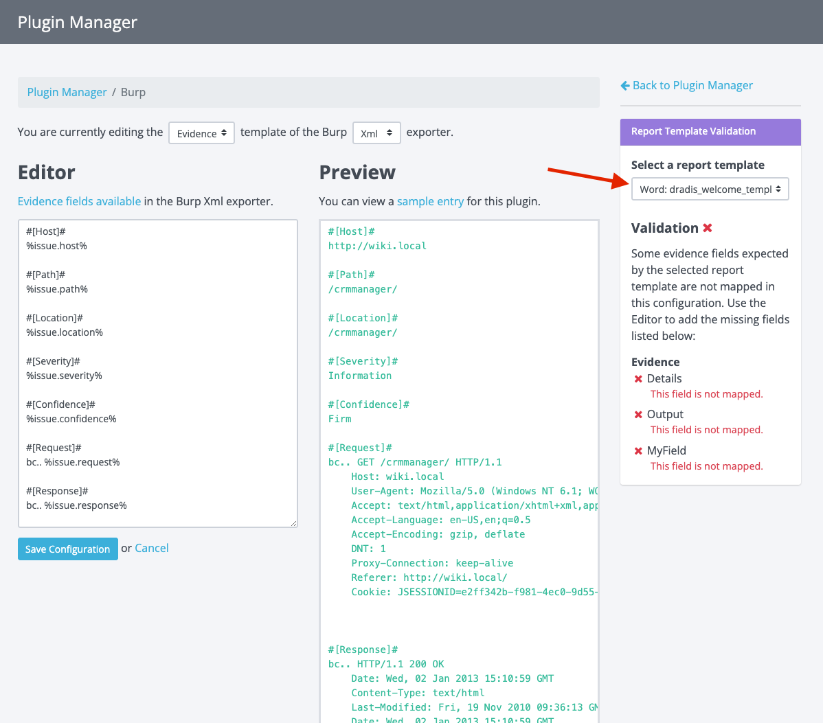
Now you can select a report template in the Report Template Validation panel:

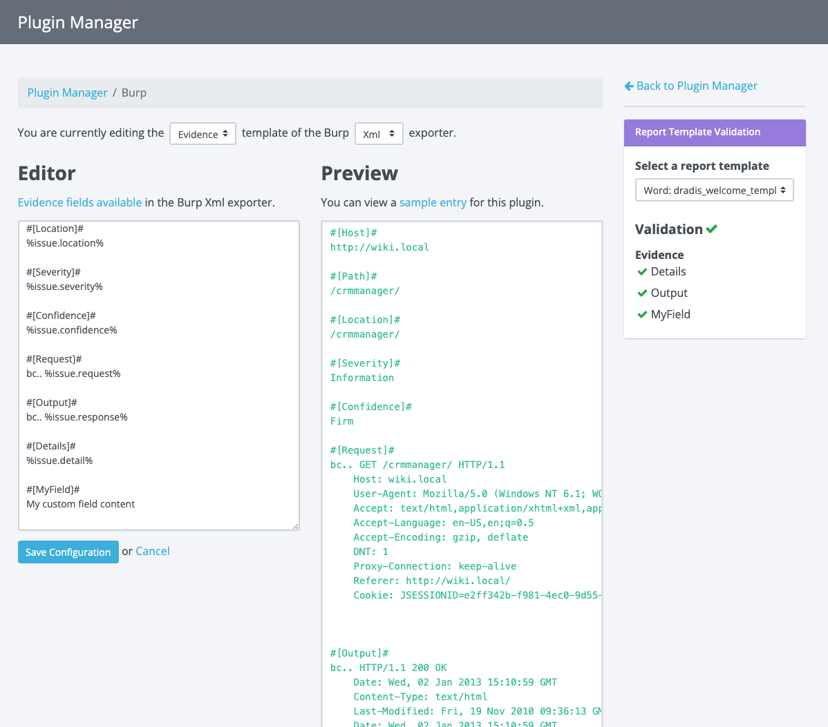
A validation check will now be executed, and you will see if any fields are not mapped as expected by the report template you selected. From here, you can make edits in the editor to add those missing fields. As you type, you will see the validation panel update in real-time to show you if the configuration passes validation.

Once you see a green validation checkmark, your configuration is valid. You can start importing tool output into Dradis and exporting reports knowing that fields will appear as expected.

Pretty cool, right?

But wait, there’s more!

Earlier in this blog post, I mentioned that the Rules Engine is involved in all of this, but we haven’t touched on it yet. If you’re not familiar with the Rules Engine, it can be used to manipulate the plugin output before it imports everything into a project. For example, based on user-defined conditions, the Rules Engine can do things like:

  • Replace the description that comes from the plugin output with a custom description
  • Change the risk rating
  • Delete a finding
  • and much more.

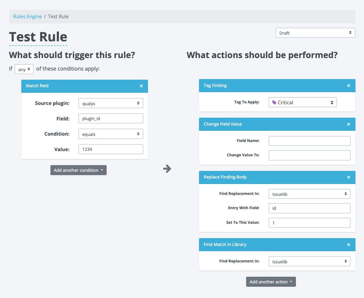
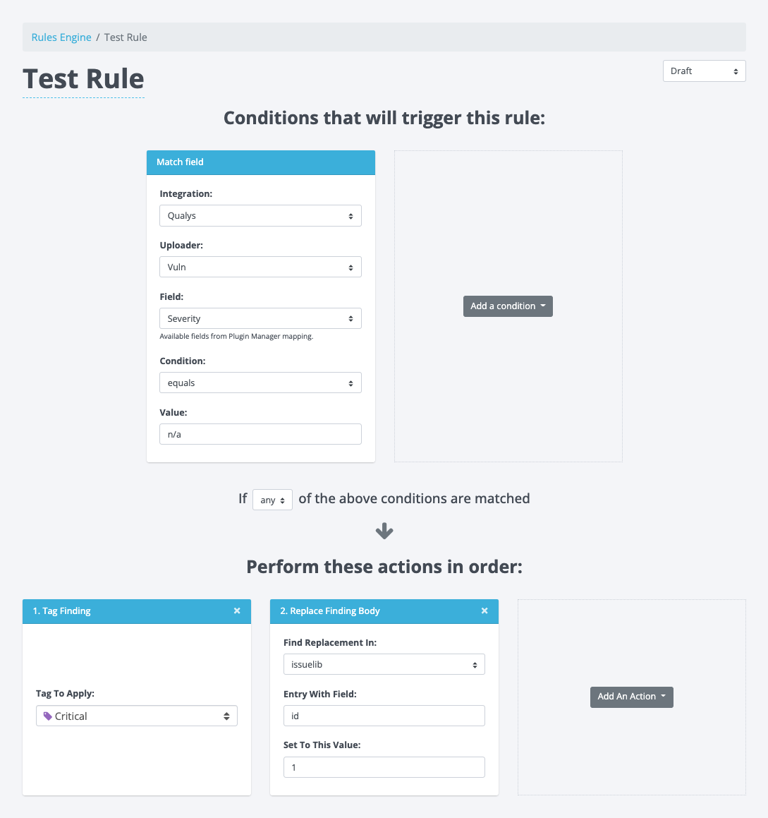
Here is an example of a Rule being created in the Rules Engine:

We have the condition that has to be met on the left and the actions that will be executed on the right.

Up to now, when building conditions, users would have to manually enter the field that the condition would check, but this required knowledge of the plugin manager configuration. This was also prone to user errors as the field name had to exactly match a field in the plugin manager for the selected plugin. Considering that we already have these fields in Plugin Manager, there is no reason to put this burden on the user. 

With the changes to Plugin Manager, this seemed like a great time to update the Rules Engine and do something about that pesky field input. 

Another issue we tackled was the scalability of this view. With the 2-column setup (conditions on the left and the actions on the right), we found that the arrow in the center would often get misaligned. This arrow guides the user’s flow from one side to the next, but when it gets misaligned, it becomes hard to understand and sometimes, it may even add confusion. 

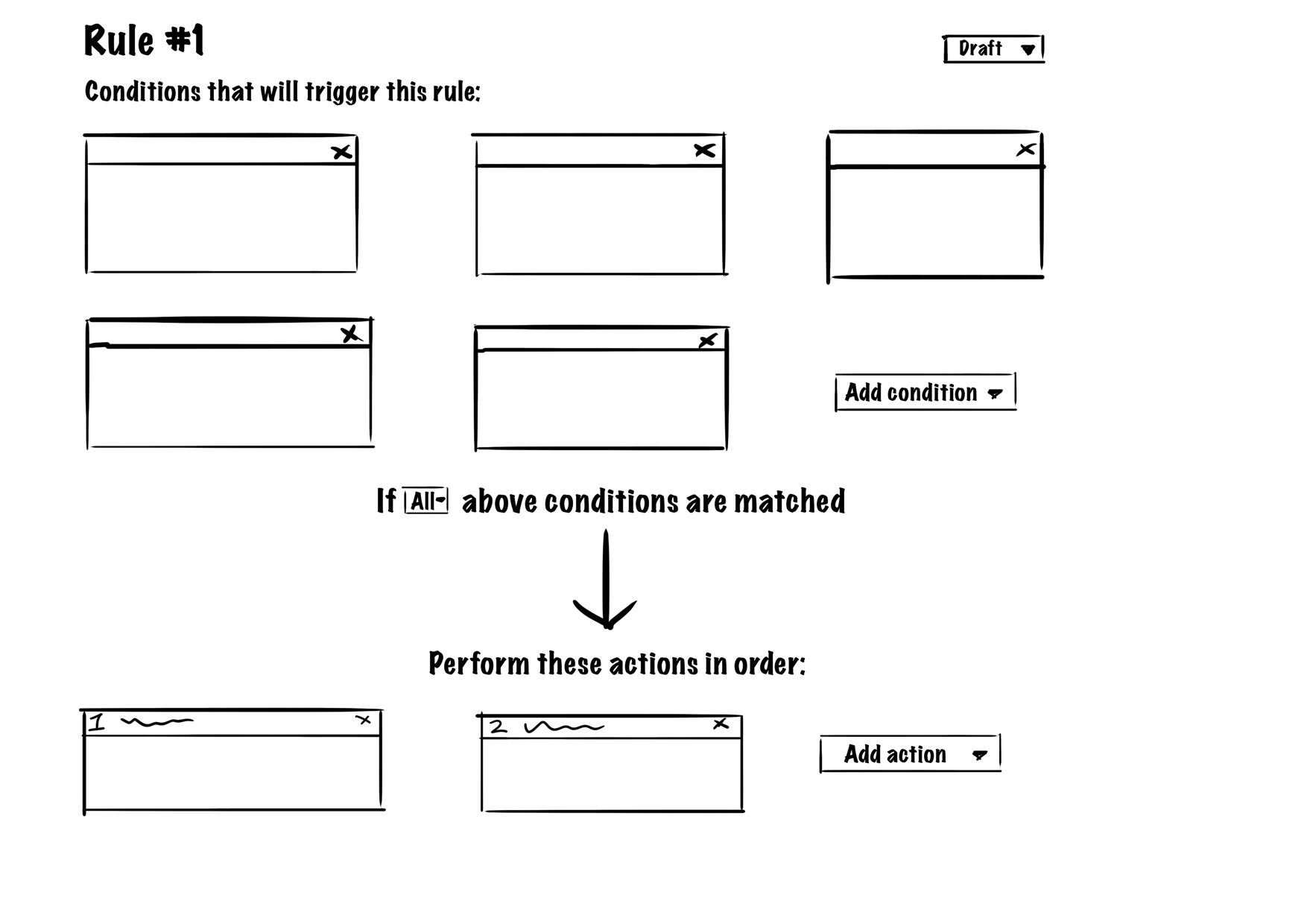
Keeping the above in mind, we set out to design some changes. We wanted to ensure the view could scale well, accommodating both small and large numbers of conditions and actions for each rule. After some experimenting, we decided to flip the layout into a top-down orientation to give it more of a timeline or story-like feel that paints the complete picture for users.

The view would list all conditions at the top, and as users transition their attention down the page, they would flow into the actions. We added some copy to guide the users between the conditions and actions. This layout scales well because regardless of how many conditions and actions there are, nothing gets misaligned and everything stays grouped together. Users start with their attention at the top, then transition towards the bottom with everything they need in between. We gave this design the green light, and after some further tweaks to the design, this is the implementation:

During this updated layout implementation, we also updated the condition boxes. They now have an uploader select to differentiate between the different uploaders a plugin may have (similar to the exporters in Plugin Manager). In addition, the field input has been replaced by a field selector. This Field selector lists all the possible fields based on the corresponding plugin manager configuration. Now users can simply select available fields without knowing what they are ahead of time or ensuring they don’t mistype anything. The action boxes largely remained the same with just a minor tweak to the headers where we now number the actions to convey the order of the actions executing. 

Give it a whirl

All of these changes combined make for an easier UI to follow and a less complex UX to upload scanner output, map the fields to Dradis in the Plugin Manager, process the data through the Rules Engine, and get the desired results in projects.

Give v4.4.0 a go and test out these new features yourself. Feel free to experiment with them and share your feedback with us. We’d love to know how you like this new validation feature in the Plugin Manager and the updates to the Rules Engine.

Happy Hacking ✌️
Matt

Fixing the Dradis Logo

As a designer, sometimes there are small details that bother me to the point where I need to address them. This time it was the Dradis logo that fell victim to my designer eye for details. A little while ago, I noticed something was amiss with the logo’s 3D perspective. When we started using the logo as the favicon, I noticed that one side appeared to be significantly narrower than the other.

Favicon with asymmetric logo

Additionally, the logo’s current style doesn’t scale well. When the logo is significantly scaled-down we lose the outlines which cause the extruded sides to blend into the top face, skewing the design.

Let’s dissect the logo to investigate and fix the perspective and symmetry problems. While we’re at it, let’s also address the scaling issue.

Investigation

Jumping right into it, let’s take a look at the current logo:

Current Dradis logo

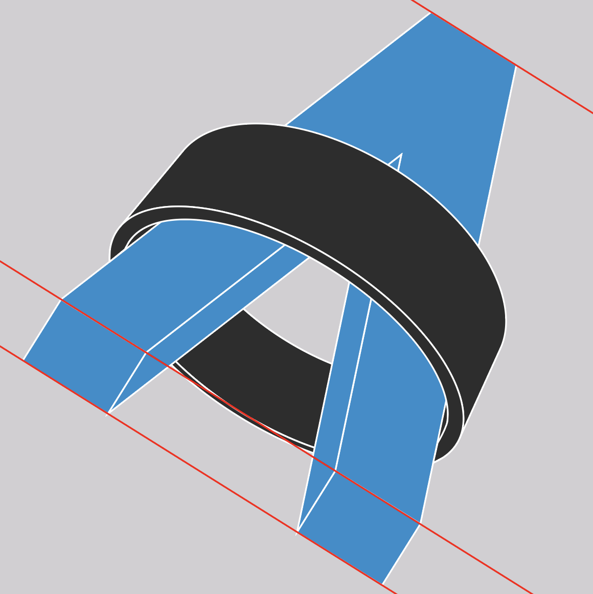
In order to get a better understanding of what is going on with the symmetry, let’s get rid of the ring and isolate just the face of the “A”:

Isolated face of the “A”

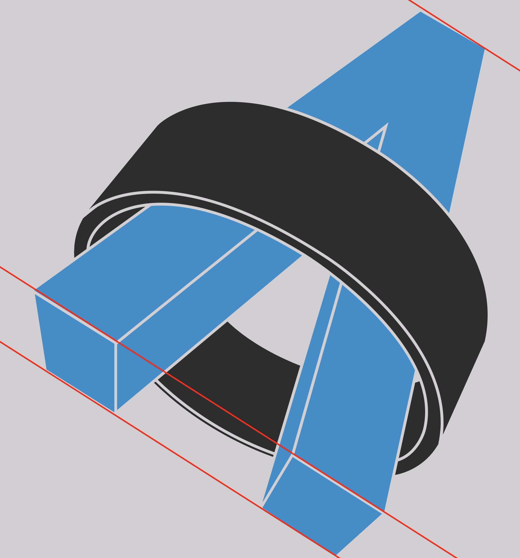
Next, let’s add some guides for alignment and straighten it out so we can see if the top and bottom are level:

Straightened “A” with alignment guides

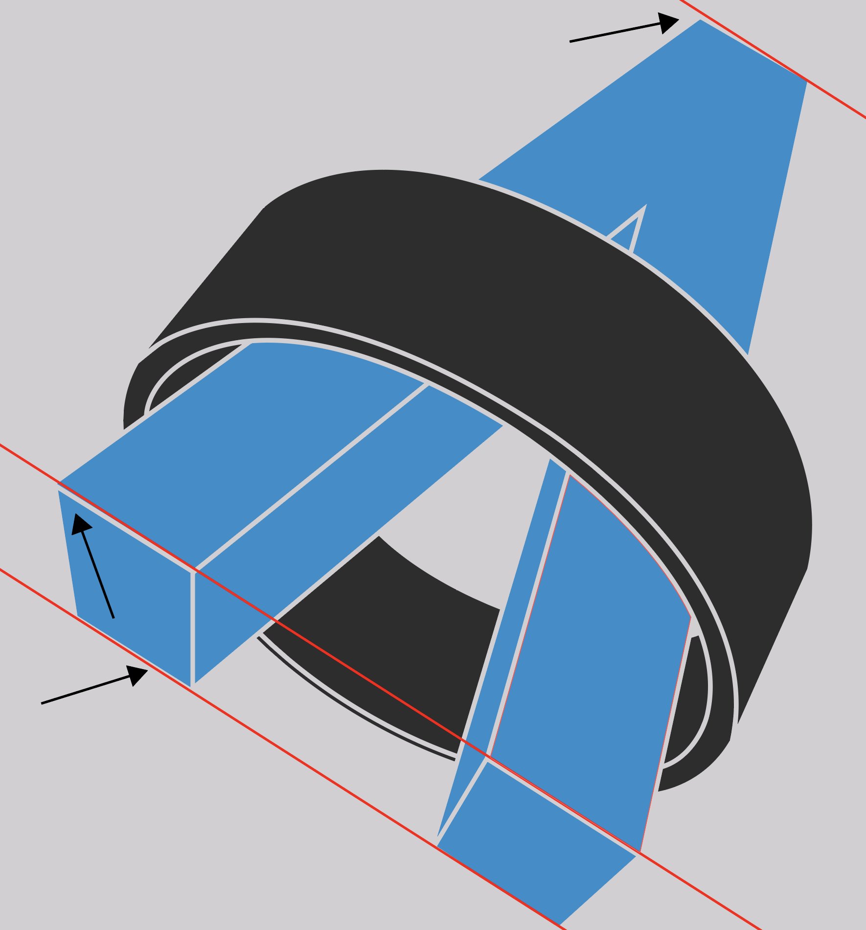
It is already evident that the top of the “A” isn’t quite level. Let’s zoom in to see how askew it really is:

Top alignment with the guide

That’s pretty significant if we are going to be using this for a 3D object. Let’s remember this for later when we look at the X-axis perspective.

Now let’s check out the bottom of the “A”:

Bottom right alignment with the guide

The bottom right looks spot on.

How about the bottom left?

Bottom left alignment with the guide

It’s slightly off but it’s minimal (you might have to click the above image to enlarge it in order to see the misalignment).

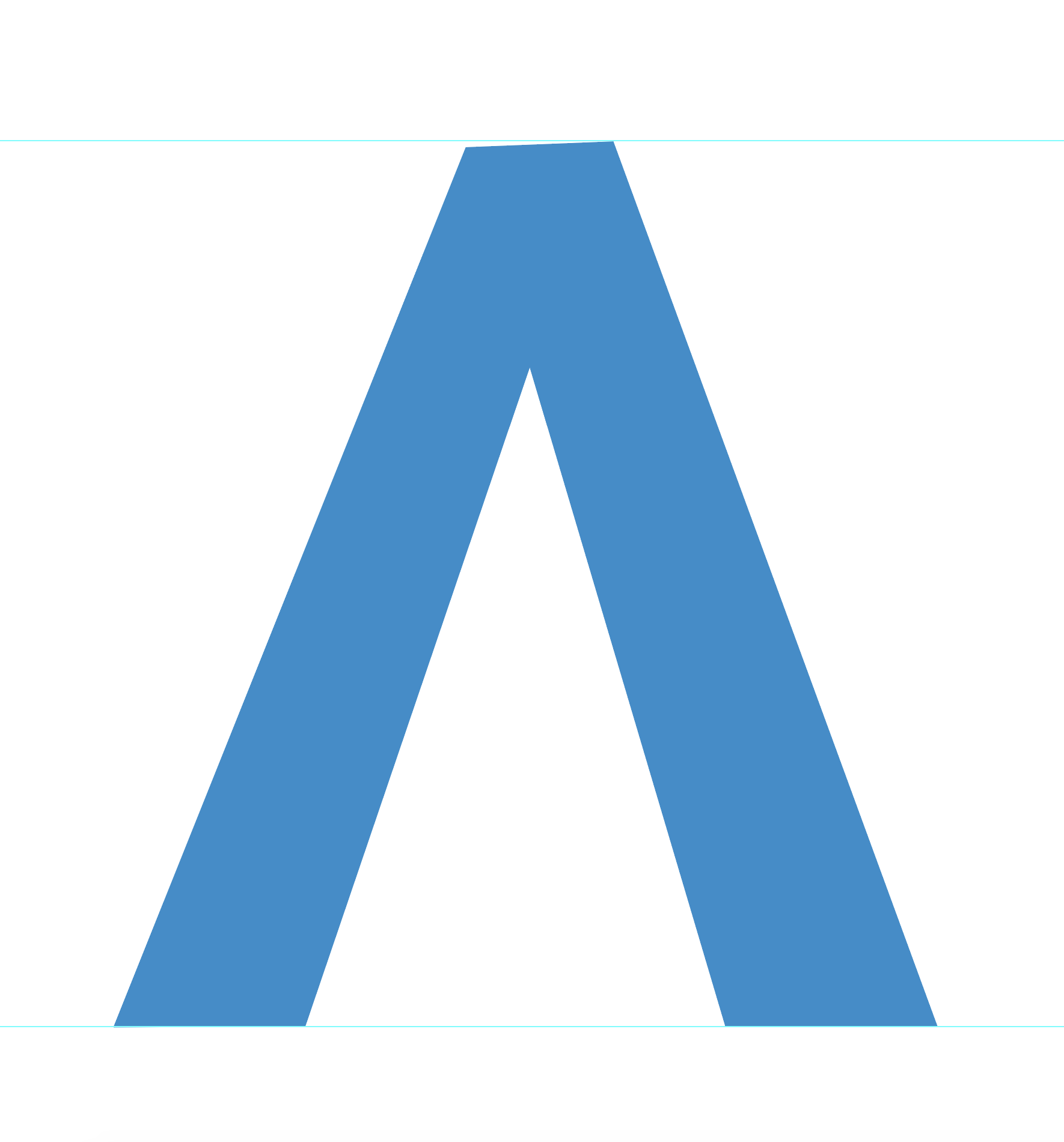
Now let’s fill in the missing sections to restore the original shape of the “A” before it was cut out by the ring.

Completed “A” shape

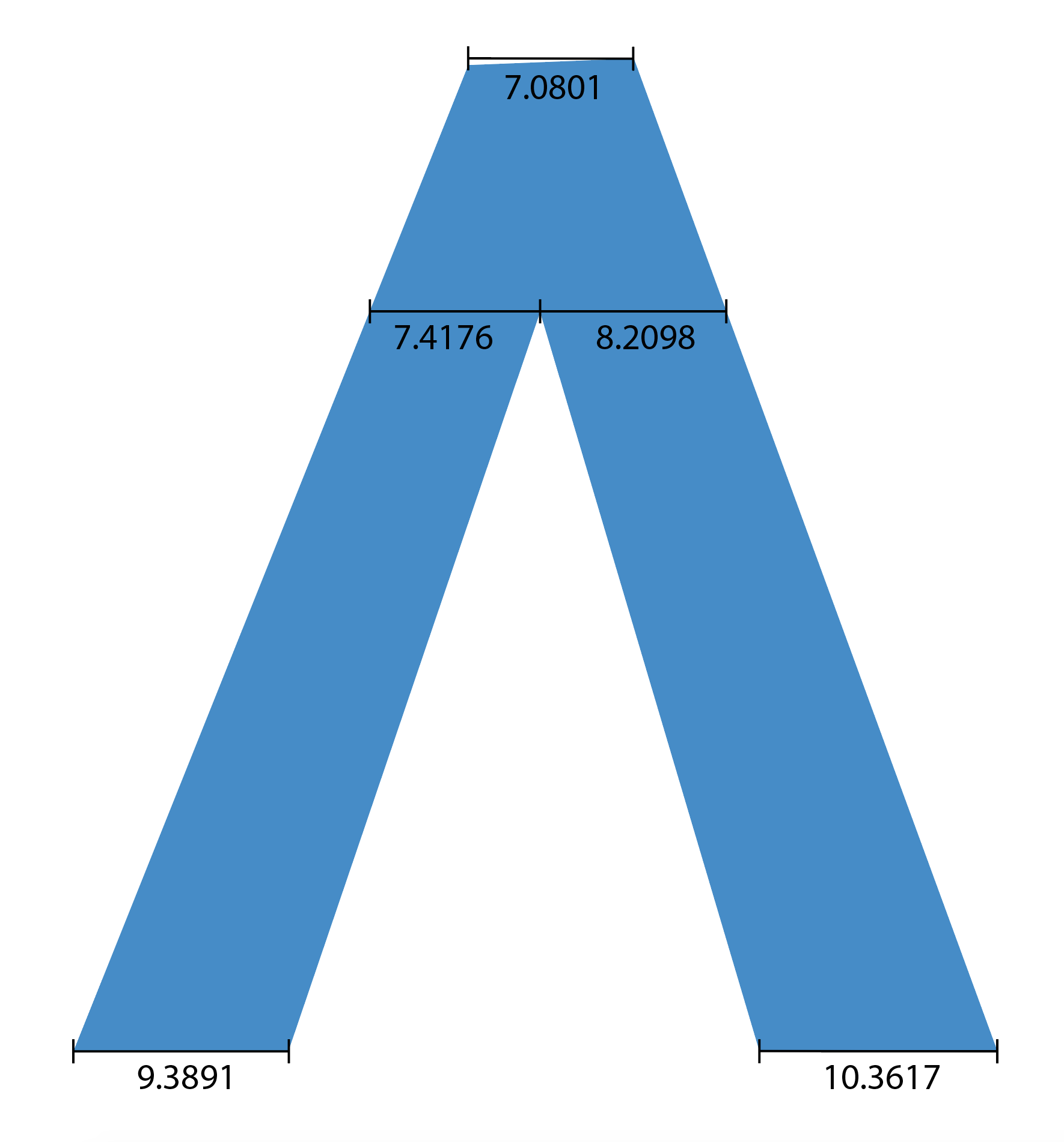
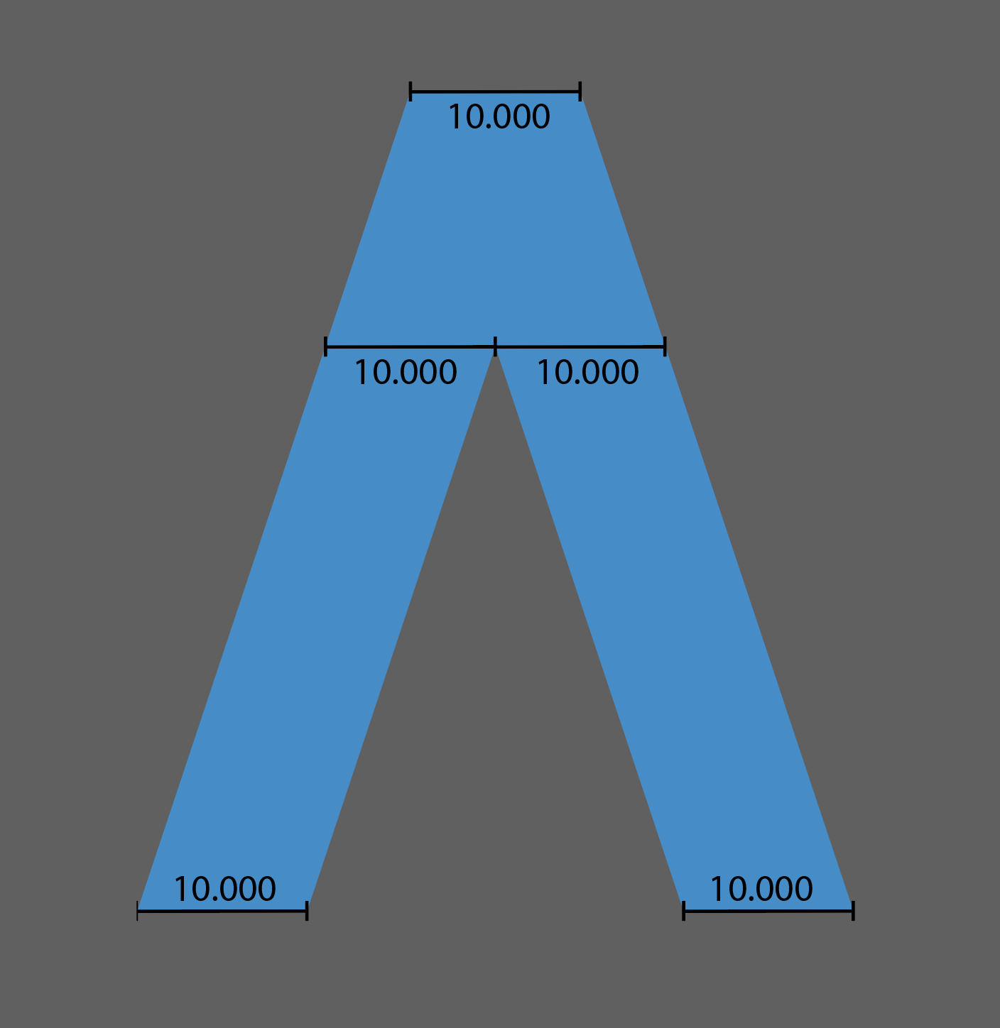
Looking at the A in this state reveals that it’s quite inconsistent. Let’s use Adobe Illustrator’s trusty measure tool to take some measurements:

“A” with measurements added

Look at it! Just look at it! 😭

All of these measurements should be the same. Let’s keep this in mind for later when we talk about the Y-axis perspective.

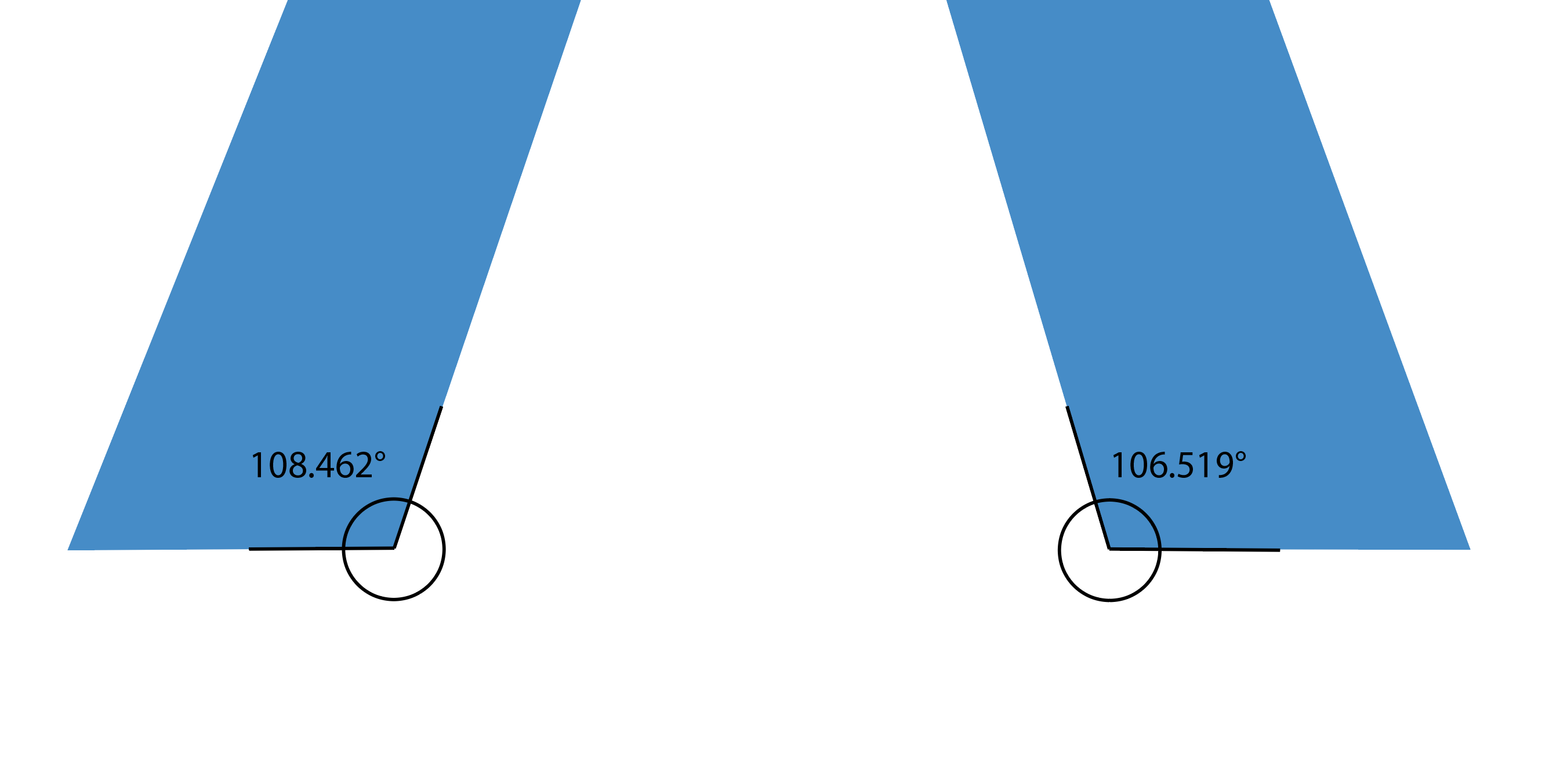
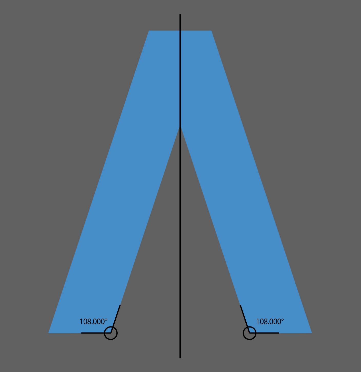
Additionally, let’s check the inner bottom angles of the “A”:

Inner bottom angles

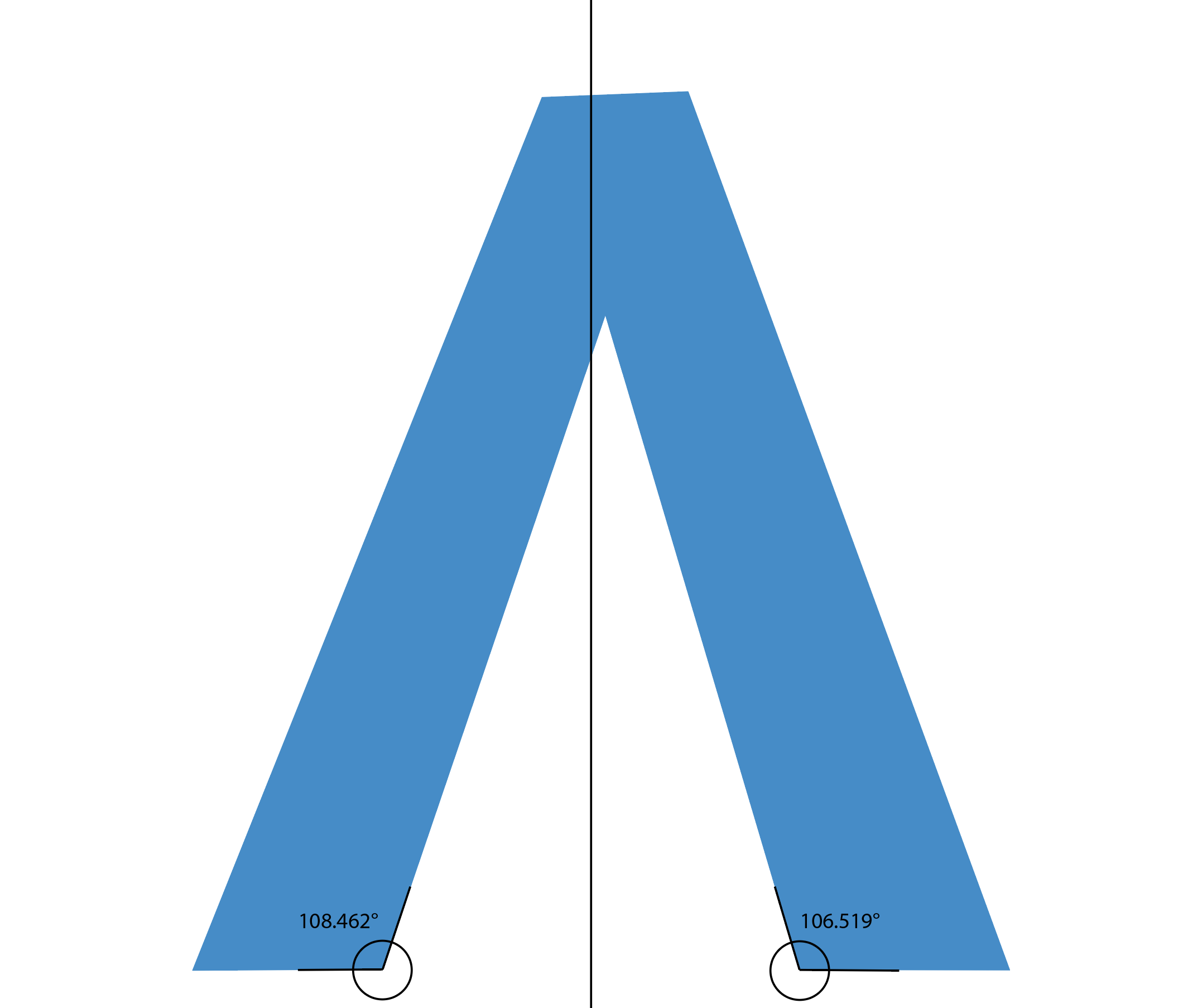
Oh boy, these angles being uneven means the top of the “A” is off-center and lopsided as if the top was pushed towards the right:

“A” with center guide

In order to fix the symmetry of this shape, we’ll need to make the measurements isometric and equal out those bottom angles. But for now, let’s take a peek at the 3D perspective problems.

This is the logo again reset to its original state:

Original logo

Looking closely it’s evident that the 3D extrusion is not realistic nor consistent. Let’s dive in deeper, I’ll try to illustrate what I’m talking about.

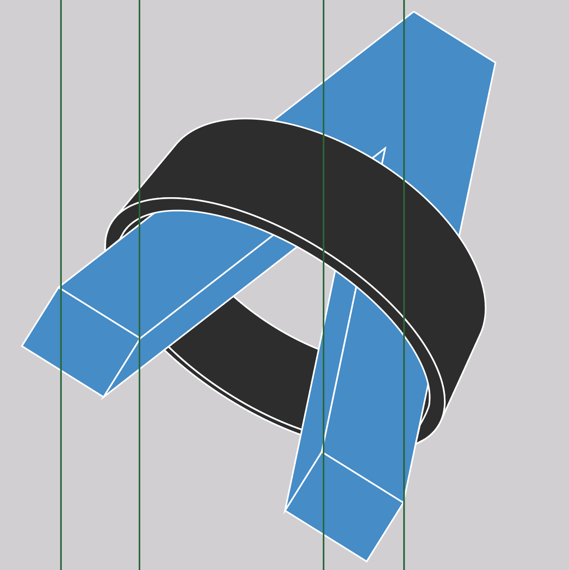
First, let’s start with the X-axis. I’ve added some gridlines that the top and bottom edges of the A should line up with:

X-axis gridlines

We can already start to see some problems here. Going back to those alignment issues we discovered above, we can see how that top edge not being level is affecting the alignment of the shape with the X-axis gridline.

Arrows showing problem areas

The bottom left of the “A” was only slightly off level but now it’s clear how that minor misalignment also caused an issue with the 3D extrusion.

Let’s move on to the Y-axis:

Y-axis gridlines

Similar to the X-axis, we can see some issues here with the Y-axis:

Arrows showing problem areas

The “A” should be aligned to these gridlines but it’s not as a result of those uneven measurements and angles we discovered earlier. 

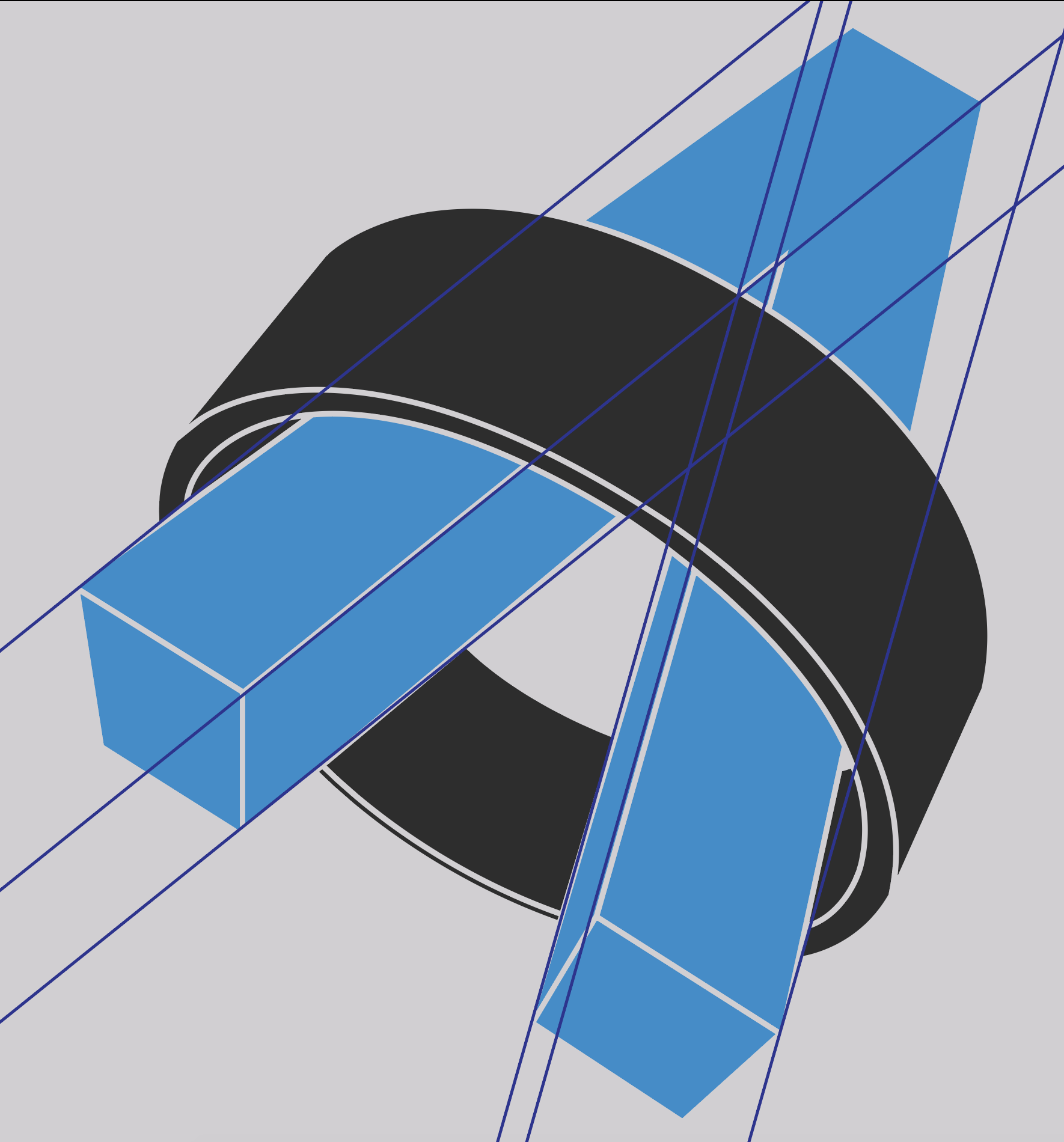
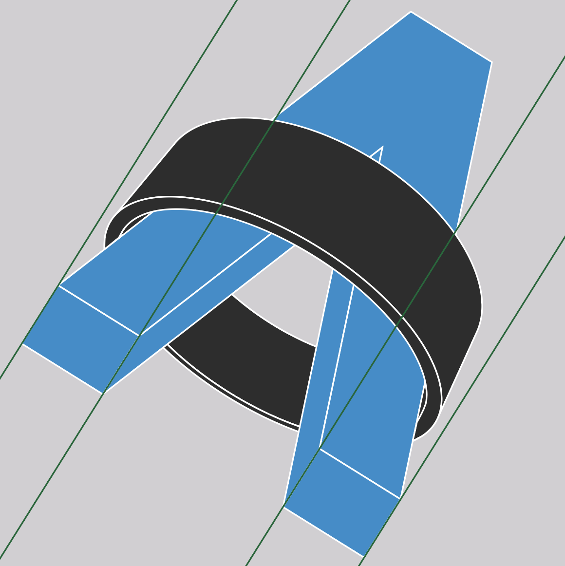
Finally, let’s take a gander at the z-axis:

Z-axis gridlines

😲 – shocked
🤯 – mindblown
😭 – crying

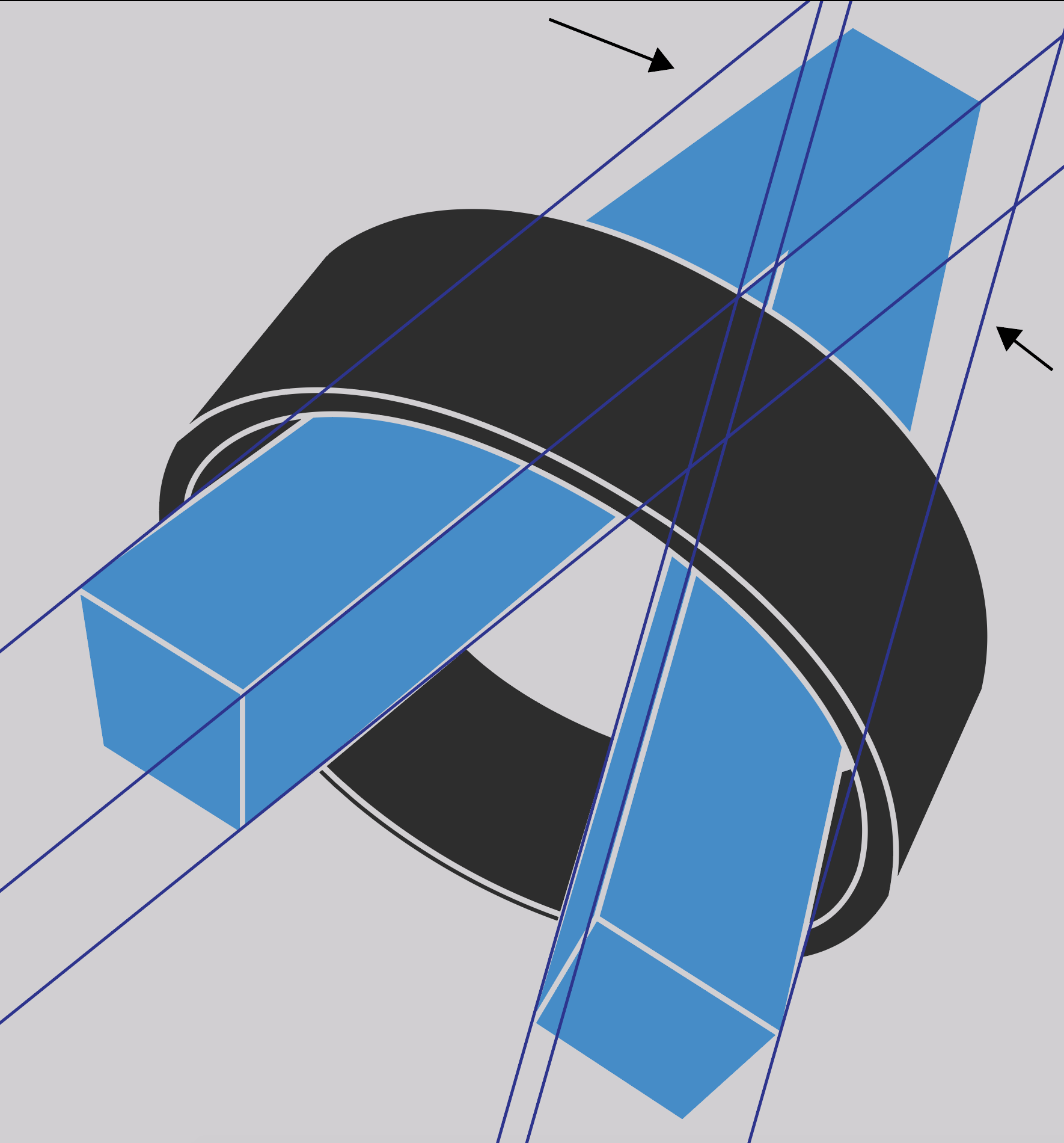
This is all wrong. Let me explain:

Arrows showing problem areas

The extrusion of the left leg’s base doesn’t make sense with how it’s skewed in. The right leg of the “A” appears to be bent down from the left leg along the Y-axis causing a huge deviation from the Z-axis gridlines. This is the main reason for the “3D-ness” not looking realistic.

Fixing

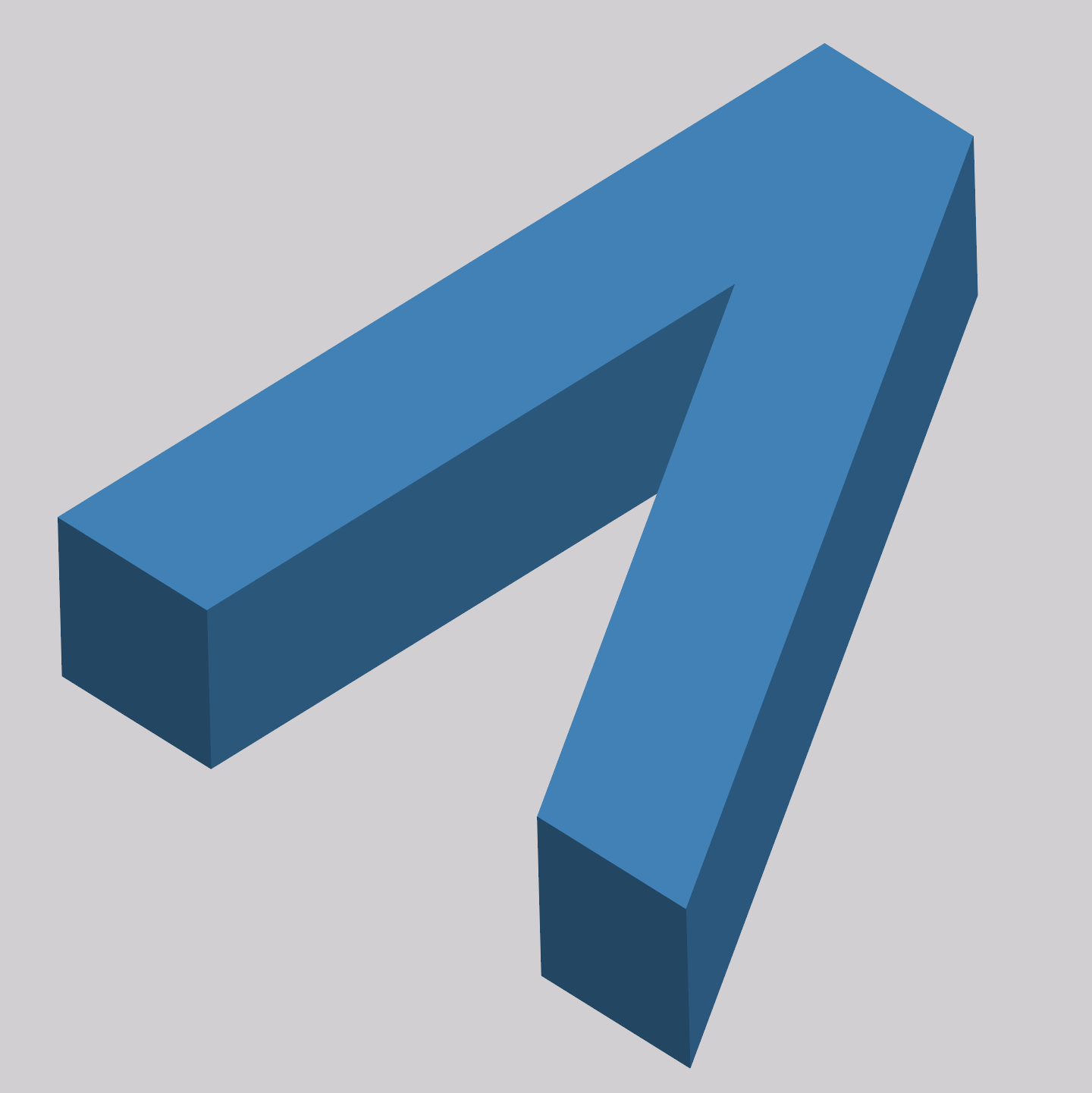
I took some time to recreate the Dradis logo using Adobe Illustrator. I corrected all the perspective and symmetry issues with the current logo design by making those uneven measurements and angles equal.

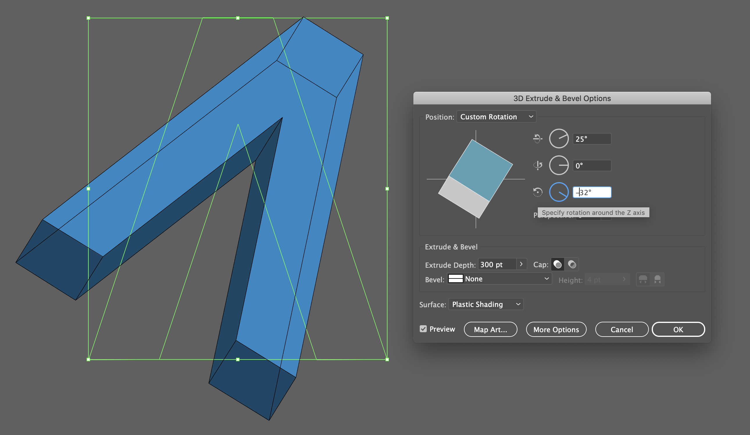
Then I used Illustrator’s 3D tools to make the 3D extrusion and adjust the perspective angle.

3D extrusion and angle adjustment

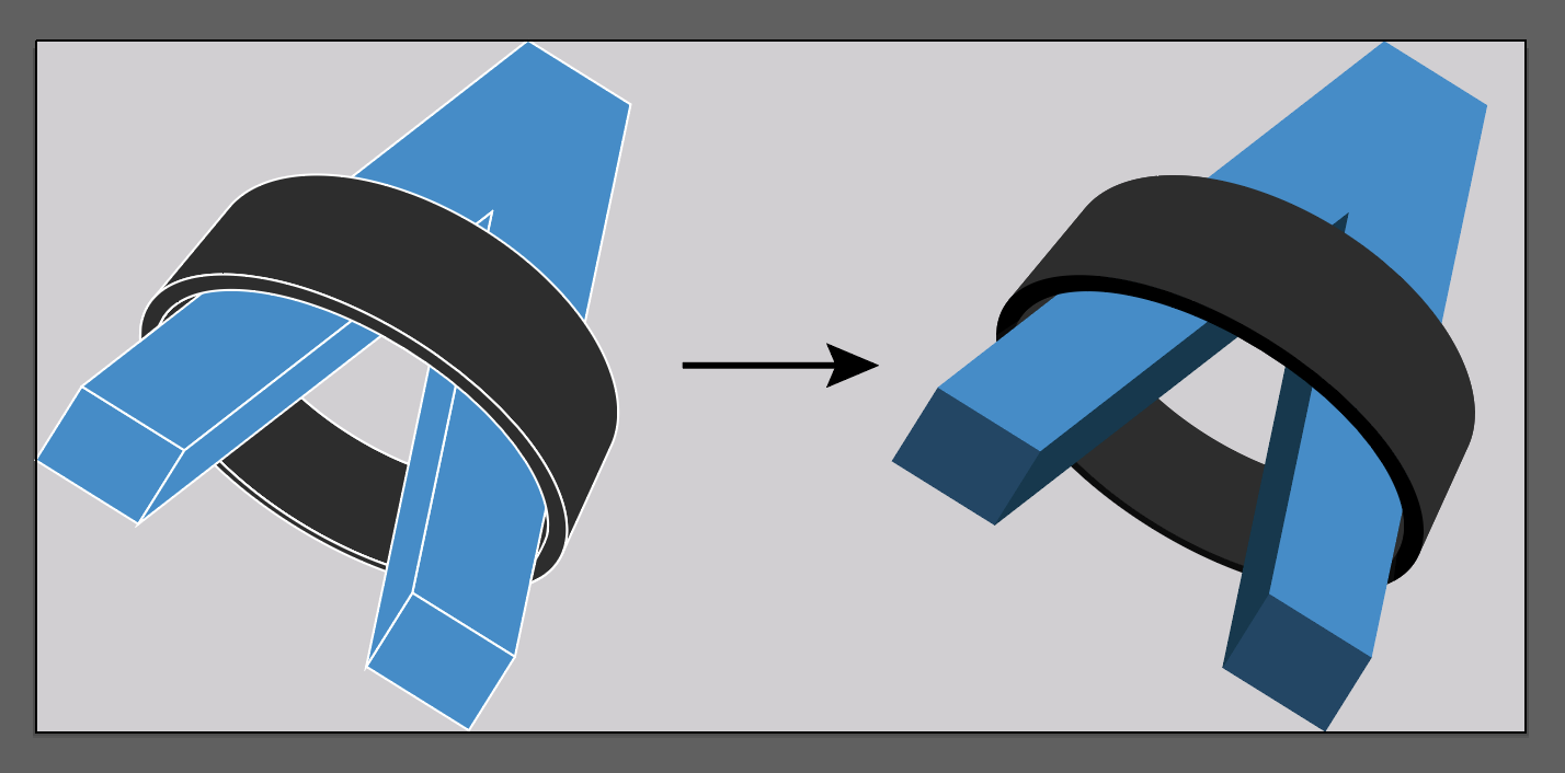
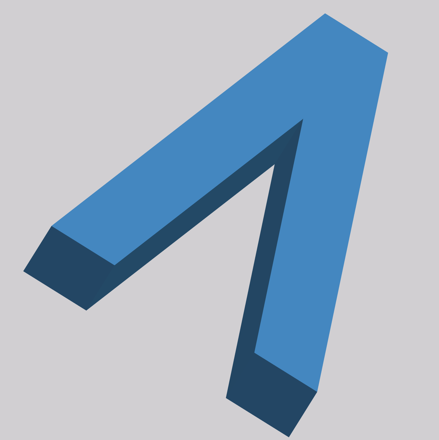
I was also able to solve the scaling issue by removing the outlines from the logo and adding shaded colors to the extrusion.

From outlines to shaded colors

Additionally, I ensured the ring was aligned to the same perspective angle as the “A” to make it look and feel right as one cohesive logo with 2 distinct elements.

The keen observer may say “but the new logo doesn’t align with the Z-axis described above!”:

Updated logo with old Z-axis gridlines

And they would be right! I like the perspective where we see the flying A’s extrusion on the inner parts of the legs. If we wanted to correct the logo using the original Z-axis angle we would end up with this perspective:

New A on the original Z-axis angle

I ended up changing the Z-axis angle to maintain the previous perspective:

Updated A on the corrected Z-axis angle 

Here is the logo again showing the adjusted Z-axis angle:

New Z-axis gridlines

And to be thorough – here are the X and Y gridlines showing how the updated logo is nice and tidy.

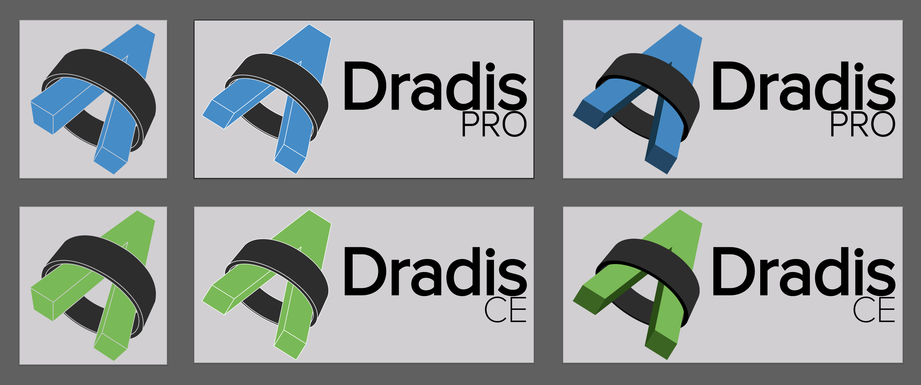
The below shows a comparison of the previous and updated logo designs.

Left: Original logo
Center: Updated logo with corrected perspective 
Right: Updated logo with shaded extrusion

Artboards

Finally, here is the before and after of the favicon.

Left: Before, After: Right

Now, the designer in me can rest easy knowing the logo has a realistic 3D extrusion and perfect symmetry.


Designing & Developing Tylium

On March 2nd, 2020, we released Tylium, a new layout for Dradis projects replacing the long-lived Snowcrash layout. Let’s go into some of the details of the work that went into designing Tylium.

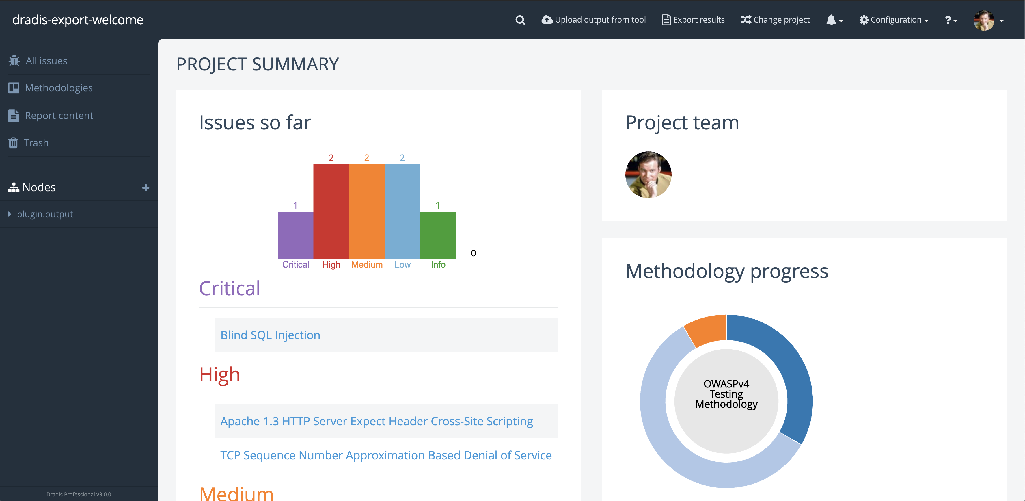
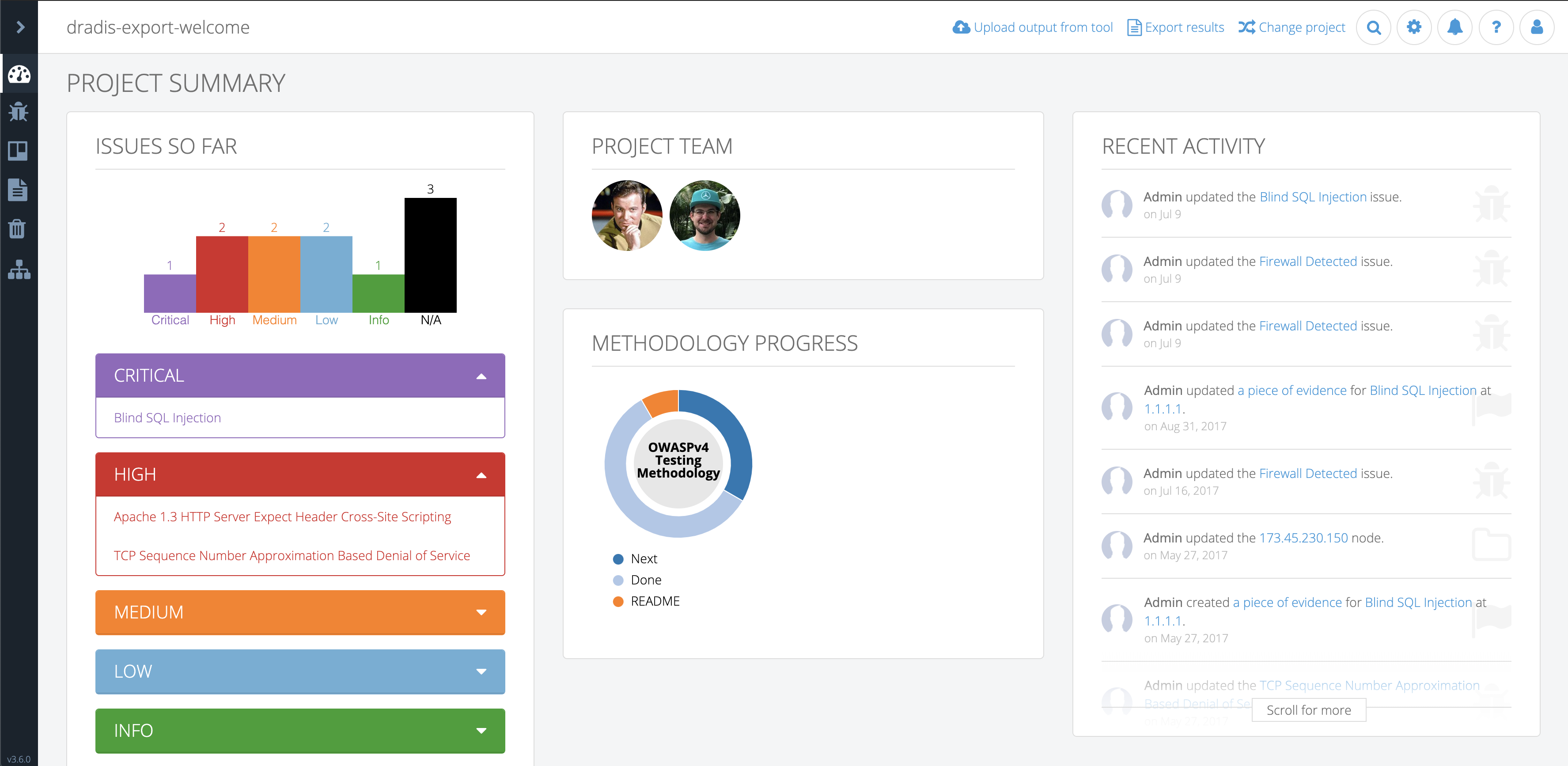
Dashboard view of the new Tylium layout

I’m Matt Budz, the product designer for Dradis, I help create new Dradis features and re-design some of the older ones that need some TLC.

First, let’s start with some background. Snowcrash has been the layout for Dradis projects since 2013. Some users may remember way back when it was released as part of v1.9. It was a shiny new UI built using the now-ancient Bootstrap 2 with a handful of 3rd-party plugin stylesheets sprinkled on top. Many new features were added over the years, but the look and feel of the app became dated.

Dashboard view of the old Snowcrash layout

My goal was to make the app look more modern and to update it to Bootstrap 4. But what does more modern entail?

I wanted to retain the long-used brand colors for both Dradis CE and Pro editions and adjust the remaining color palette to improve color contrast while ensuring the changes wouldn’t be too jarring for existing users.
Increasing on-screen real-estate was a priority during the redesign. Adjusting spacing and incorporating a collapsable sidebar that could move out of the way provided more space. Snowcrash had some inconsistent visual hierarchy, especially around header & paragraph text sizes.

Some elements lacked visual cues to inform users that more information could be seen by scrolling. Additionally, Snowcrash had various cluttered views with a lot of information and action links that could be tucked away and accessed only when needed. I wanted to create an action menu (we call it the dots-menu) that could be used for any resource in virtually any view. I wanted this to have a specific look so that users would be able to recognize that there is something more they can do when they see this menu – like adding, editing, moving, and so on.

I embarked on this re-design journey knowing that I wanted to change the overall layout of the app but not completely re-design the individual partials that are rendered within the layout’s different views. I decided it would be best to work on those as the respective features got updated or other features got added.

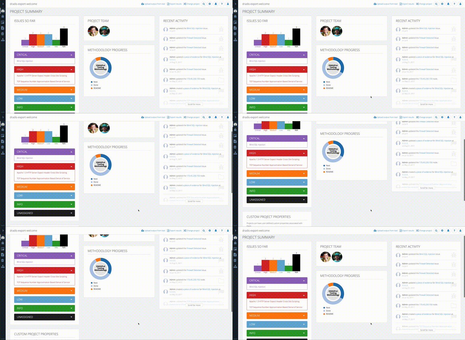
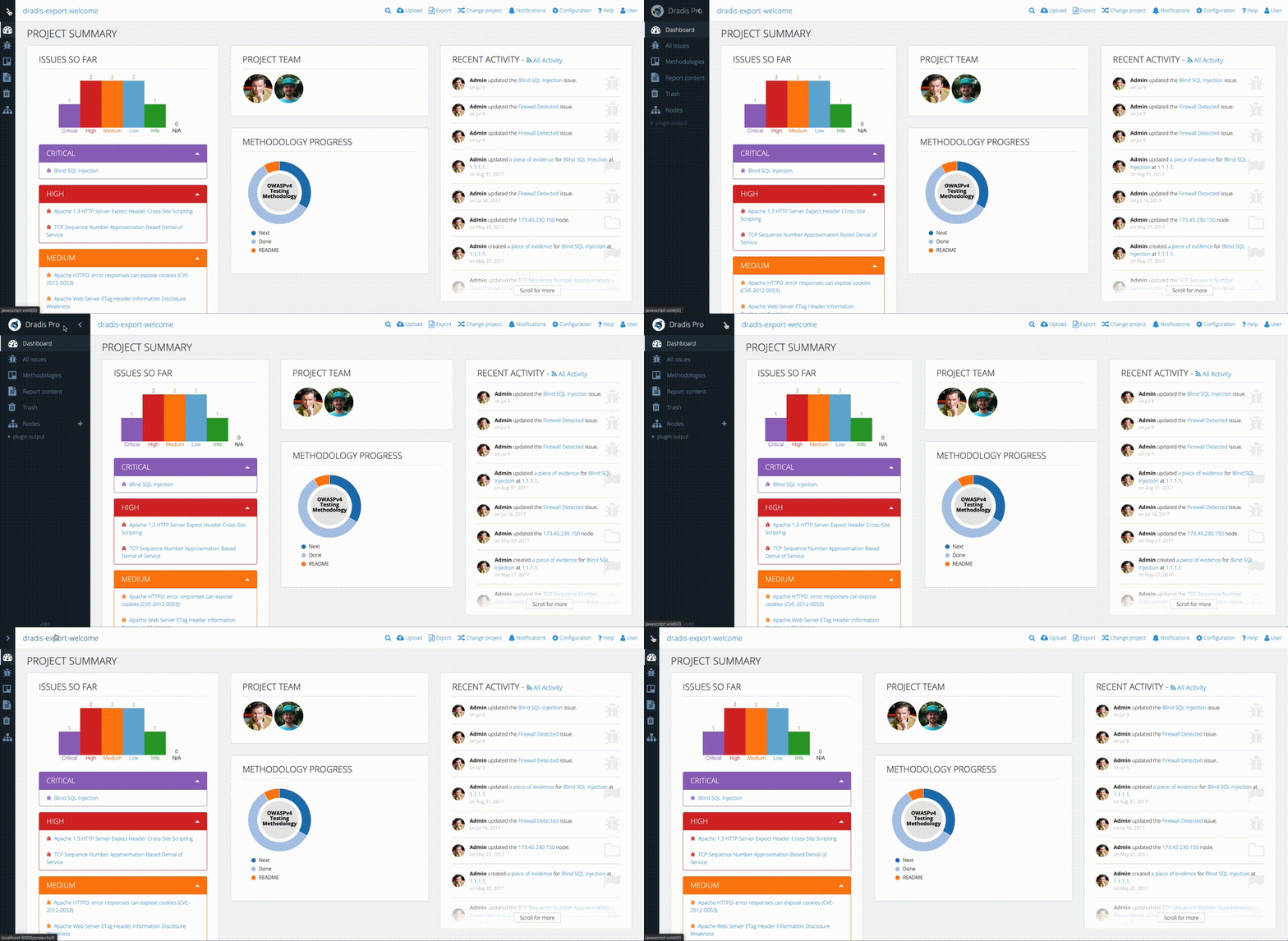
Using my design tool of choice, Adobe Xd, I started on the main sidebar and the collapse/expand functionality. I designed this so that the user would expand the sidebar and once they navigated by clicking the links in the sidebar or clicked off the sidebar, it would collapse out of the way. With the sidebar opened, the rest of the view became faded out to bring attention to the floating sidebar. This came with subtle animations for the sidebar width transition, navigation link position, as well as opacity transitions for the node tree and sidebar header. At this point, I also added the new-to-Tylium Dashboard link, so users could easily navigate back to the initial view they are greeted with when they opened the project.

New sidebar style

Next, I moved on to the top navbar. In Snowcrash it was becoming a bit full and offered very limited space for long project names as well as new nav items. It was also visually connected to the sidebar giving the illusion of a smaller workspace for everything else in the project. I wanted to completely separate the navbar from the sidebar so I moved away from using the edition color as the navbar’s background color. In order to save some space, I changed the less-used nav links to round buttons with icons to reduce the total width they took up. I also re-designed the way the search button expanded and behaved to match the new round nav buttons.

Comparison of the old navbar (top) vs the new navbar (bottom)

I worked on the sidebar and navbar while looking at the project dashboard, so naturally, I moved on to the main dashboard area next. I wanted to keep the panels the dashboard had in Snowcrash but with an updated look. Again, I didn’t want to completely re-design any of the partials but I did update things along the way so they would be more cohesive with the new layout. The page heading and the panel headings had to become more distinguishable for one another so I increased the size of the page headers to ensure they wouldn’t be lost with panel headers. I also noticed there was inconsistency with borders and dividers, both in terms of colors and usage. I ensured all borders and dividing lines got the same color and that they were used consistently regardless of the view for a better visual presentation. The panels got a subtle border with rounded corners along with matching underlines for the panel headers. Some other components that got a refresh were the list of issues and the list of recent activities. 

For better user experience, I wanted the sidebar and navbar to always be visible regardless of the height and width of the view. This meant that only the view content would be scrollable. In order to keep a visual consistency throughout the layout, I used the changes I made to the dashboard to set the tone for all the other views.

Sidebar and navbar with locked position

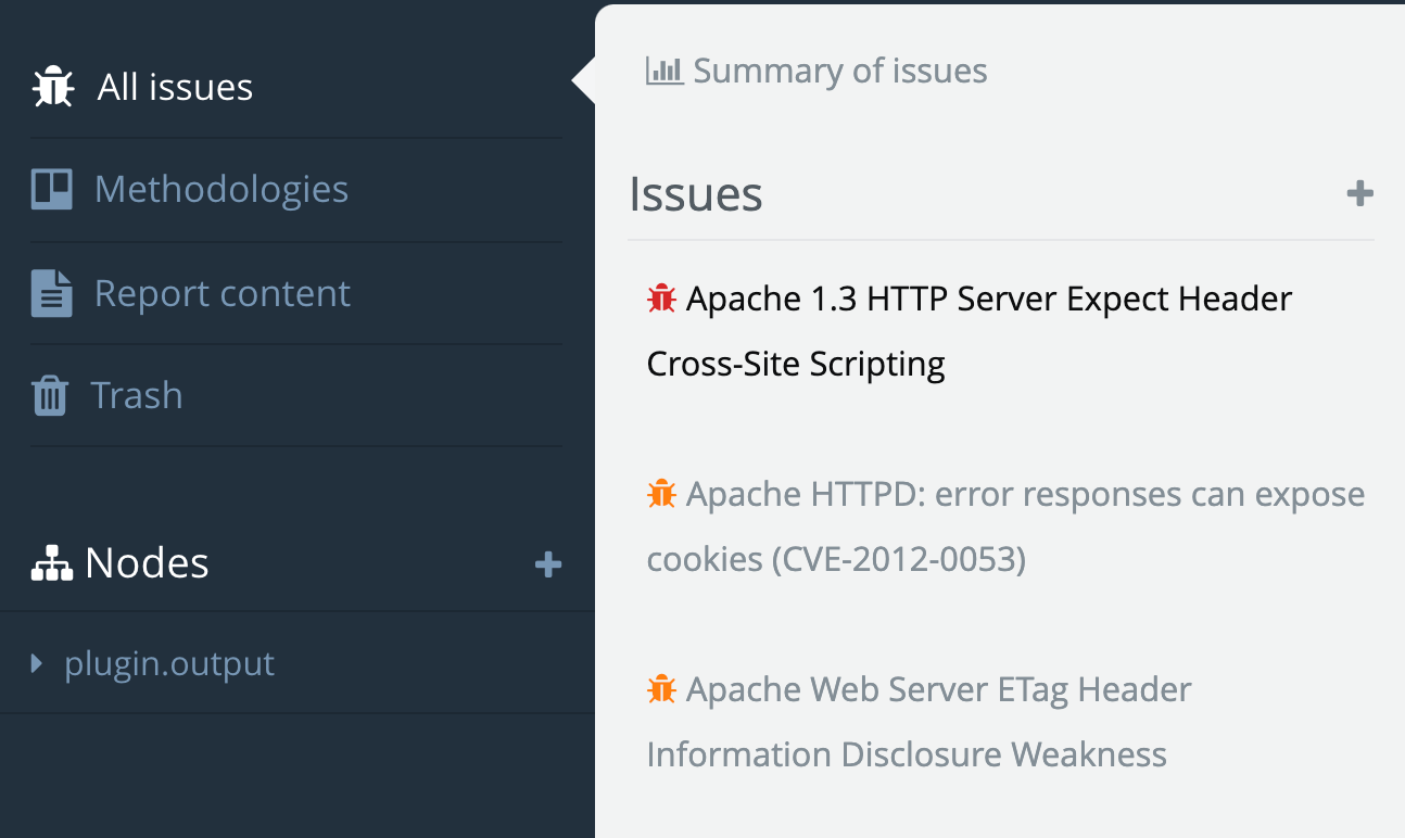
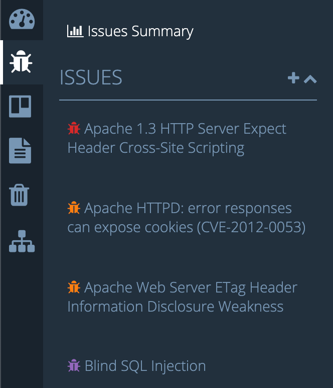
At this point, I had a decent base for all views in the app but one major component that still needed work. Many of the views utilize a secondary sidebar that lists view-specific collections of items like, attachment uploads and import options. In design, we want the secondary sidebar to flow nicely with the main sidebar. I achieved this flow by making the secondary sidebar background color the same as the main sidebar active item background color. This would give the active sidebar item and the secondary sidebar a visual connection. The views that use a secondary-sidebar needed to match the rest of the app by having the view content sections neatly presented in panels. This meant that sections like Comments, Subscriptions, and so on got their own panel.

After all the design was completed it was time to dive into the code and translate the mockups to an actual working layout. Before I could do any of the fun stuff I had to first do the Bootstrap 2 to Bootstrap 4 migration. This proved to be quite tedious and required every single view file to be touched and restructured the Bootstrap 4 way. All the rows, columns, modals, panels/cards, and more, all had to be revised. Additionally, any JavaScript files using Bootstrap 2 classes had to be updated with Bootstrap 4 classes to maintain functionality. Finally, moving on to CSS files, I realized that over time as new features were added to Snowcrash, more CSS was added but as features were revised or updated, the no-longer-needed CSS was not removed. This resulted in a good amount of unused CSS lingering in the codebase. Furthermore, the custom CSS on top of 3rd party stylesheets resulted in some messy CSS that could have been significantly reduced to achieve the same result. I found many instances of over-specified properties on child elements and re-defined properties that were already defined elsewhere for the same elements. I put off cleaning up the CSS until I had the new Tylium layout in place. I figured some of the CSS could be re-used since the design of the partials rendered in the layout would not significantly change.

With the Bootstrap migration completed and out of the way, I was able to start coding the layout changes I’d designed in Adobe Xd. I implemented the design in roughly the same order as I designed it. I started with the sidebar and navbar, then moved to the main content areas of all views without a secondary-sidebar. I added the panel changes to each section of the views and adjusted things like header styles and font-sizes while utilized SASS variables for easy switching of colors between CE and Pro editions. 

Example of Tylium view without a secondary sidebar

Last but not least, I worked on the secondary sidebar and adjusted all the view files that utilized this sidebar and updated panel styles, panel headers, page headers, etc . While coding the secondary-sidebar I quickly realized that it could be taller than the view content itself depending on the collection of items rendered within it. This would cause the view content to be unnecessarily scrollable. To solve this, I locked the secondary sidebar height to match the height of the browser window and made it scroll independently of the main view content. This would also be a more natural behavior in situations where both the secondary sidebar and view content have enough height that they both need to scroll vertically. 

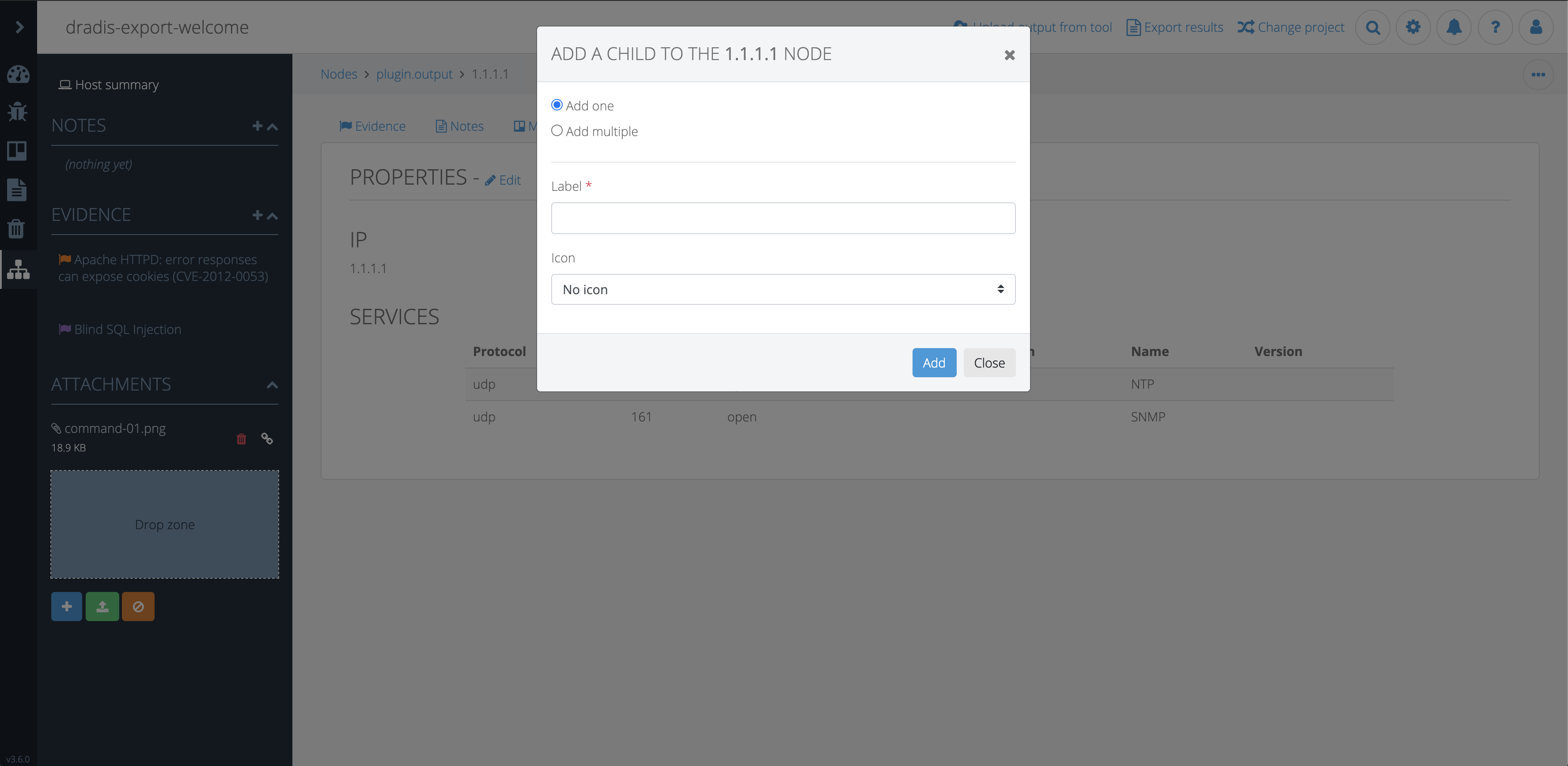
Another challenge I ran into was caused by a bug where the Bootstrap 4 modals appeared under the modal backdrop rendering all modals useless. After many hours of digging through the code, scratching my head, and growing new strands of grey hair, I turned to StackOverflow. It turns out this is a known Bootstrap 4 issue and the best way to solve it is to render all modals as direct children of the <body> tag. This required a refactor of the way we rendered modals in views.

At this point, the layout had come together nicely and everything was working as expected. Any bugs and quirks that came up along the way were resolved. Just as I was feeling good about it, all kinds of specs in the test suite were failing. I dove into the specs and updated what I knew needed updating based on the layout changes and Bootstrap migration but I noticed I wasn’t getting consistent failures. Some specs would fail sometimes and those same specs would pass other times. I had our developers, Aaron and Brian, step in to take a look. After many hours of debugging and researching, they finally realized the problem had to do with the sidebar toggle animation. The test suite was expecting the sidebar to be opened instantly so it could continue to go through the testing steps but the milliseconds of animation caused the test suite to intermittently break causing failures at different points. Ultimately, the solution was to disable animations for the test suite and all was well.

The last piece of the puzzle was to clean up all that old CSS. I ended up restructuring the CSS using a modified version of the SMACSS methodology. While tediously combing through each stylesheet, I removed unused, redundant, and unnecessary CSS. I was able to further reduce the amount of CSS by improving specificity.

Fun fact: Implementing Tylium modified 290 files and reduced the app’s code by 1871 lines.

GitHub stats

Tylium was finally ready for release. Pleasantly, the new look was generally well-received and as more and more users started to use the updated version of Dradis, we started to get more constructive feedback. Both our internal team and our users realized that the auto-collapsing toolbar created a workflow issue in cases where users needed to frequently switch nodes or manually add many new nodes. I set out to fix this hindrance by eliminating the need to click the sidebar in order to create/navigate nodes. After discussing a few options with the team, the decision was made to have users toggle the sidebar manually. To enable users to keep working regardless of the state of the sidebar, I removed the overlay that faded out the rest of the view. This allowed users to chose if they would like to have the sidebar open or closed and we implemented some logic to remember the sidebar state so users wouldn’t have to toggle it each time they returned to a project. This also helped with seamless navigation between views.

Overall, the new layout improved the app by:

  • Increasing screen real-estate by 18-20%
  • Updating Bootstrap’s version from the historic 2.3.2 to a more current 4.3.1
  • Improving accessibility by updating the text colors to meet at least Level AA of WCAG 2.0 standards.
  • Providing users with an app that has a modern look and feel while also increasing their productivity

This entire endeavor started in Oct 2019 with very early rough sketches and spanned about 6 months until it was finally publicly released in March 2020. Huge thanks to the entire team for their help and input throughout the entire process. ✌️

Matt,
Designer.

New Kid On The Block

The blog title gives it away but I’m the new guy over at Security Roots working on Dradis. My name is Matt and I love to explore the world. I was born in Poland, grew up in Canada and I am currently hanging out in one of the most tech savvy capitals, Shenzhen, China. Since I am the new guy I wanted to introduce myself, give you some inside scoop, my experience working with the team and a little bit about my first assignment. 👋

Over many years I have worked on a number of web design and development projects. I pride myself in being a designer with a creative edge and although I have extensive knowledge and experience with design concepts, HTML/CSS/JS, Photoshop, Illustrator, Xd and more, I strive to continuously expand my knowledge with all the ever changing technologies. Currently, as a result of joining Security Roots, I am learning Ruby and Ruby on Rails which, I have quickly realized, it’s quite different from Python and Django. I also enjoy video production/editing using Final Cut Pro X and I have my eyes on a DJI Mavic 2 Pro. 👀

Now let me tell you a little bit about my first month at Security Roots. Initially I was drawn to the job posting because it really resonated with me and I was thrilled when I got an email from Daniel (he’s the big cheese over here if you aren’t sure who I’m talking about) and we discussed the opportunity and by the end of it, all of my needs and wants had been checked off for my dream job. I did a small test assignment, which apparently went well since I’m here, and I got to meet the team. I was a bit nervous about this since I knew everyone had been working together for a few years now and are already in the groove of things. I had all kinds of thoughts going through my mind but I was very excited to join the team. All the nervous feelings were put to rest moments after I joined the workspace as I was welcomed with (virtual) open arms by everyone. With the warm welcome I could feel there was excitement and enthusiasm from everyone that a designer has joined the team. I quickly learned that everyone is friendly, very helpful and extremely knowledgable and skilled in their roles. The work environment at Security Roots is very different from anything I have experienced before but is also the most interesting and effective one in comparison! Everyone works independently on their assignments but at the same time is always collaborating and communicating with each other. Every week there is a new topic that everyone answers in a video and posts it to share with the team. This is a great way to get to know the people on the team and promotes more of a social vibe in a work environment. Curious about what the office looks like? Where is it located? Who has the best parking spot or the prime corner view? Well this is actually one of the MANY perks of being part of the Security Roots team. We all work 100% remotely all over the world, so the office can be anything from a home office to a co-working space, or even a boat! Another great feature of being on the team is consistent personal development. Daniel is constantly encouraging us to grow and develop! Whether you want to learn something new within the industry, take a course or read a book, we have it covered. I love to learn so being part of a company that promotes personal development was very important to me. Security Roots really knows how to treat their employees! ✅

I could go on and on about the perks and first impressions but let’s move on to something you will get to see and experience first hand. The first thing I tackled during my first month on the team was a redesign and update of the user profile page. When I am presented with a new feature that needs to be designed, or a current view that needs to be redesigned, I like to make a list of objectives and goals for the design. I want understand how it will be integrated into the overall project. I do background research on the feature, and use a variety of tools to come up with a few variations of a design, then decide on the best one to continue to develop and finalize. In the case of the profile page redesign, I looked at the current design and identified what the issues were with the flow. We also decided to update to the most current version of the HTML/CSS/JS framework incorporated into the project. There was quite a bit of work to be done to make the view work in the current layout regarding HTML structure and CSS class names. I got the view into something that could be navigated and jumped over to Adobe Xd and made mock ups to see how I could make the page flow better and be more visually appealing. I decided to incorporate a 2-column view which focused on arranging the fields in a way that made more sense. I opt-ed to make the left column show the avatar and API token reset and moved all the text fields into the right column and arranged them in a natural order of flow. Once the front end components were arranged, I added some validation styling and magic to make it all work and BOOM! My first project was completed with better flow and a more user friendly experience. 💣

As a team we truly hope that the new designs are beneficial to you and look forward to any feedback from users on the new designs that will be coming soon to Dradis CE & Pro!

Matt,
Designer.