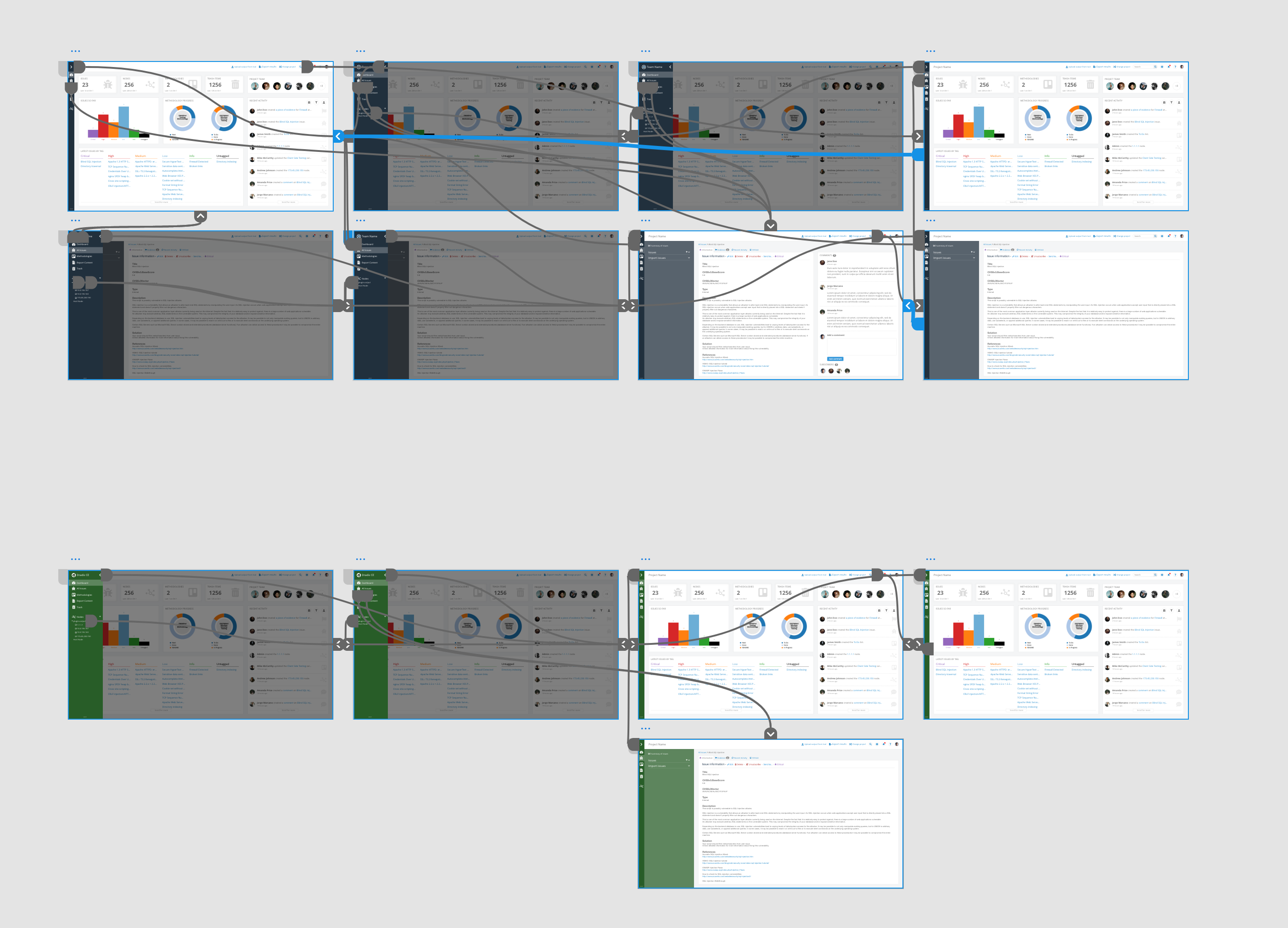
On March 2nd, 2020, we released Tylium, a new layout for Dradis projects replacing the long-lived Snowcrash layout. Let’s go into some of the details of the work that went into designing Tylium.

I’m Matt Budz, the product designer for Dradis, I help create new Dradis features and re-design some of the older ones that need some TLC.
First, let’s start with some background. Snowcrash has been the layout for Dradis projects since 2013. Some users may remember way back when it was released as part of v1.9. It was a shiny new UI built using the now-ancient Bootstrap 2 with a handful of 3rd-party plugin stylesheets sprinkled on top. Many new features were added over the years, but the look and feel of the app became dated.
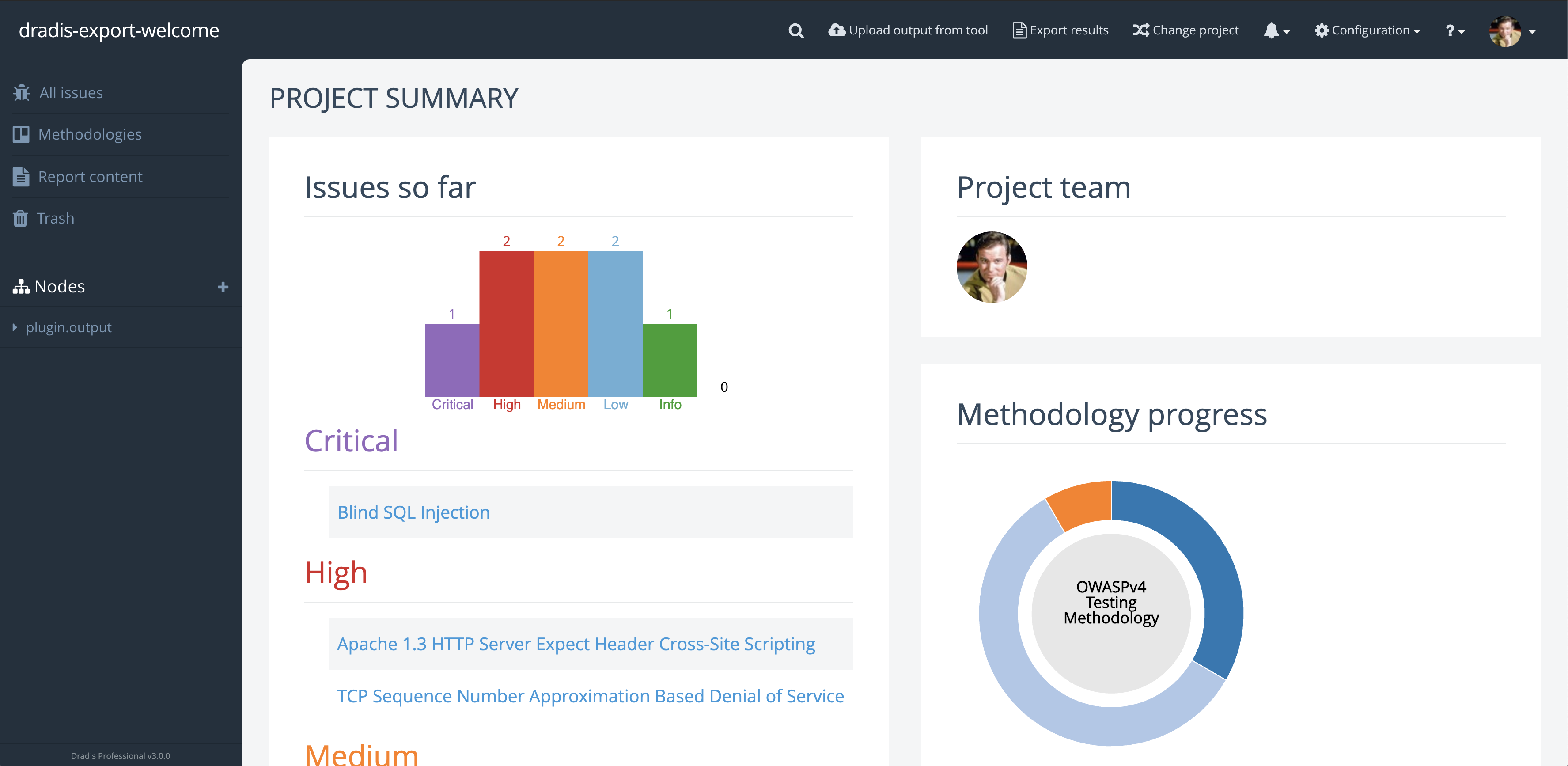
My goal was to make the app look more modern and to update it to Bootstrap 4. But what does more modern entail?
I wanted to retain the long-used brand colors for both Dradis CE and Pro editions and adjust the remaining color palette to improve color contrast while ensuring the changes wouldn’t be too jarring for existing users.
Increasing on-screen real-estate was a priority during the redesign. Adjusting spacing and incorporating a collapsable sidebar that could move out of the way provided more space. Snowcrash had some inconsistent visual hierarchy, especially around header & paragraph text sizes.
Some elements lacked visual cues to inform users that more information could be seen by scrolling. Additionally, Snowcrash had various cluttered views with a lot of information and action links that could be tucked away and accessed only when needed. I wanted to create an action menu (we call it the dots-menu) that could be used for any resource in virtually any view. I wanted this to have a specific look so that users would be able to recognize that there is something more they can do when they see this menu – like adding, editing, moving, and so on.
I embarked on this re-design journey knowing that I wanted to change the overall layout of the app but not completely re-design the individual partials that are rendered within the layout’s different views. I decided it would be best to work on those as the respective features got updated or other features got added.
Using my design tool of choice, Adobe Xd, I started on the main sidebar and the collapse/expand functionality. I designed this so that the user would expand the sidebar and once they navigated by clicking the links in the sidebar or clicked off the sidebar, it would collapse out of the way. With the sidebar opened, the rest of the view became faded out to bring attention to the floating sidebar. This came with subtle animations for the sidebar width transition, navigation link position, as well as opacity transitions for the node tree and sidebar header. At this point, I also added the new-to-Tylium Dashboard link, so users could easily navigate back to the initial view they are greeted with when they opened the project.

Next, I moved on to the top navbar. In Snowcrash it was becoming a bit full and offered very limited space for long project names as well as new nav items. It was also visually connected to the sidebar giving the illusion of a smaller workspace for everything else in the project. I wanted to completely separate the navbar from the sidebar so I moved away from using the edition color as the navbar’s background color. In order to save some space, I changed the less-used nav links to round buttons with icons to reduce the total width they took up. I also re-designed the way the search button expanded and behaved to match the new round nav buttons.

I worked on the sidebar and navbar while looking at the project dashboard, so naturally, I moved on to the main dashboard area next. I wanted to keep the panels the dashboard had in Snowcrash but with an updated look. Again, I didn’t want to completely re-design any of the partials but I did update things along the way so they would be more cohesive with the new layout. The page heading and the panel headings had to become more distinguishable for one another so I increased the size of the page headers to ensure they wouldn’t be lost with panel headers. I also noticed there was inconsistency with borders and dividers, both in terms of colors and usage. I ensured all borders and dividing lines got the same color and that they were used consistently regardless of the view for a better visual presentation. The panels got a subtle border with rounded corners along with matching underlines for the panel headers. Some other components that got a refresh were the list of issues and the list of recent activities.

Old Dashboard view 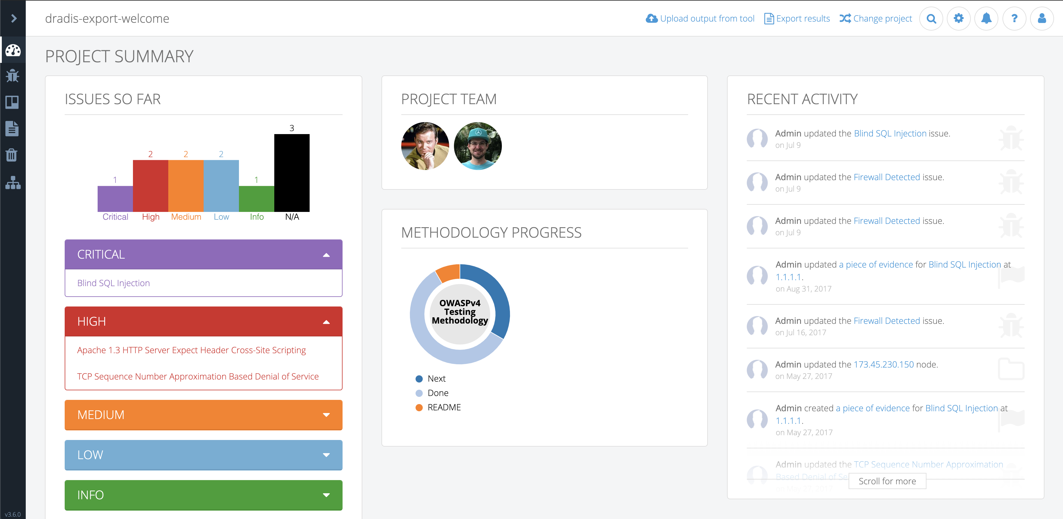
New Dashboard view
For better user experience, I wanted the sidebar and navbar to always be visible regardless of the height and width of the view. This meant that only the view content would be scrollable. In order to keep a visual consistency throughout the layout, I used the changes I made to the dashboard to set the tone for all the other views.
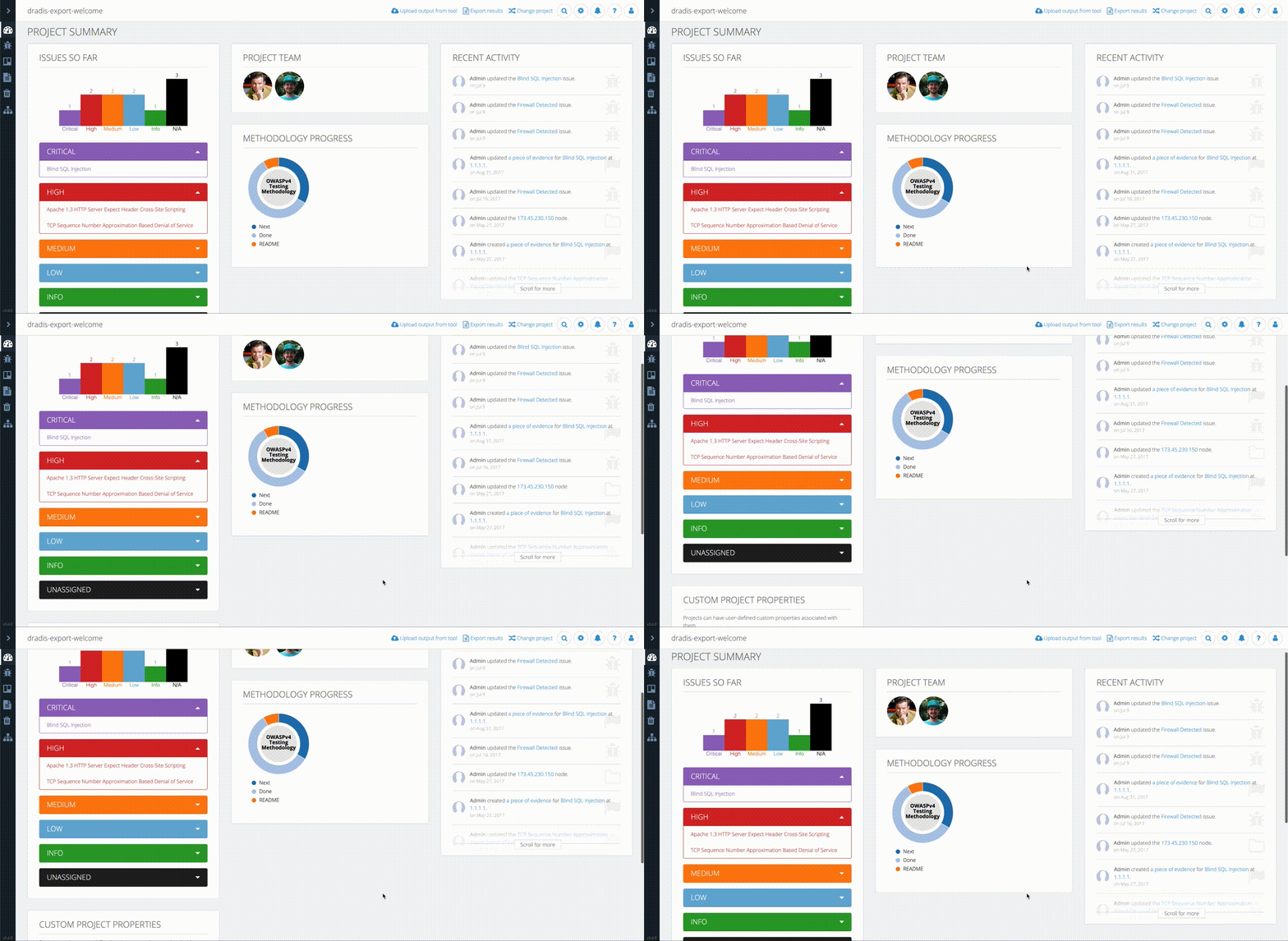
At this point, I had a decent base for all views in the app but one major component that still needed work. Many of the views utilize a secondary sidebar that lists view-specific collections of items like, attachment uploads and import options. In design, we want the secondary sidebar to flow nicely with the main sidebar. I achieved this flow by making the secondary sidebar background color the same as the main sidebar active item background color. This would give the active sidebar item and the secondary sidebar a visual connection. The views that use a secondary-sidebar needed to match the rest of the app by having the view content sections neatly presented in panels. This meant that sections like Comments, Subscriptions, and so on got their own panel.
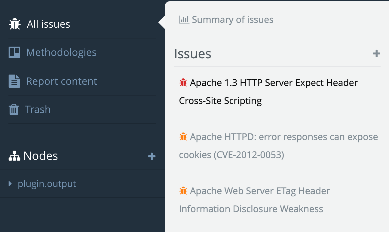
Snowcrash secondary sidebar 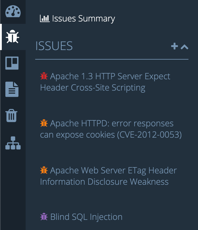
Tylium secondary sidebar
After all the design was completed it was time to dive into the code and translate the mockups to an actual working layout. Before I could do any of the fun stuff I had to first do the Bootstrap 2 to Bootstrap 4 migration. This proved to be quite tedious and required every single view file to be touched and restructured the Bootstrap 4 way. All the rows, columns, modals, panels/cards, and more, all had to be revised. Additionally, any JavaScript files using Bootstrap 2 classes had to be updated with Bootstrap 4 classes to maintain functionality. Finally, moving on to CSS files, I realized that over time as new features were added to Snowcrash, more CSS was added but as features were revised or updated, the no-longer-needed CSS was not removed. This resulted in a good amount of unused CSS lingering in the codebase. Furthermore, the custom CSS on top of 3rd party stylesheets resulted in some messy CSS that could have been significantly reduced to achieve the same result. I found many instances of over-specified properties on child elements and re-defined properties that were already defined elsewhere for the same elements. I put off cleaning up the CSS until I had the new Tylium layout in place. I figured some of the CSS could be re-used since the design of the partials rendered in the layout would not significantly change.
With the Bootstrap migration completed and out of the way, I was able to start coding the layout changes I’d designed in Adobe Xd. I implemented the design in roughly the same order as I designed it. I started with the sidebar and navbar, then moved to the main content areas of all views without a secondary-sidebar. I added the panel changes to each section of the views and adjusted things like header styles and font-sizes while utilized SASS variables for easy switching of colors between CE and Pro editions.
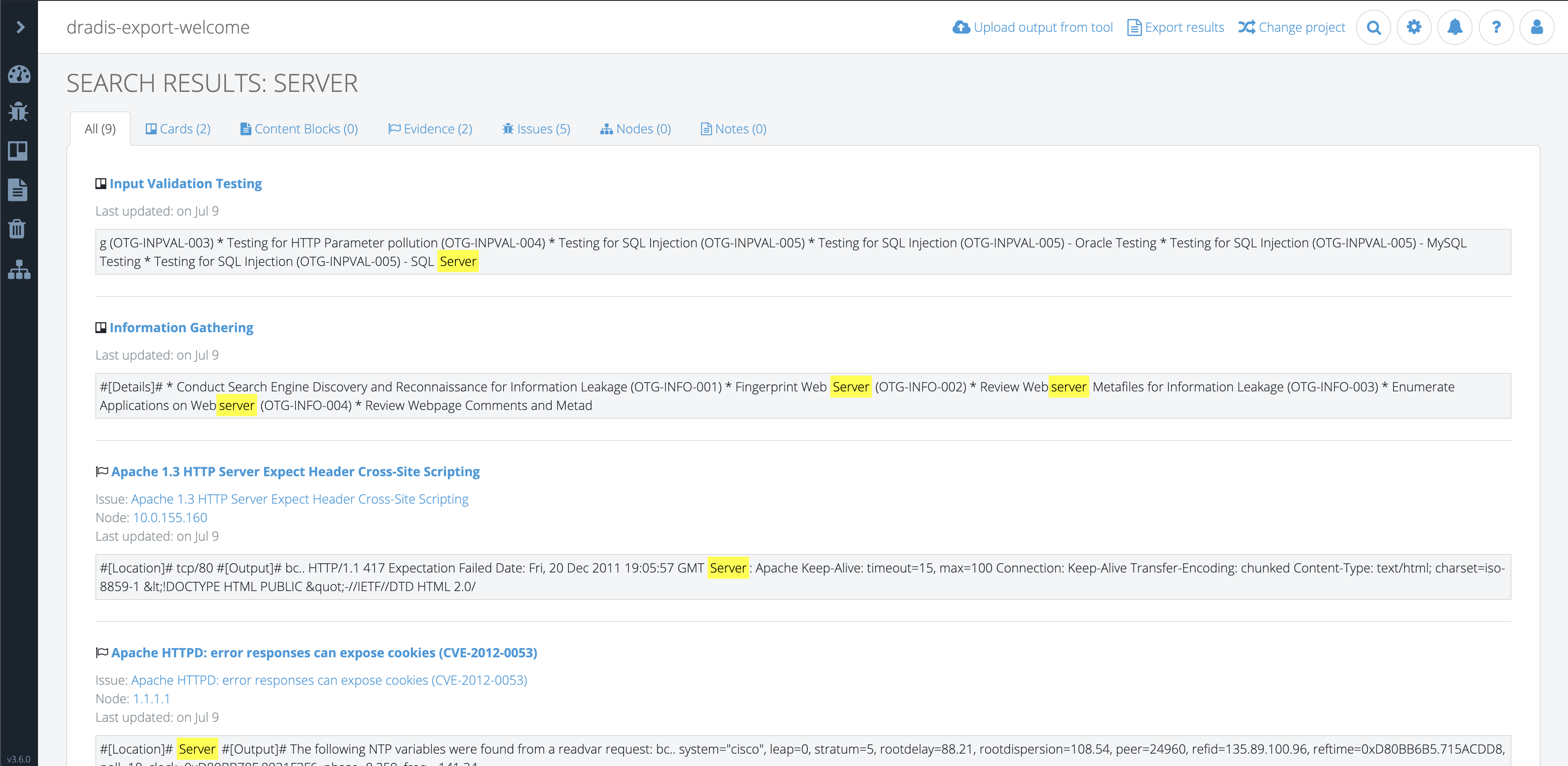
Last but not least, I worked on the secondary sidebar and adjusted all the view files that utilized this sidebar and updated panel styles, panel headers, page headers, etc . While coding the secondary-sidebar I quickly realized that it could be taller than the view content itself depending on the collection of items rendered within it. This would cause the view content to be unnecessarily scrollable. To solve this, I locked the secondary sidebar height to match the height of the browser window and made it scroll independently of the main view content. This would also be a more natural behavior in situations where both the secondary sidebar and view content have enough height that they both need to scroll vertically.
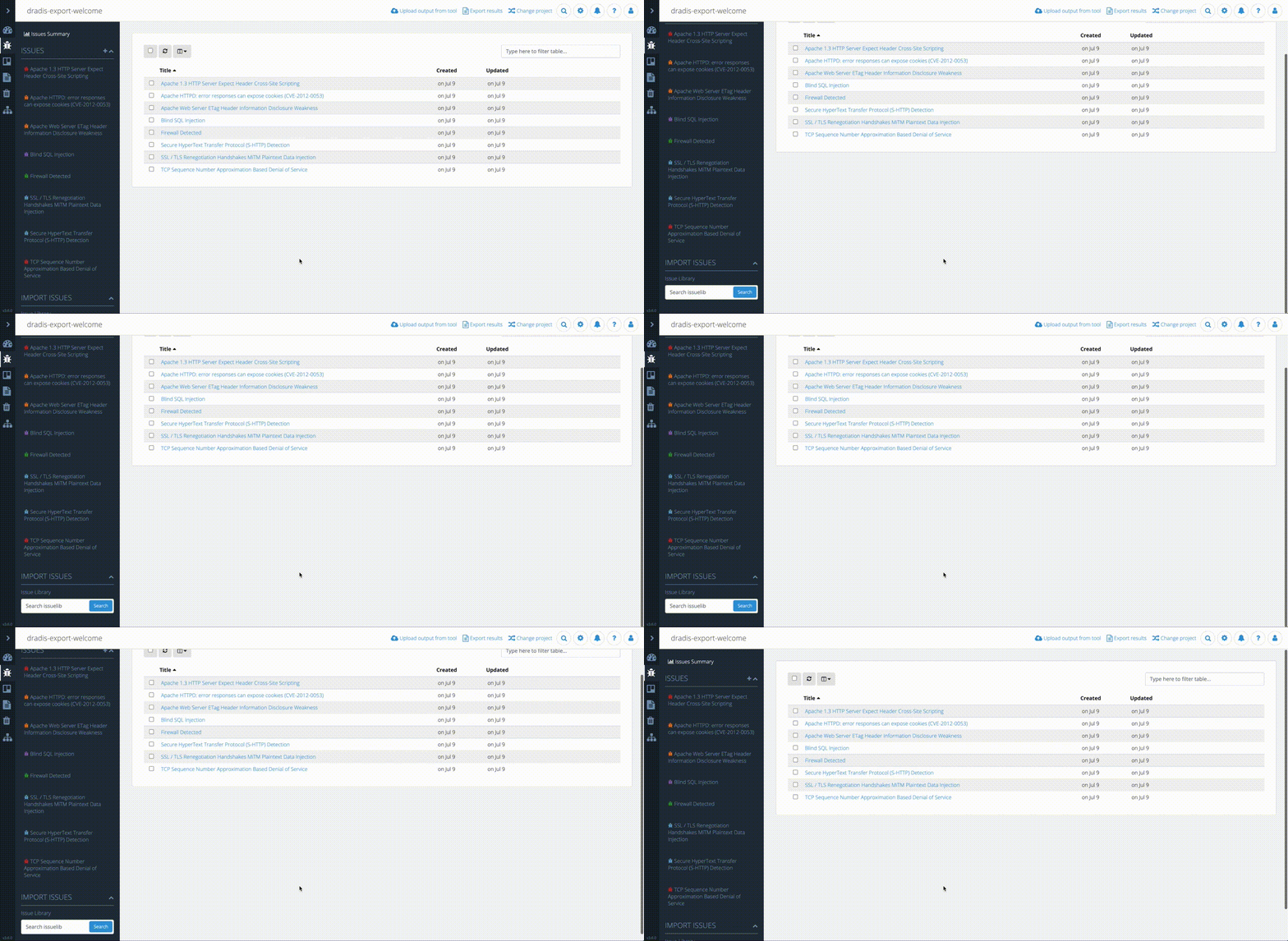
Broken: Entire view scrolling with secondary sidebar 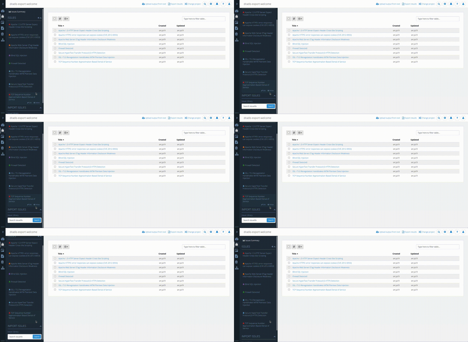
Fixed: Secondary sidebar scrolling independently
Another challenge I ran into was caused by a bug where the Bootstrap 4 modals appeared under the modal backdrop rendering all modals useless. After many hours of digging through the code, scratching my head, and growing new strands of grey hair, I turned to StackOverflow. It turns out this is a known Bootstrap 4 issue and the best way to solve it is to render all modals as direct children of the <body> tag. This required a refactor of the way we rendered modals in views.
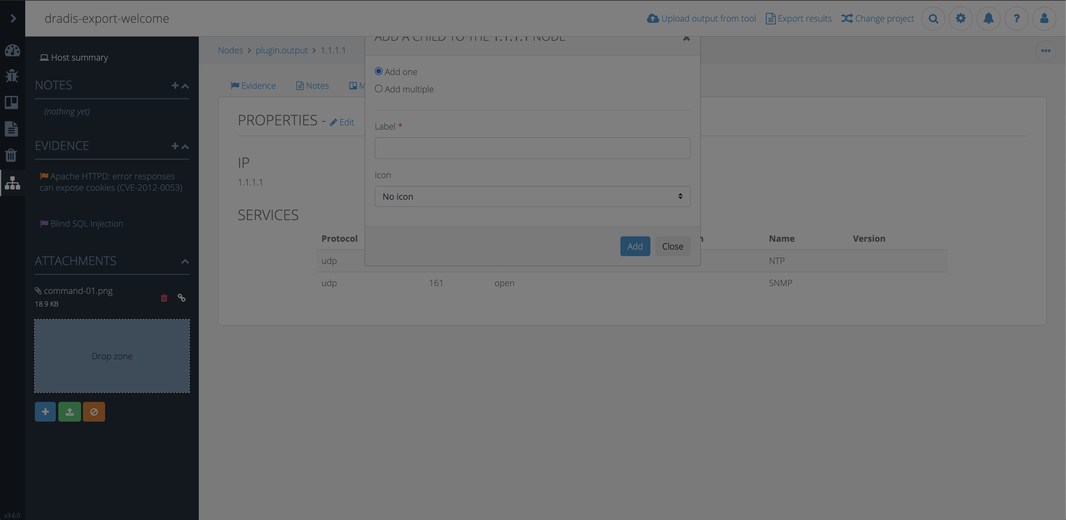
Broken: Modal under backdrop 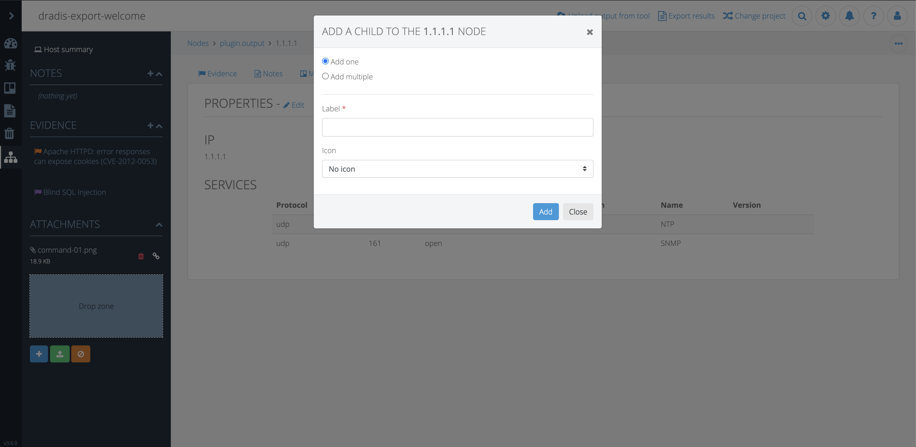
Fixed: Modal above backdrop
At this point, the layout had come together nicely and everything was working as expected. Any bugs and quirks that came up along the way were resolved. Just as I was feeling good about it, all kinds of specs in the test suite were failing. I dove into the specs and updated what I knew needed updating based on the layout changes and Bootstrap migration but I noticed I wasn’t getting consistent failures. Some specs would fail sometimes and those same specs would pass other times. I had our developers, Aaron and Brian, step in to take a look. After many hours of debugging and researching, they finally realized the problem had to do with the sidebar toggle animation. The test suite was expecting the sidebar to be opened instantly so it could continue to go through the testing steps but the milliseconds of animation caused the test suite to intermittently break causing failures at different points. Ultimately, the solution was to disable animations for the test suite and all was well.
The last piece of the puzzle was to clean up all that old CSS. I ended up restructuring the CSS using a modified version of the SMACSS methodology. While tediously combing through each stylesheet, I removed unused, redundant, and unnecessary CSS. I was able to further reduce the amount of CSS by improving specificity.
Fun fact: Implementing Tylium modified 290 files and reduced the app’s code by 1871 lines.

Tylium was finally ready for release. Pleasantly, the new look was generally well-received and as more and more users started to use the updated version of Dradis, we started to get more constructive feedback. Both our internal team and our users realized that the auto-collapsing toolbar created a workflow issue in cases where users needed to frequently switch nodes or manually add many new nodes. I set out to fix this hindrance by eliminating the need to click the sidebar in order to create/navigate nodes. After discussing a few options with the team, the decision was made to have users toggle the sidebar manually. To enable users to keep working regardless of the state of the sidebar, I removed the overlay that faded out the rest of the view. This allowed users to chose if they would like to have the sidebar open or closed and we implemented some logic to remember the sidebar state so users wouldn’t have to toggle it each time they returned to a project. This also helped with seamless navigation between views.

Tylium sidebar v1 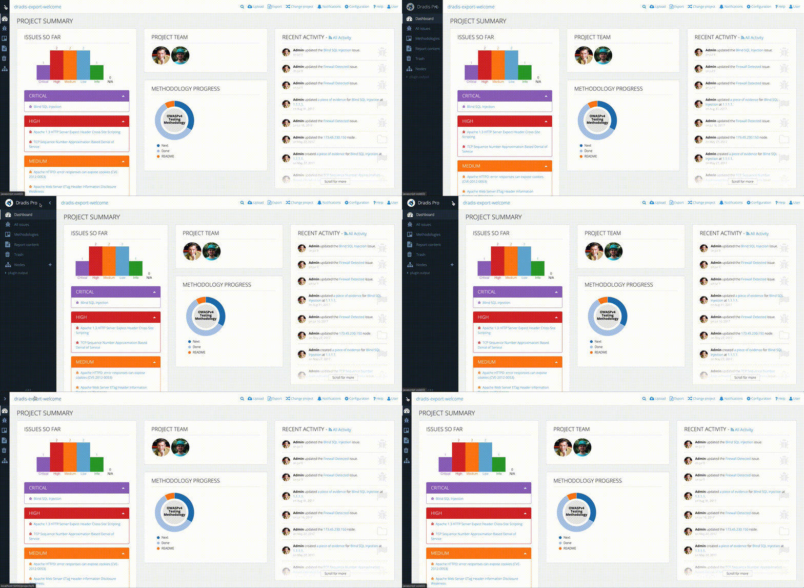
Tylium sidebar v2
Overall, the new layout improved the app by:
- Increasing screen real-estate by 18-20%
- Updating Bootstrap’s version from the historic 2.3.2 to a more current 4.3.1
- Improving accessibility by updating the text colors to meet at least Level AA of WCAG 2.0 standards.
- Providing users with an app that has a modern look and feel while also increasing their productivity
This entire endeavor started in Oct 2019 with very early rough sketches and spanned about 6 months until it was finally publicly released in March 2020. Huge thanks to the entire team for their help and input throughout the entire process. ✌️
Matt,
Designer.

